Getting Started
This tutorial provides a quick start for exploring the features of CytoAnalyst using our demo dataset. For more details on each feature and elements in the app, see the corresponding documentation. Check out our Case Studies for a more in-depth look at the analysis process.
Workflow
The diagram below shows what you will perform in this tutorial:
Create a New Study
To create a new study, navigate to the Study Management page and fill in the required fields in the Create Study form.
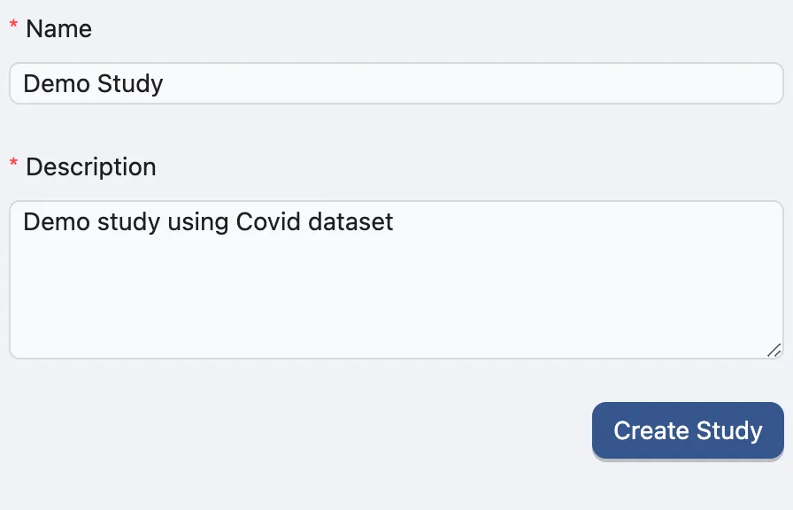
The Name and Description fields are required. You can modify these details later if needed. Click Create Study to create a new study.
A new study will be created, and added to the study table. You can use this table to manage your studies, including viewing, editing, and sharing them.

Upload Data
Use Demo Data
On the study table, hover on the View action of the study you just created. A pop-up will appear with options to navigate the study. Click on the Data Management option to go to the data management page.
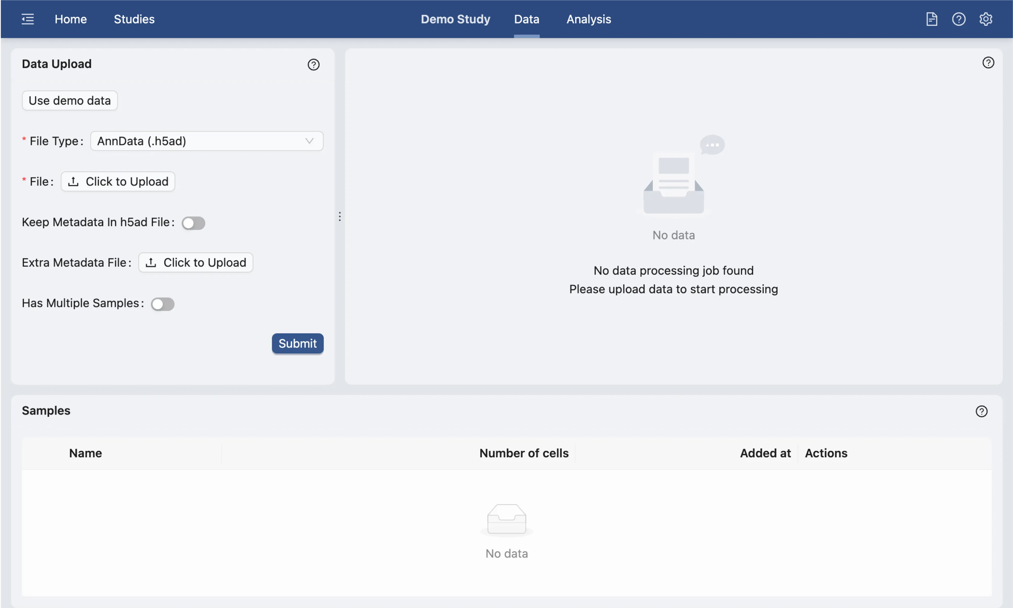
On the data management page, you can upload your data files. In this tutorial, we will use the demo dataset provided.
Click the Use Demo Data button on the Data Upload form to load the demo dataset and settings. We suggest that the settings for this demo dataset should not be changed for this tutorial.
The demo dataset is an individual single-Cell RNA-seq PBMC data from Guo et al. with 14,783 cells and 17,374 genes. After selecting the demo dataset, the following parameters will be set:
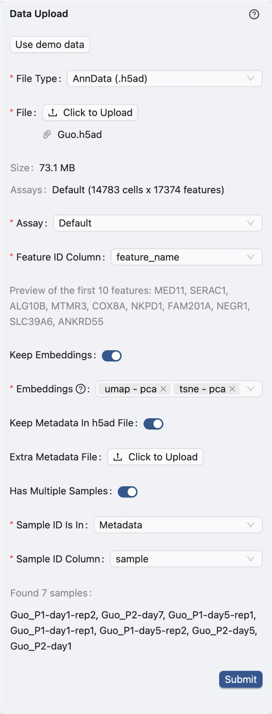
File Type:
AnnData (.h5ad). Indicates the file format of the dataset.File:
Guo.h5ad. The name of the dataset file.Assay:
Default. The type of assay used in the dataset. In this case, it is the default assay.Feature ID Column:
feature_name. The column in the dataset that contains the feature IDs. In this case, it is the gene names.Keep Embeddings:
True. Indicates whether to keep the precomputed embeddings in the dataset.Embeddings:
umap - pcaandtsne - pca. The precomputed visualizations and embeddings in the dataset to be kept.Keep Metadata in h5ad file:
True. Indicates whether to keep the metadata in the dataset file.Extra Metadata File:
Empty. An additional metadata file to be uploaded. In this case, no extra metadata file is uploaded.Has Multiple Samples:
True. Indicates whether the dataset has multiple samples.Sample ID Is In:
Metadata. Indicates where the sample IDs are located. In this case, they are in the metadata.Sample ID Column:
sample. The column in the dataset that contains the sample IDs.
Finally, click the Submit button to start the data preprocessing. A job will be created in the background to process the data. Once the job is completed, the right panel will display the options for data filtering. Visit Study Logs to learn more about monitoring analysis jobs and system status.
Data Filtering
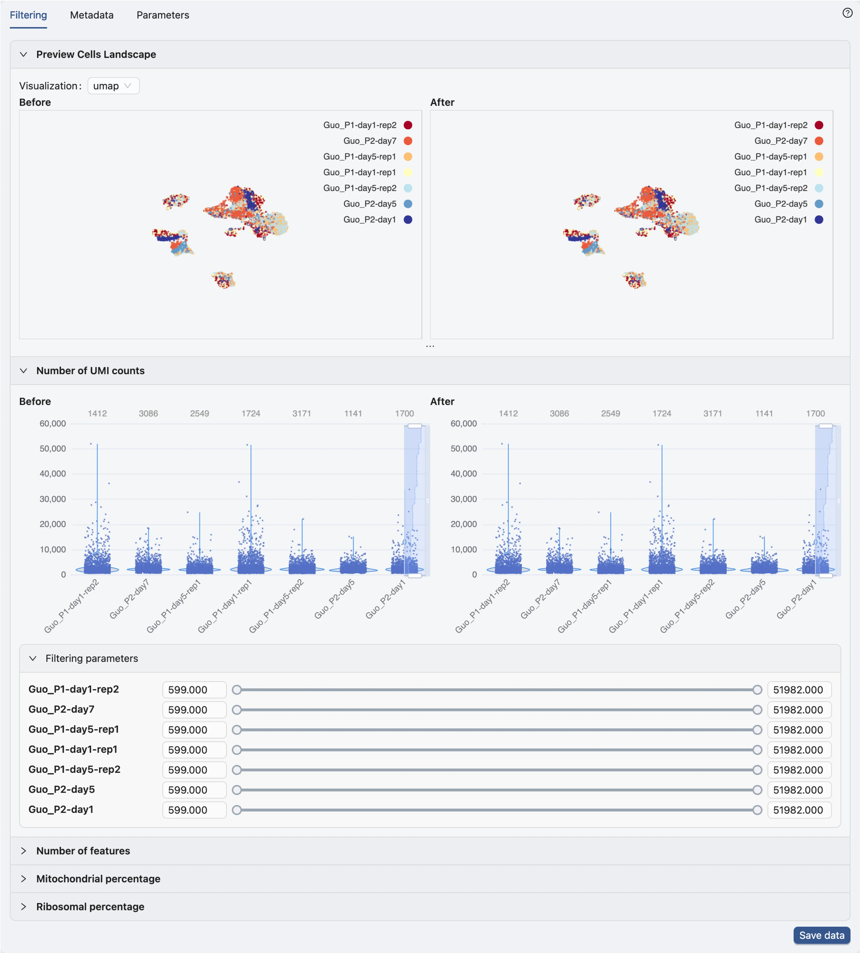
In the data filtering panel, you can filter cells based on different criteria, including the number of UMI counts, the number of genes expressed, and the percentage of mitochondrial genes.
Check out Data Management for more details on data filtering.
In this tutorial, we will not apply any data filtering as the demo dataset is already preprocessed.
Click Save data to open dialog for saving the data.
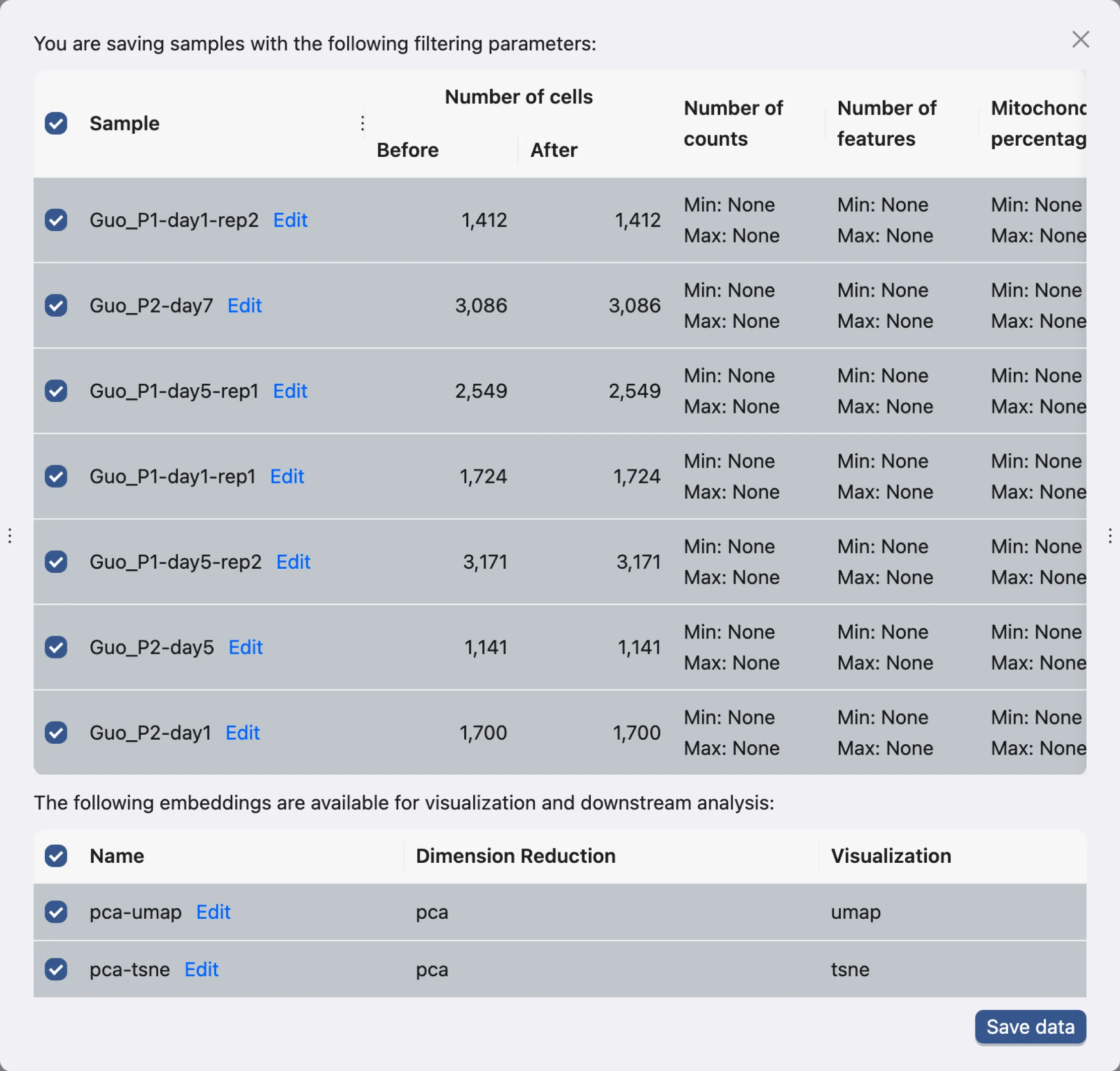
This dialog allows you to choose what samples and what embeddings to save. In this tutorial, we will save all samples and embeddings.
Click Save data to save the data. The newly saved data will be added to the data table.

Basic Data Visualization
Once the data is saved, you can start exploring the data and perform analysis in the Analysis page. To access the Analysis page, scroll to the top of the page and click on the Analysis button.
The Analysis page provides a comprehensive view of the data and analysis tools. The basic layout of the Analysis page is shown below:
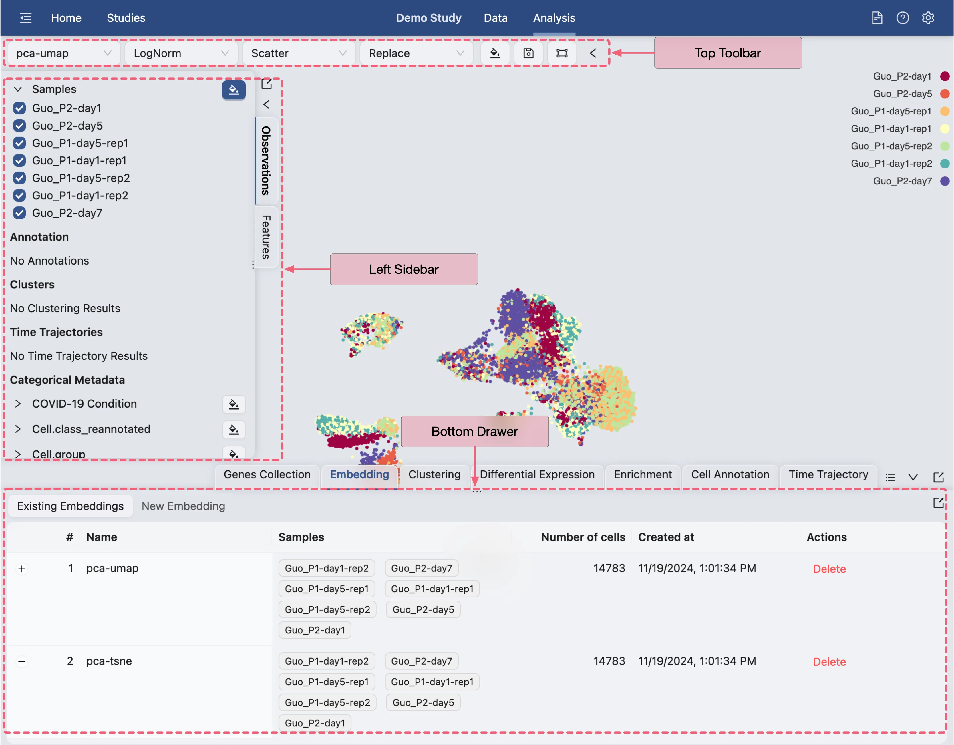
Top Toolbar: Contains dropdown menus for selecting embedding, data normalization, plot type, blending mode, and color map.
Left Sidebar: Contains the label selection panel for selecting labels to visualize.
Bottom Drawer: Contains all analysis tools
Each of these panels can be expanded or collapsed by clicking on the ![]() icon.
icon.
In this tutorial, we will start with basic data visualization using metadata and gene sets. Visit Data Visualization for more details on data visualization.
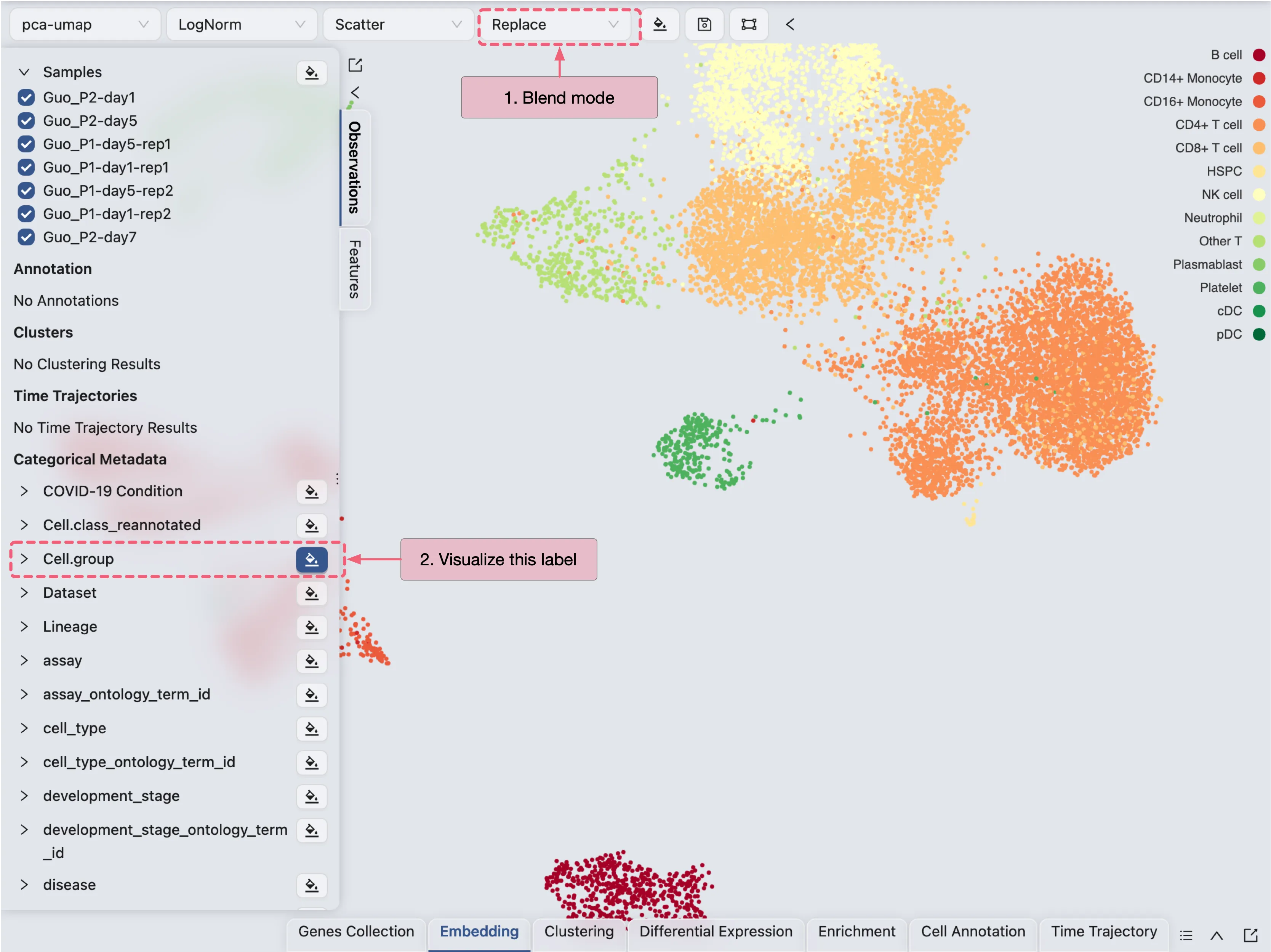
Visualize one label at a time
To visualize one label at a time, select the Blending mode as Replace on the top toolbar. Next, click on ![]() icon to select the label you want to visualize.
icon to select the label you want to visualize.
Visualize multiple labels
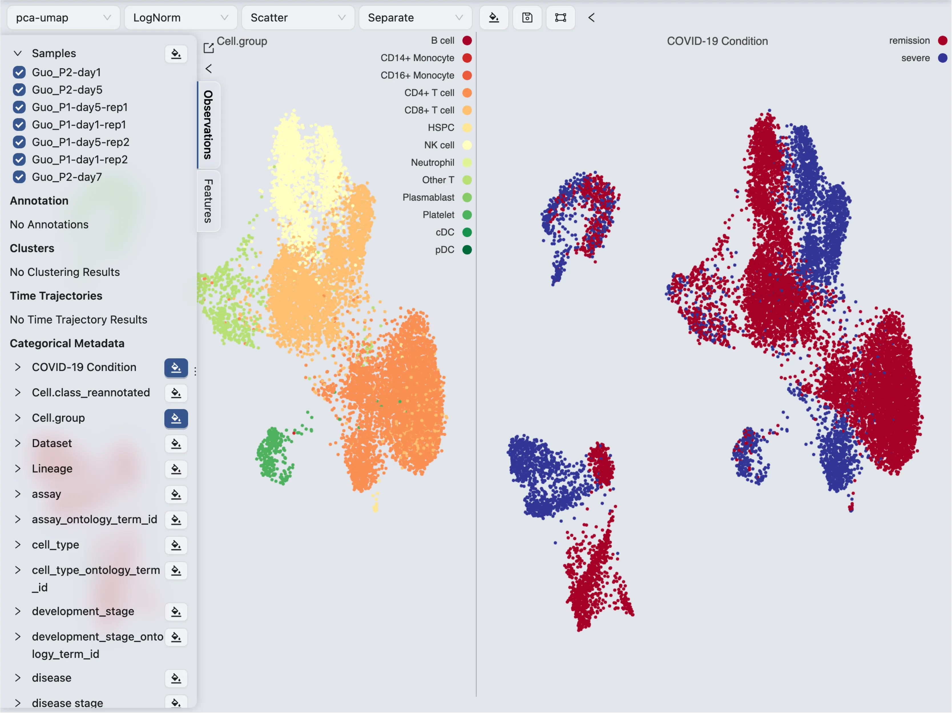
To visualize multiple labels, select the Blending mode as Separate on the top toolbar. Next, click on ![]() icon to select the labels you want to visualize.
icon to select the labels you want to visualize.
Update color mapping and other settings
Click on the ![]() on the top toolbar to update the color mapping and other settings.
on the top toolbar to update the color mapping and other settings.

Here you will be able to:
Update the color mapping
Change the plot title
Arrange the plot by simply dragging it up or down
Change how many plots are displayed in a row
Enable and disable tooltips
Synchronize the zoom and pan across all plots
And more
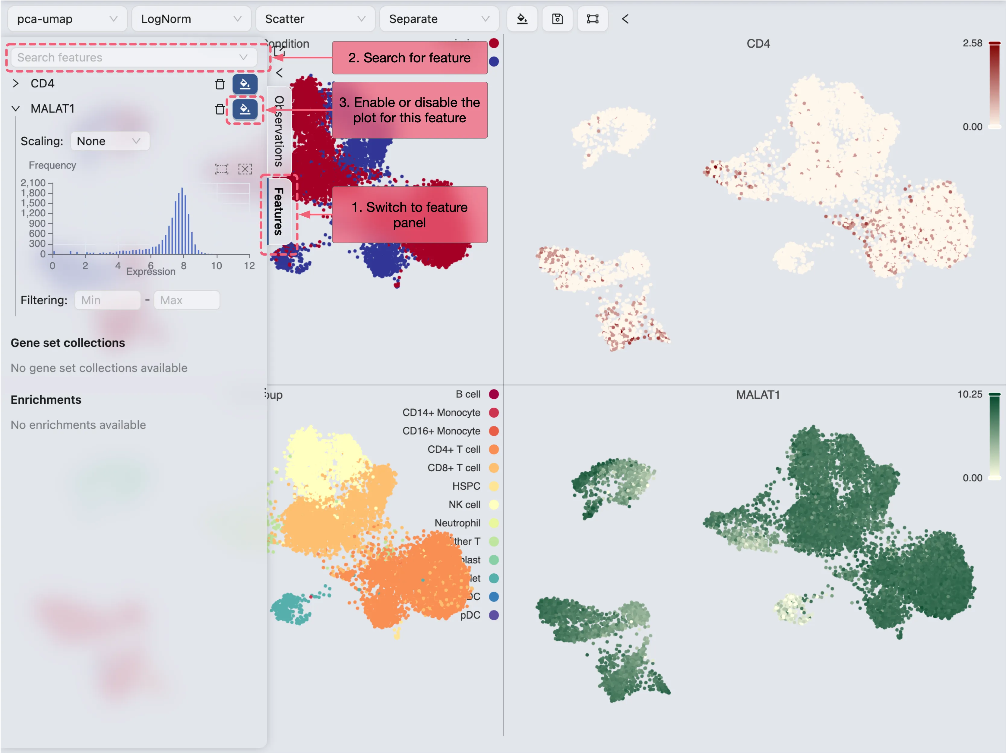
Visualize genes/features
To visualize a gene or feature, follow these steps:
Switch to the Feature tab in the left sidebar
Enter the gene name in the search box
Click on the gene name to visualize it
Visualize a set of genes/features
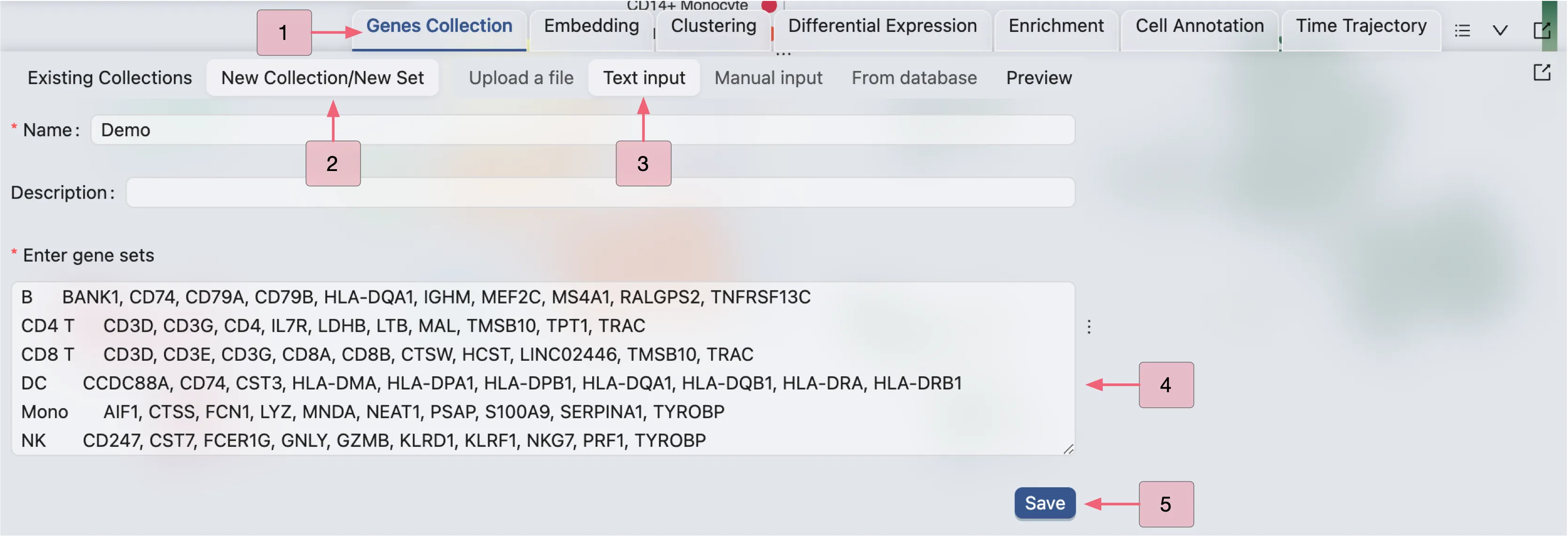
To visualize a set of genes or features, we first need to create a gene set collection. Visit Gene Set Collection for more details on creating gene set collections. In this tutorial, we will use an example gene set collection.
Follow these steps to create a gene set collection:
Click on the
Gene Set Collectiontab on the Bottom DrawerClick on New Collection to create a new gene set collection
Select Input Type as Text Input
Enter a name and the following gene sets in the text box:
Click Save to save the gene set collection
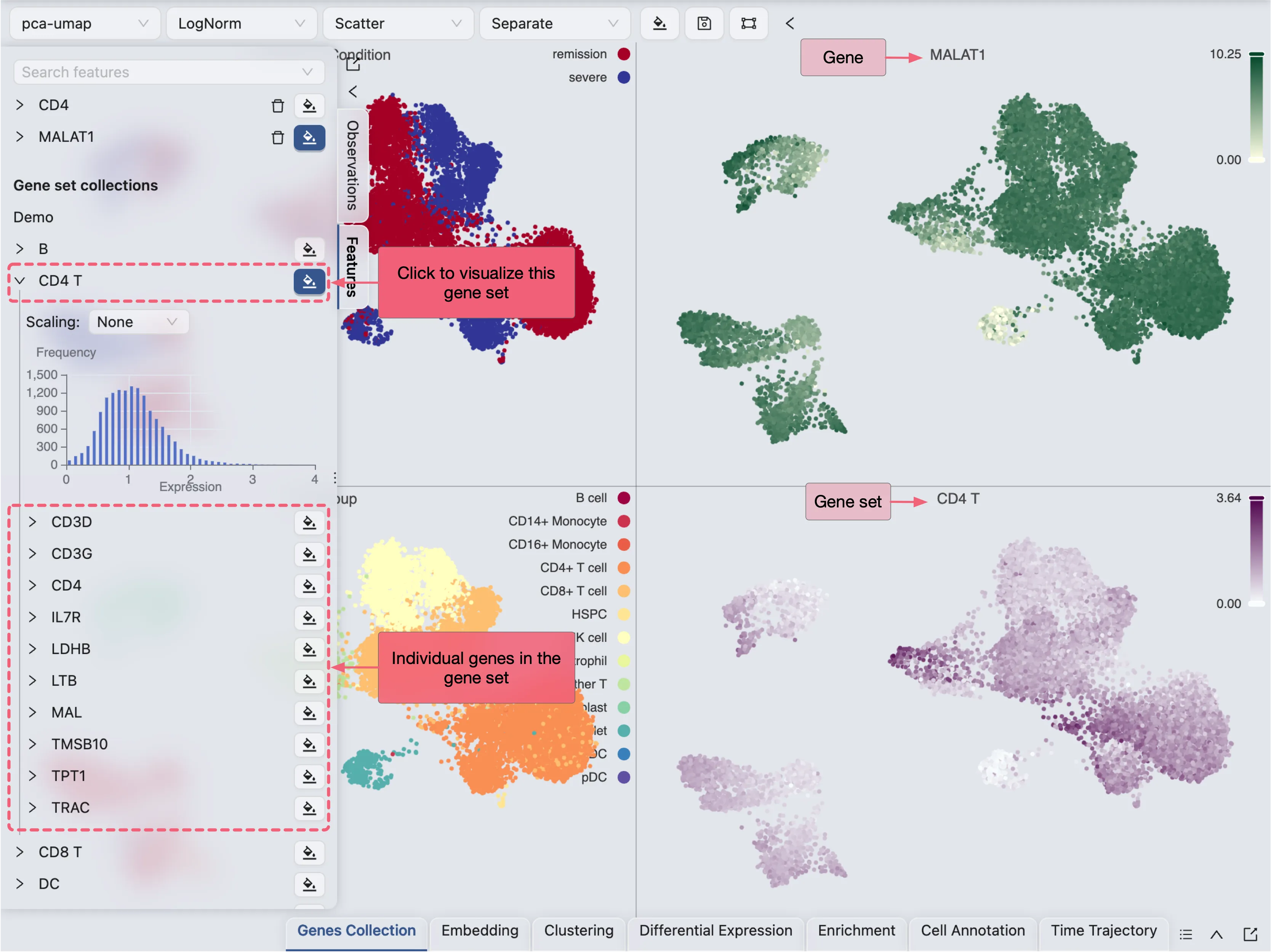
The newly created gene set collection will be added to the Future tab in the left sidebar. Click on the gene set collection to visualize the gene sets as a whole.
Filter data for individual plots
To filter data for individual plots, simply click on the plot legend to filter the data points for categorical labels, or drag the range slider to filter the data points for continuous labels.
Filter data for all plots
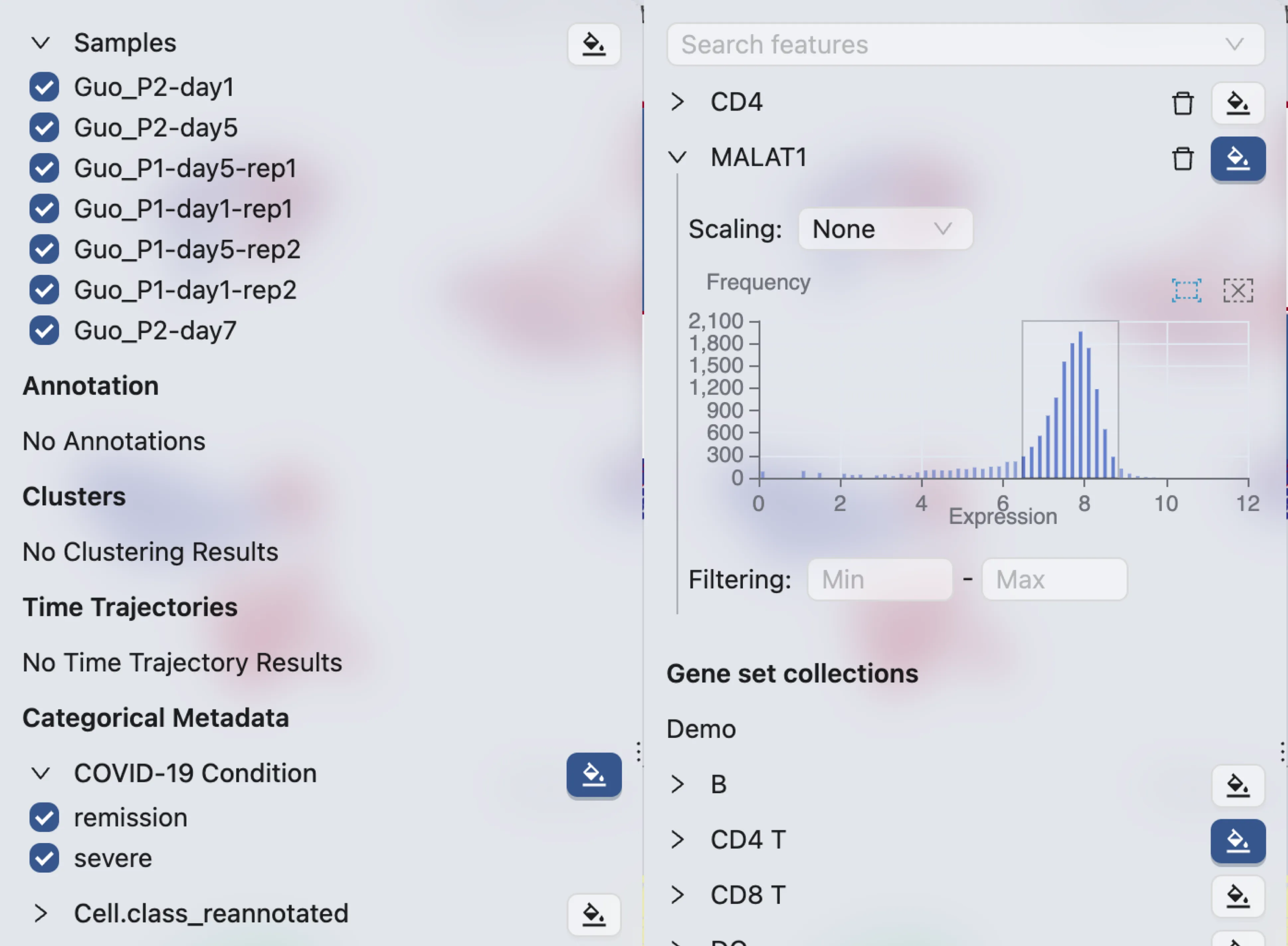
To filter data for all plots, expand the label in the left sidebar and uncheck the data points you want to filter out. For continuous labels, provide the range in the input box or select from the histogram.
Select data points
To select data points:
Click on the
 icon on the top toolbar. A selection tool with options will appear.
Click and drag on the plot to select data points.
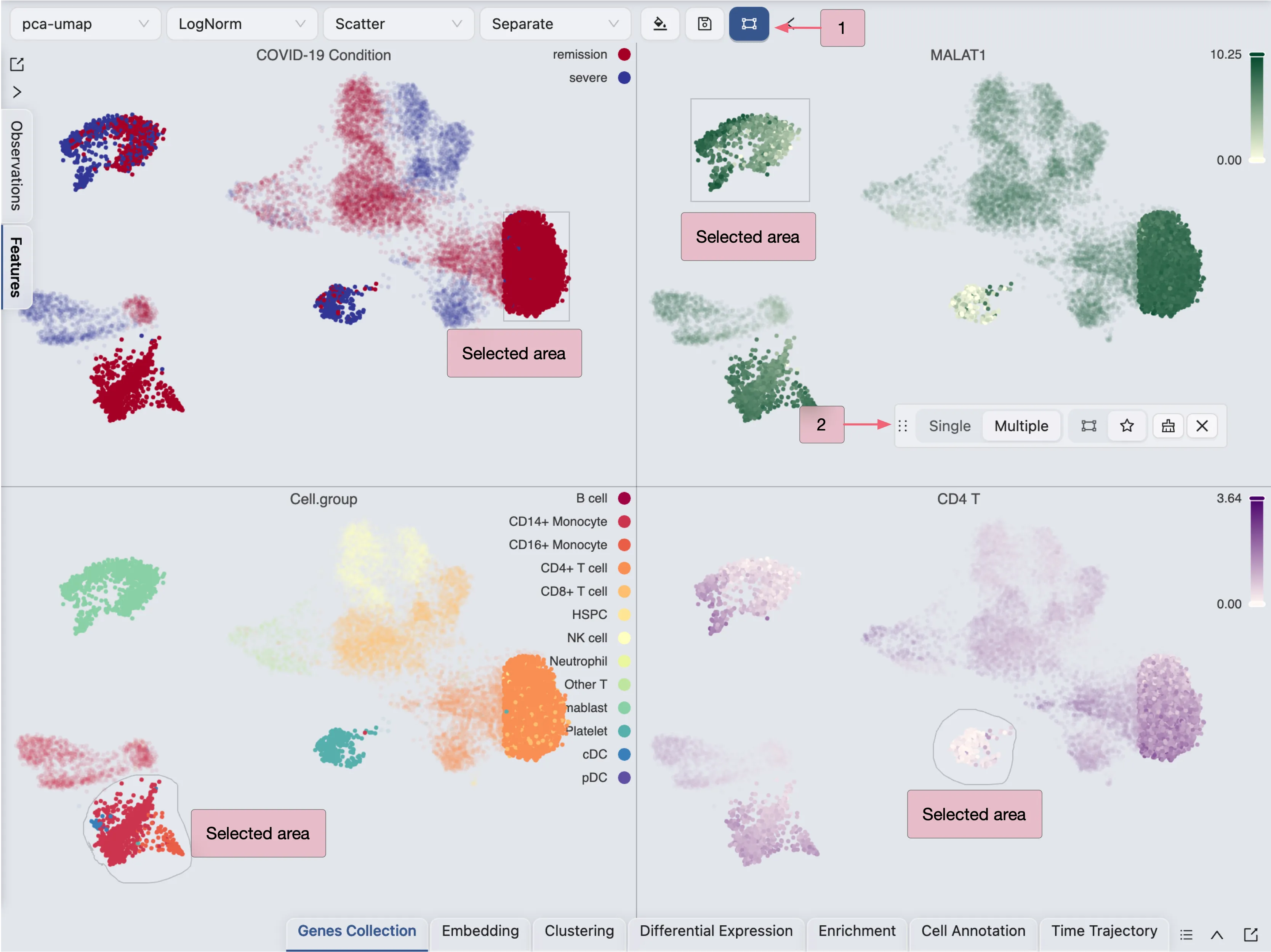
You can select from multiple plots and the selection will be applied to all plots.
The selection tool is useful when you need to filter cells for cell annotation, create a new embedding, perform differential expression analysis, and more.
Perform Clustering
To perform clustering, click on the Clustering tab on the Bottom Drawer, and then click on the New Clustering button.
Here, we will perform clustering using the Louvain algorithm on the pre-computed embedding with the resolution set to 1.0.

Click Create to start the clustering analysis. Once the job is completed, the clustering results will be added to the Clustering Table and ready for visualization in the Left Sidebar.
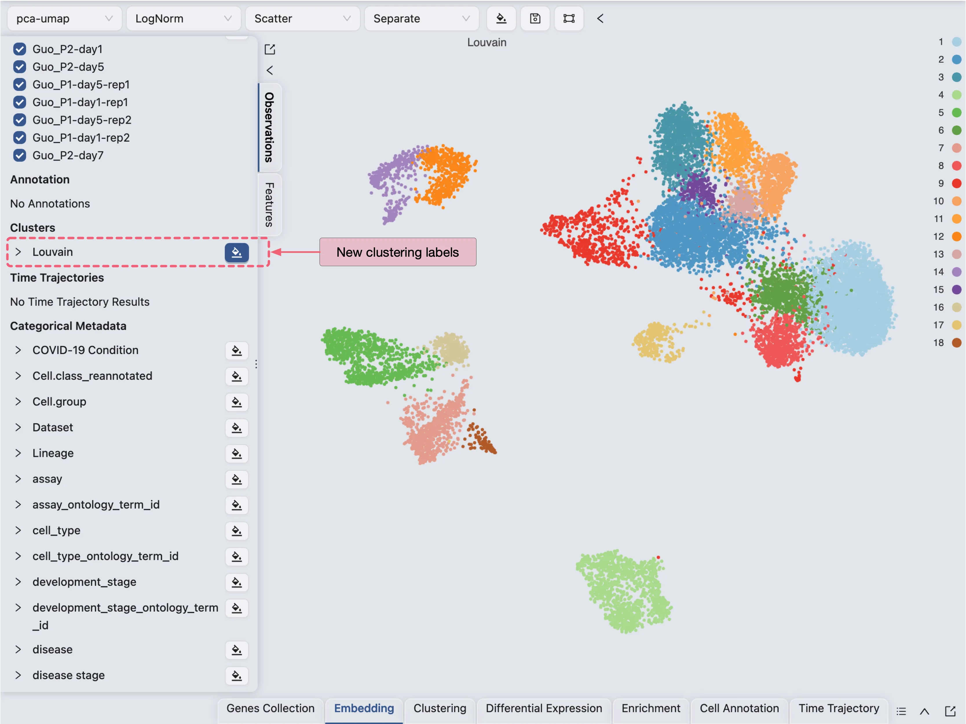
To learn more about clustering, visit Clustering Analysis.
Perform Sub-Clustering
CytoAnalyst allows you to perform sub-clustering on any cluster in the clustering results. You can perform sub-clustering on multiple clusters at once.
To perform sub-clustering, you need to:
Create a new embedding for each cluster you want to sub-cluster.
Perform clustering on the new embeddings.
It is not recommended to perform sub-clustering on the global embedding as it may not capture the local structure of the clusters. To learn more about embedding, visit Embedding.
For demonstration purposes, we will perform sub-clustering on one of the clusters. Here we will perform sub-clustering on the Cluster 4 using the KMeans algorithm with the number of clusters set to 2.
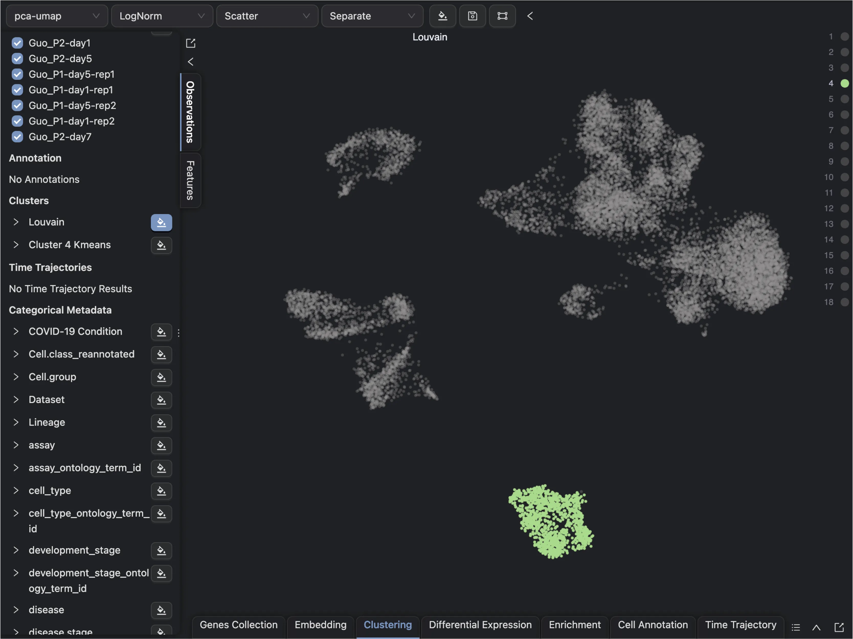
Follow these steps to create a new embedding for Cluster 4:
First, create a new embedding for
Cluster 4using theEmbeddingtab in the Bottom Drawer.Click on the
New Embeddingbutton and enter a name for the embedding.Next, filter the data points for
Cluster 4using Clustering Filters in the Cell Filtering panel.Leave the default settings for the embedding method and parameters.
Finally, click
Createto create the new embedding.
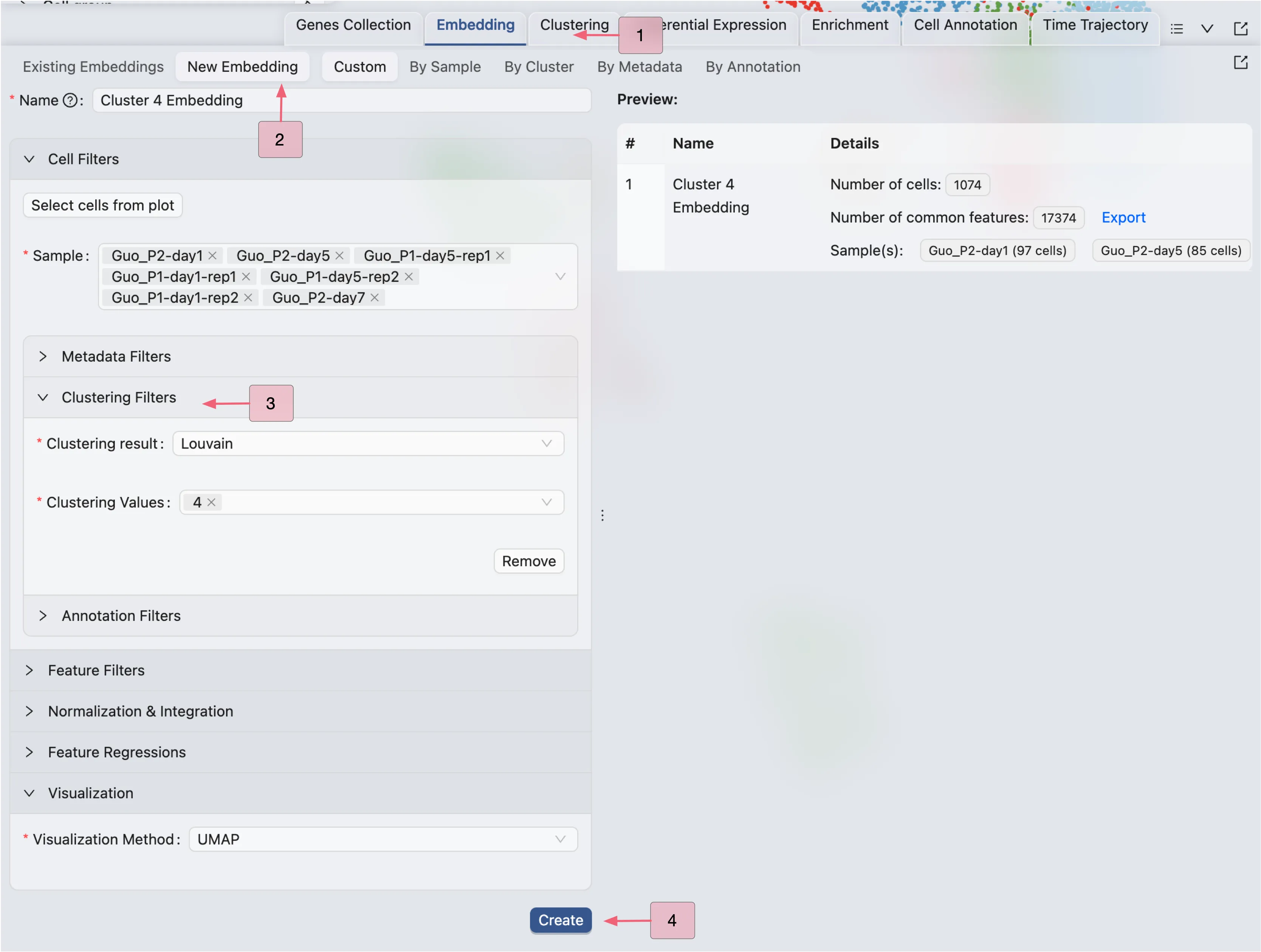
CytoAnalyst will create a job to create the new embedding. Once the job is completed, the new embedding will be added to the Embedding Table. This embedding can also be used for visualization in the Top Toolbar.
Next, follow these steps to perform sub-clustering on Cluster 4:
Click on the
Clusteringtab in the Bottom Drawer.Click on the
New Clusteringbutton.Select the new embedding for
Cluster 4in the Embedding dropdown.Enter a name for the clustering analysis.
Choose the
KMeansalgorithm and set the number of clusters to2.Click
Createto start the sub-clustering analysis.

Once the job is completed, the sub-clustering results will be added to the Clustering Table, and ready for visualization in the Left Sidebar.
Visualize Clustering Results
You can visualize the clustering results as any other label in the Left Sidebar. In this example, we will learn how to aggregate the clustering and sub-clustering results in a single plot.
First, change the Blending mode to Separate in the Top Toolbar so that each cluster is visualized separately. Next, select the clustering and sub-clustering results in the Left Sidebar to visualize them.
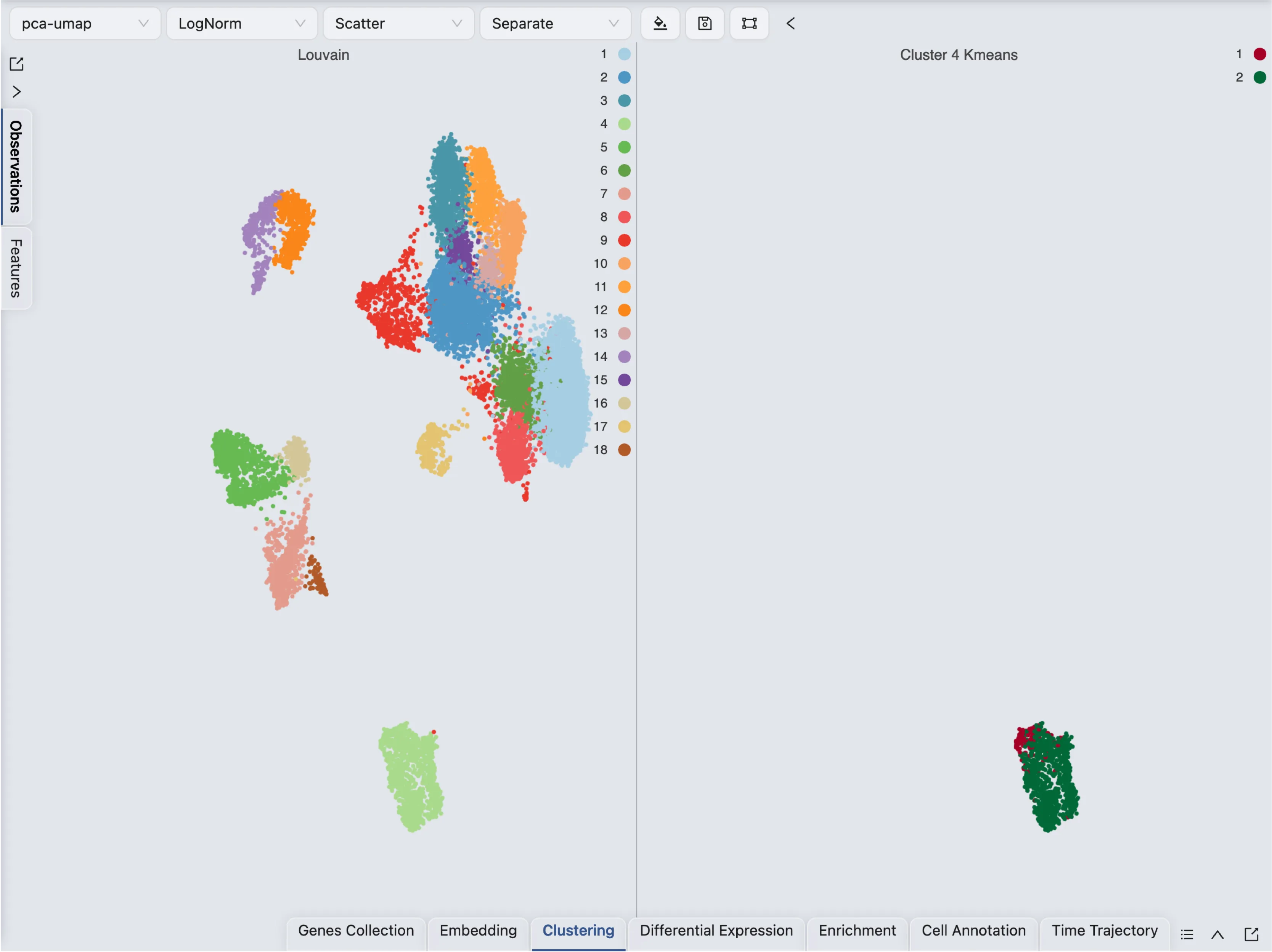
This visualization shows the clustering and sub-clustering results side by side. In CytoAnalyst, you can aggregate multiple labels in a single plot by using the Blending mode.
Follow these steps to visualize the clustering and sub-clustering results in a single plot:
Click on the
 icon on the top toolbar to open the visualization settings.
On the table shown in the settings, navigate to the Blending column.
Select Aggregate as the blending mode for the sub-clustering result.
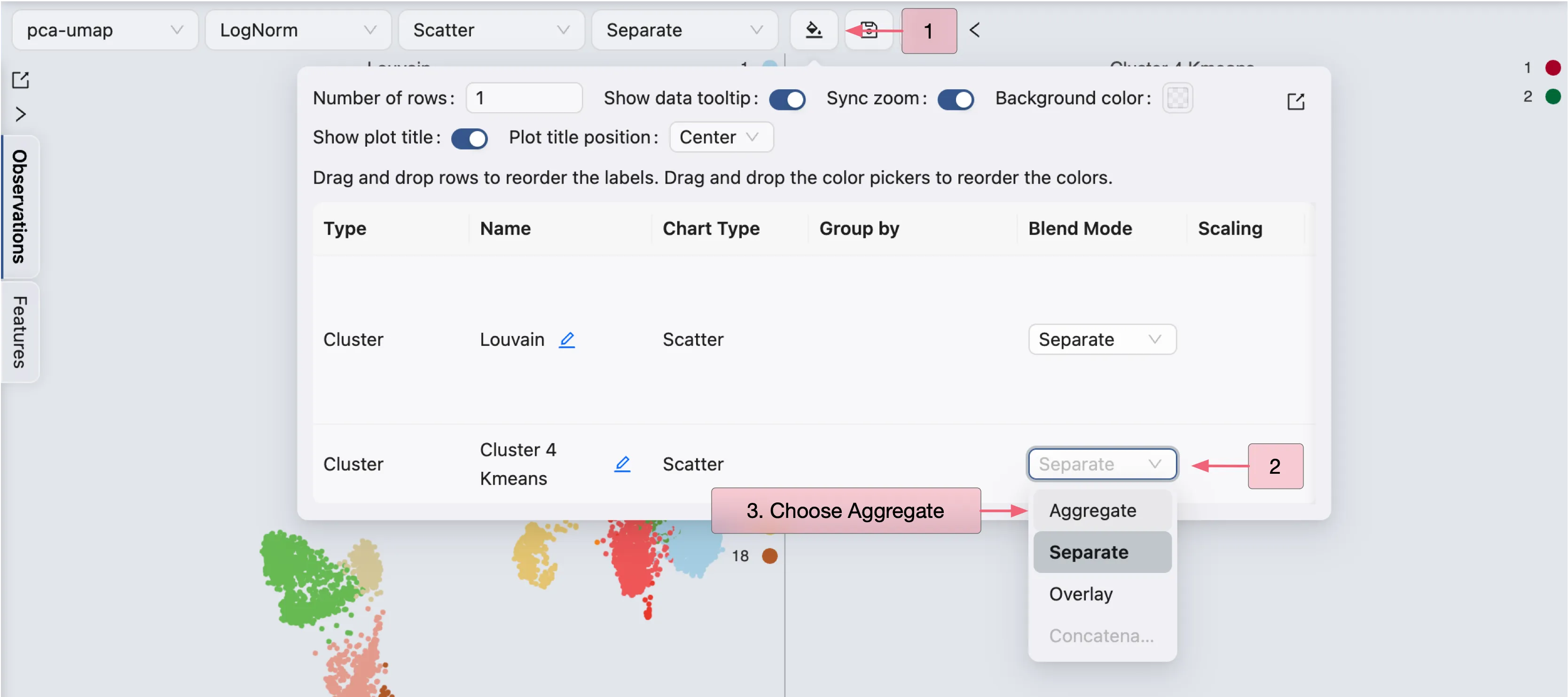
The clustering and sub-clustering results will be aggregated in a single plot.
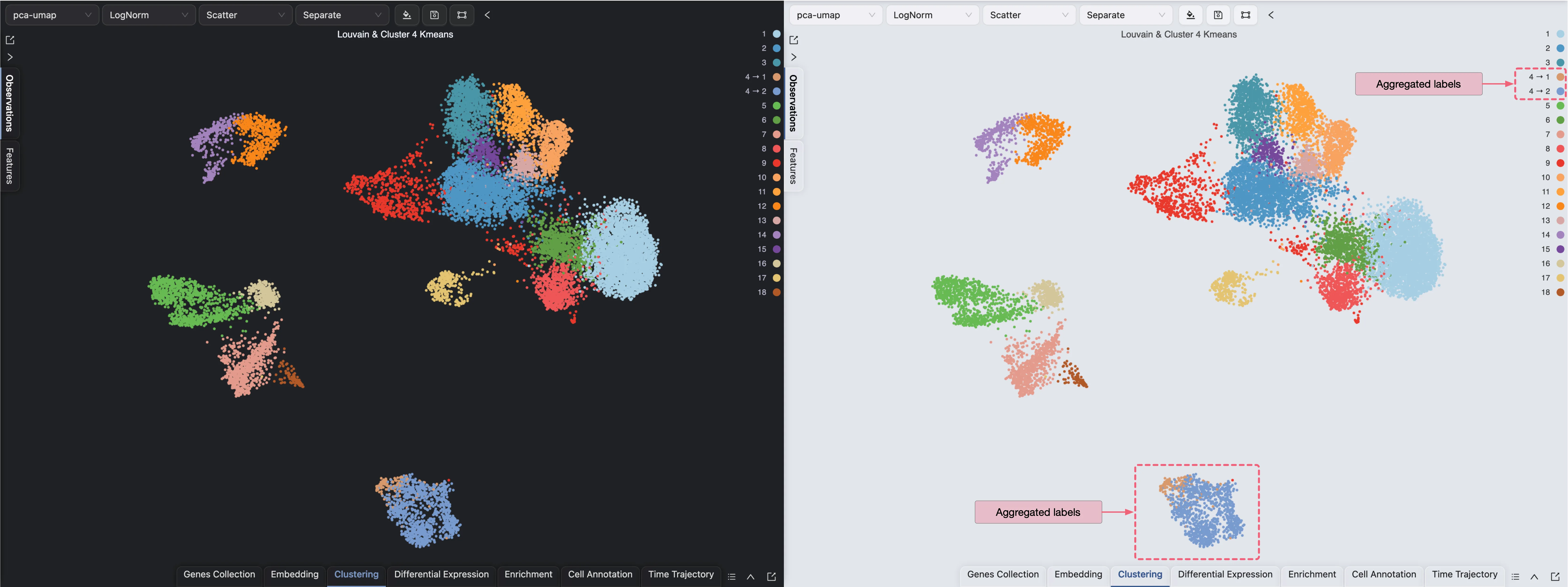
Please visit Data Visualization for more details on visualizing data in CytoAnalyst.
Perform Cell Type Enrichment Analysis
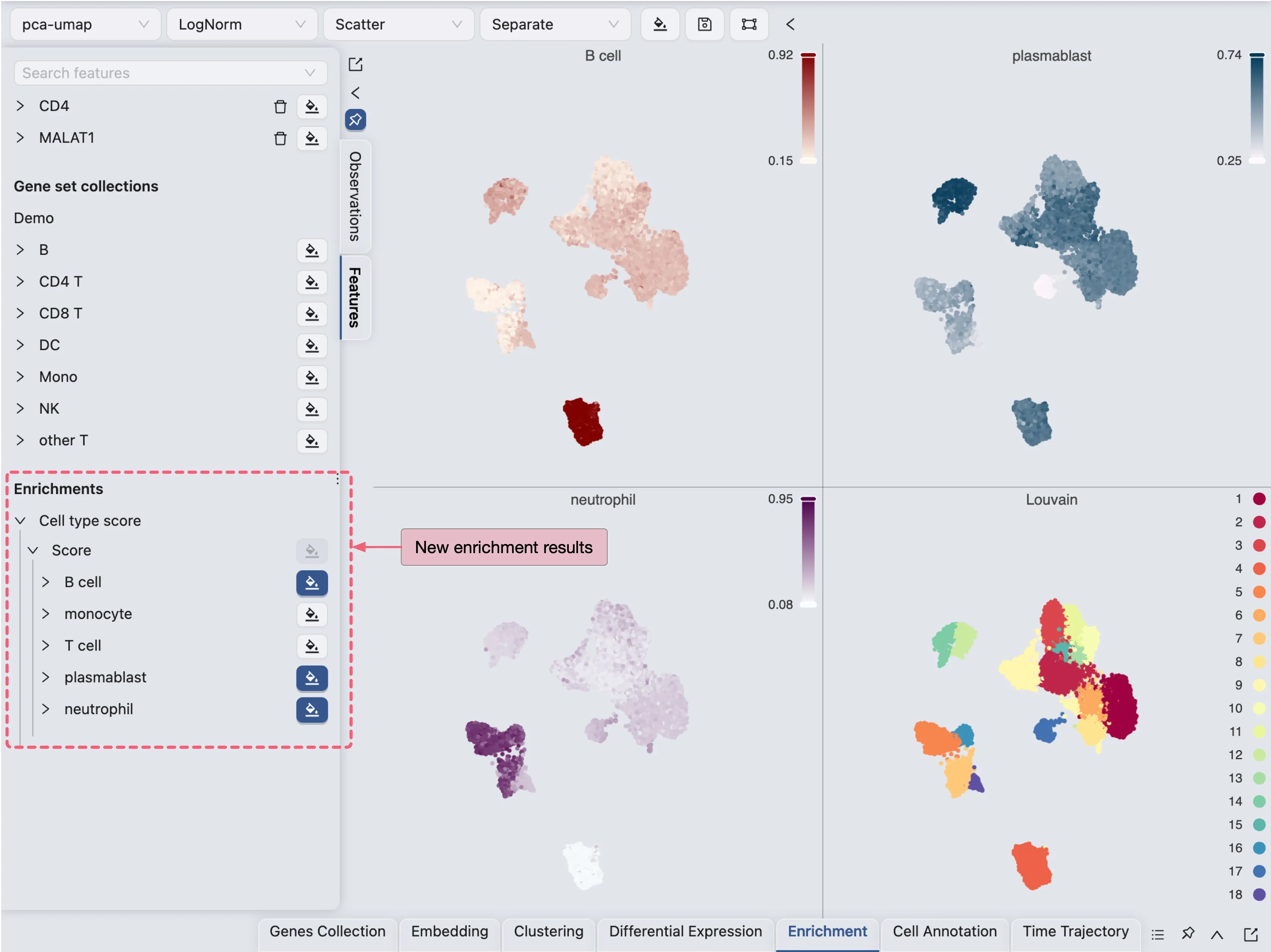
CytoAnalyst provides multiple tools for enriching cells to help with cell annotation. You can enrich cells using genes from gene set collections, differentially expressed genes, or using pretrained models to calculate cell type scores.
In this example, we will score cells using a pretrained model provided in CytoAnalyst for some certain cell types.
To perform cell enrichment analysis using a pretrained model, follow these steps:
Click on the
Enrichmenttab in the Bottom Drawer.Click on the
New Enrichmentbutton.Choose the
Using Cell Type Scoringbutton.Fill in the required fields, such as the name of the enrichment analysis, organism, and cell types.
Click
Submitto start the enrichment analysis.
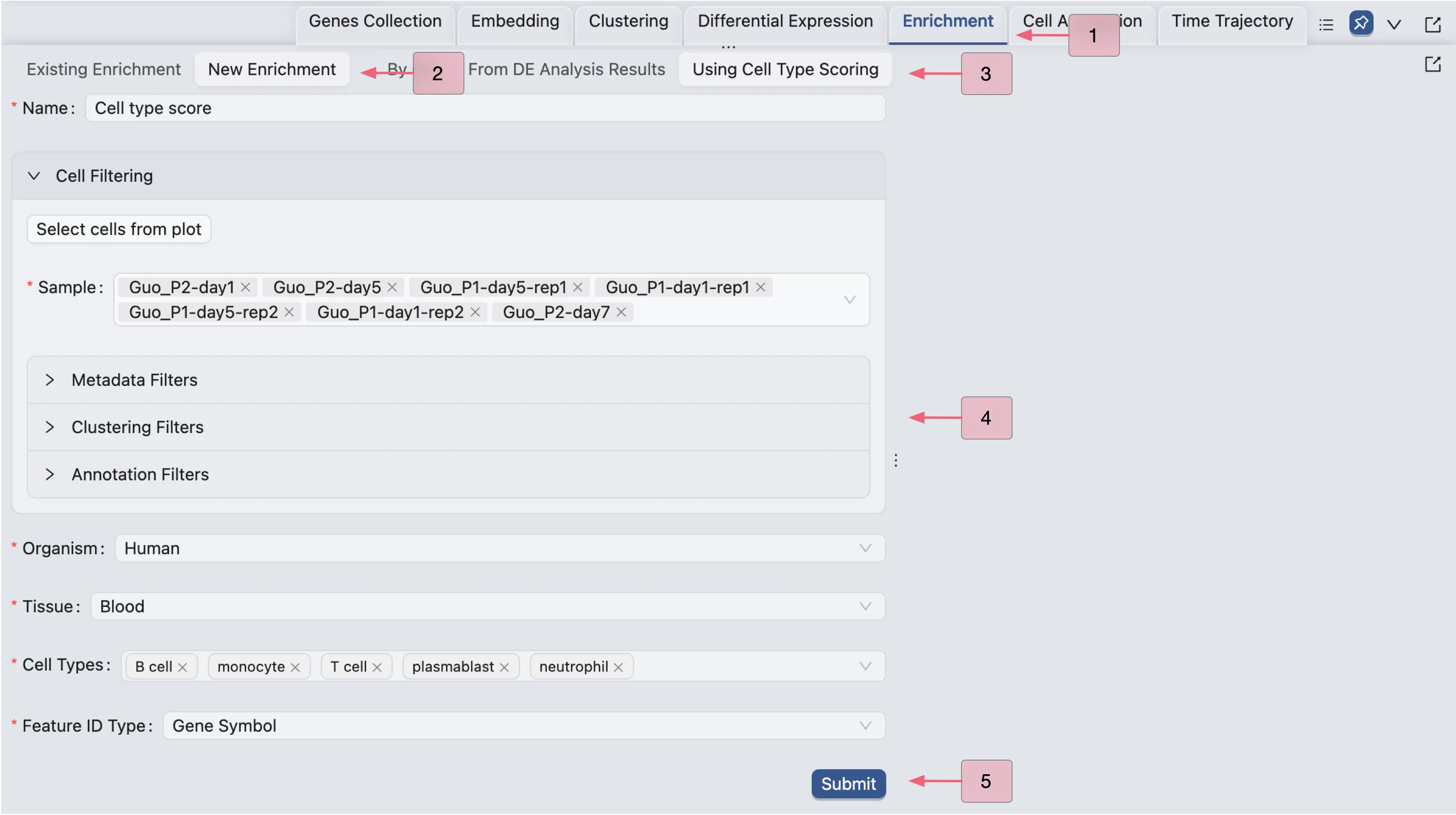
Once the job is completed, the cell type enrichment results will be added to the Enrichment Table and ready for visualization in the Left Sidebar.
Annotate Clusters
Create Annotation Label
In CytoAnalyst, metadata, clusters, and other analysis results are immutable and cannot be directly modified. Instead, you need to create an Annotation Label and make changes to this label.
To create a new Annotation Label, follow these steps:
Click on the
Cell Annotationtab in the Bottom Drawer.Click on the
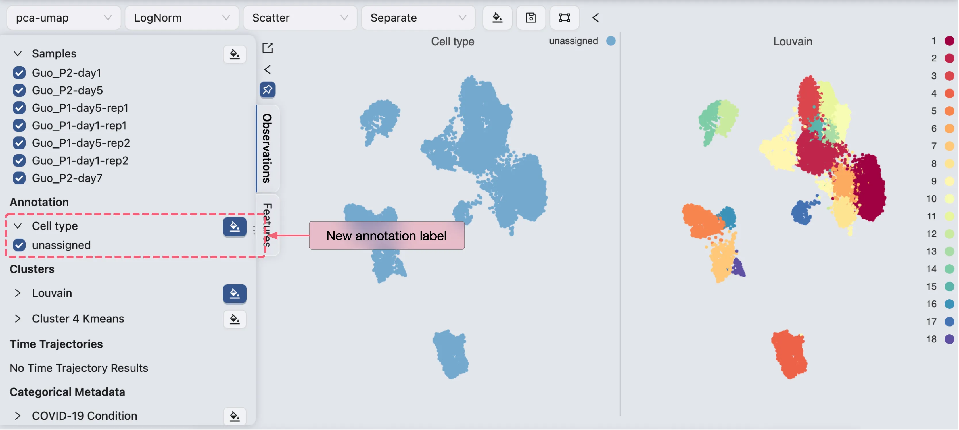
New Annotationbutton.Enter a name and default value for the annotation label.

CytoAnalyst allows you to copy values from existing labels to the new annotation label, as well as create annotation by aggregating enrichment results. Check out Cell Annotation for more details. In this tutorial, we will create a new annotation label with all values set to unassigned, and then manually annotate cells.
Once the annotation label is created, you can start visualizing the annotation label in the Left Sidebar.
Annotate Cells
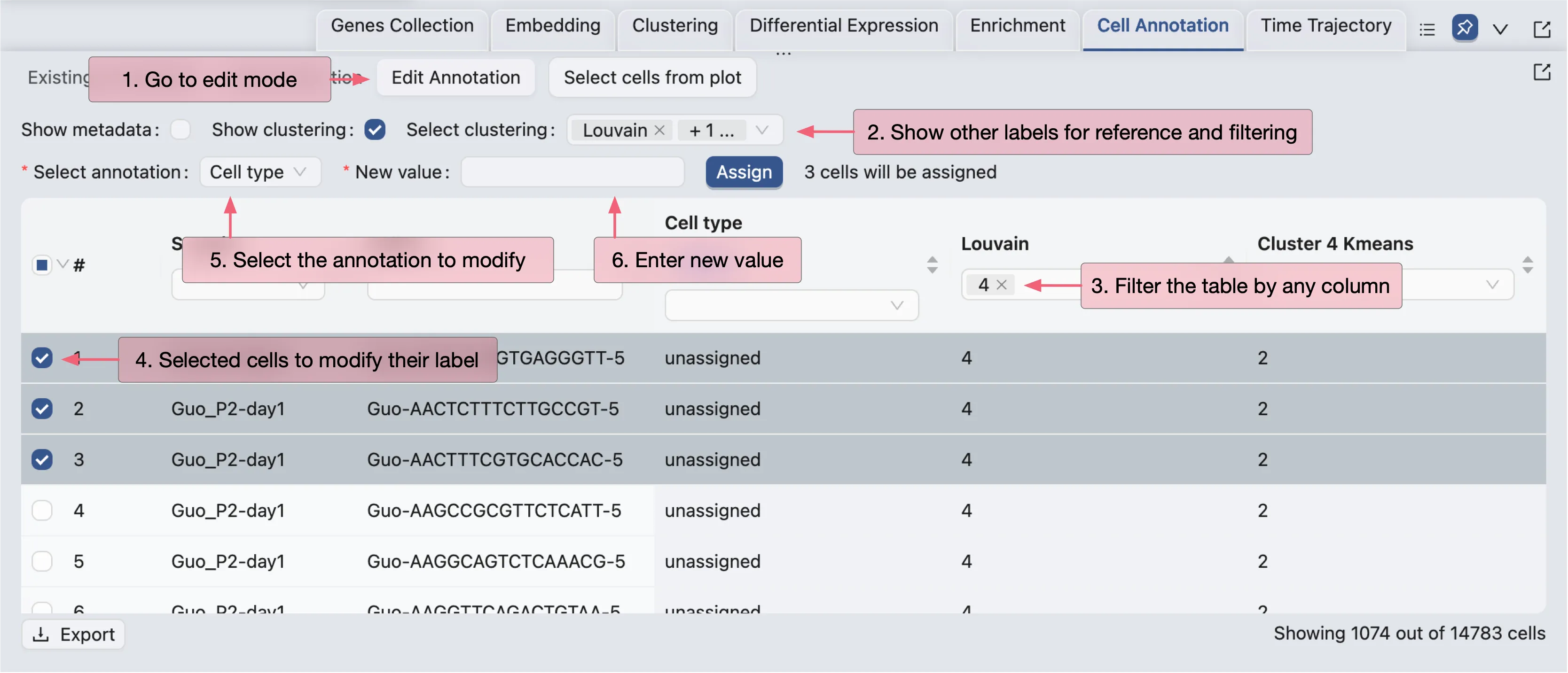
To annotate cells, click on the Edit Annotation button in the Cell Annotation panel. In the annotation editor, you can:
View the annotation label and values
Add other labels (metadata, clustering, etc.) to the annotation editor for reference and filtering
Edit the annotation values for selected cells
In this tutorial, we will only annotate a few clusters for demonstration purposes. First, we will arrange the visualization to show the annotation label, the clustering results, and some the enrichment results side by side.
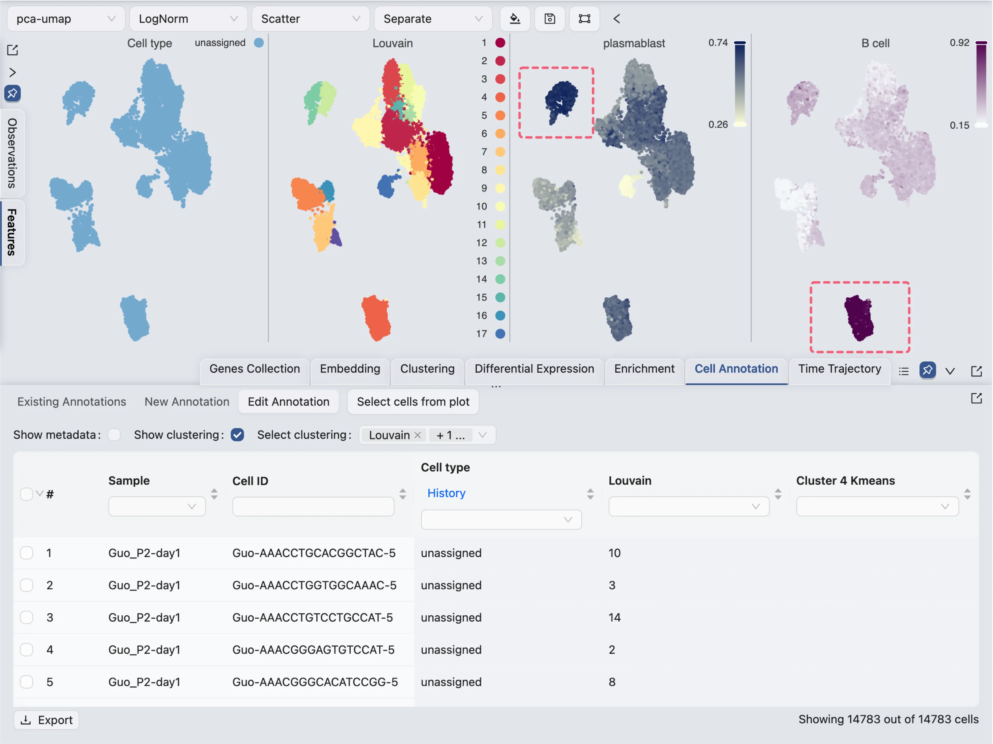
Here we visualize 4 labels side by side:
Cell type: The newly created annotation label
Louvain: The clustering results using the Louvain algorithm
plastmablast: The enrichment results for plasma blasts
B cells: The enrichment results for B cells
From the score of the enrichment results for plastmablast and B cells, we can infer that:
Cluster
12and14are likely to be plasmablastsCluster
4is likely to be B cells
For cluster 12 and 14, we will use the filtering tool to select the cells and annotate them as plasmablasts.

For cluster 4, we will select cells from the visualization and annotate them as B cells.
First, click on the
Select cells from plotbutton in the Cell Annotation panel.Next, click and drag on the plot to select the cells.
Finally, select cells in the table and annotate them as
B cells.
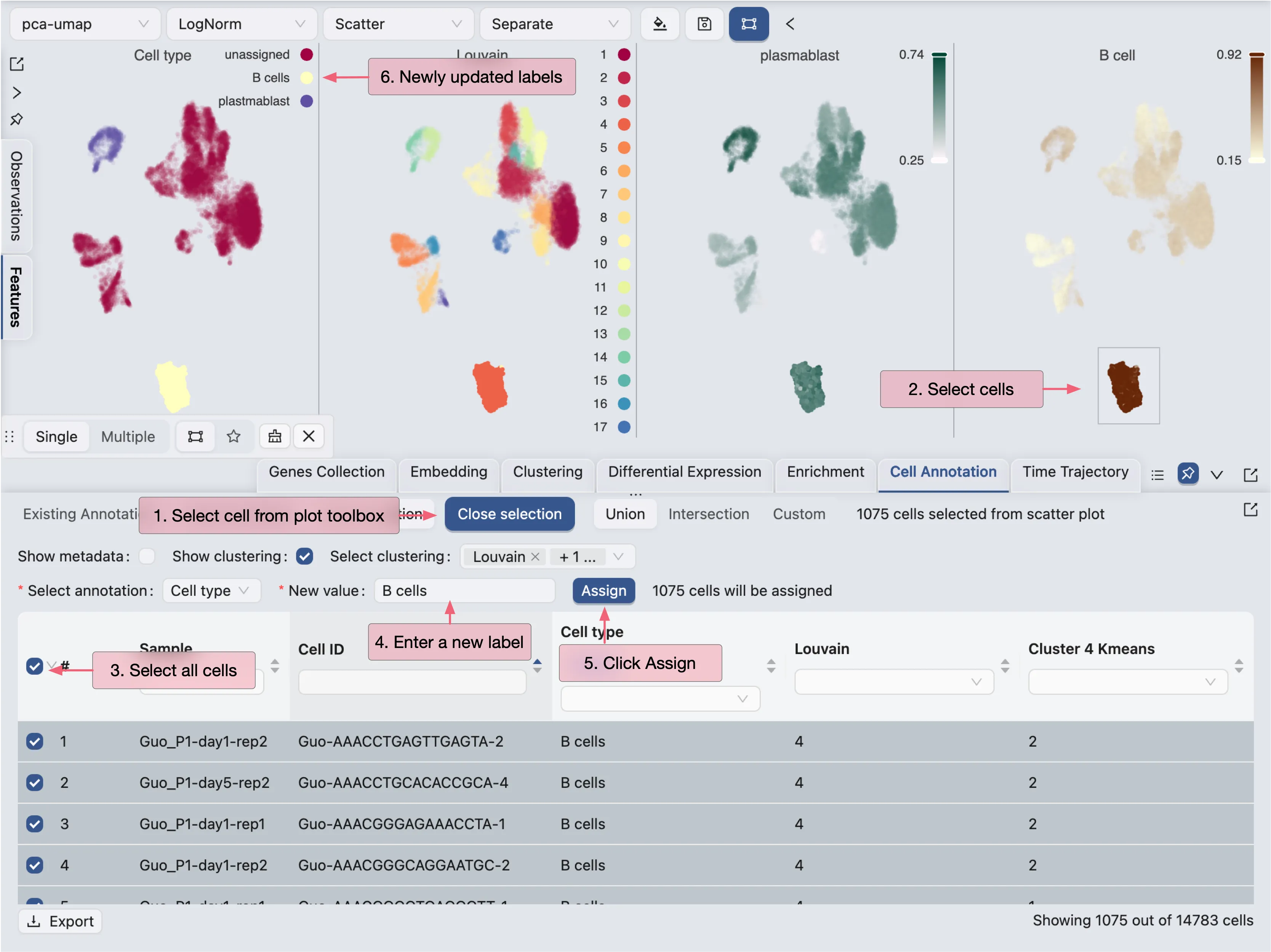
To annotate other clusters and sub-clusters, repeat the same process.
Run Differential Expression Analysis
To run differential expression (DE) analysis, click on the Differential Expression tab in the Bottom Drawer. CytoAnalyst allows you to create DE analysis between any subset of cells. You can also quickly generate DE results between clusters, conditions, or any other labels. To learn more about DE analysis, visit Differential Expression Analysis.
Compare Between Clusters
To compare gene expression between clusters, follow these steps:
Click on the
New Differential Analysisbutton.Choose the
By Clusteroption.Enter a name for the DE analysis. Here
{cluster}will be replaced by the cluster name.Select the comparison mode as
With othersChoose the clustering results
Choose the cluster you want to compare with others
Click
Submitto start the DE analysis.
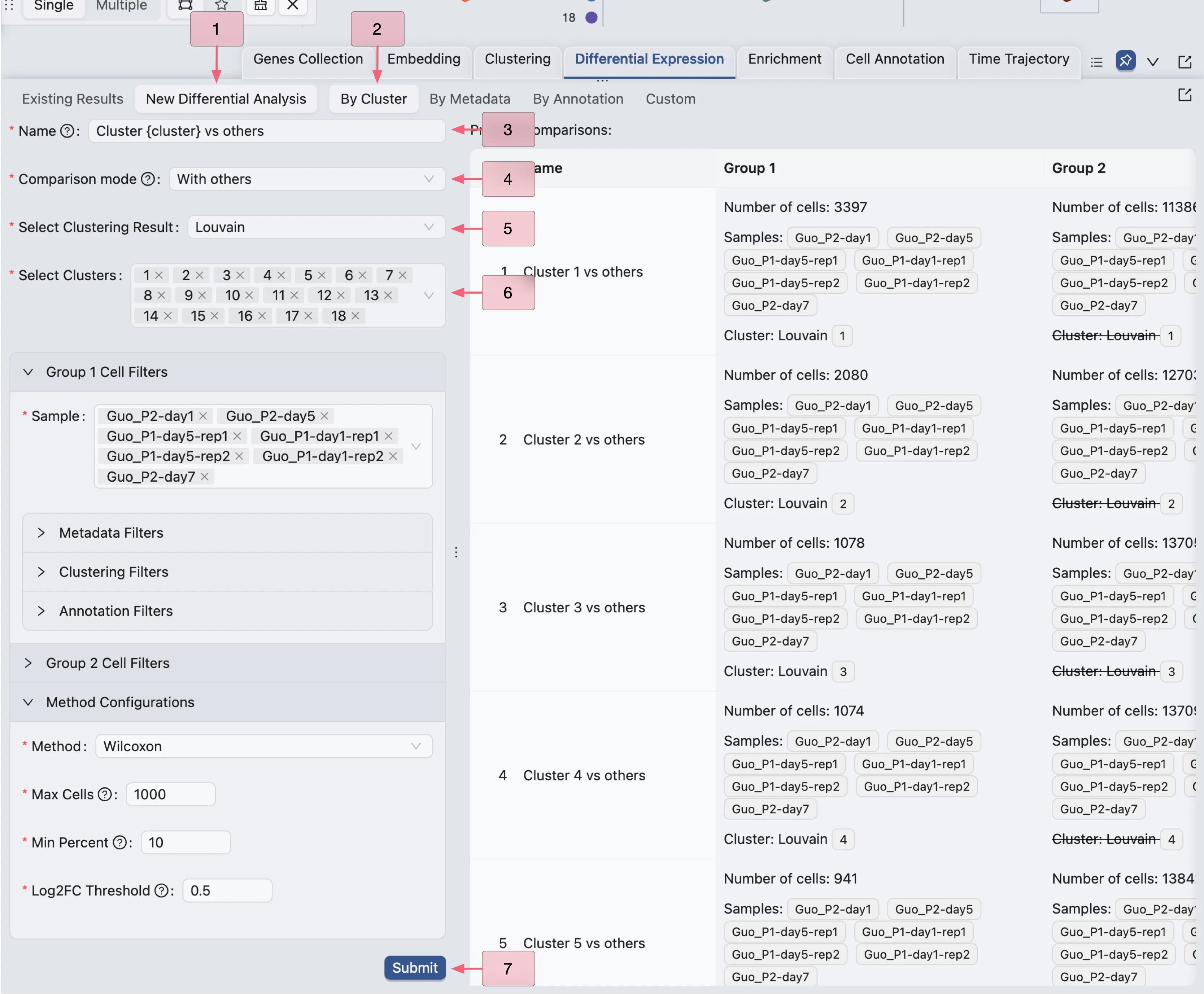
In this example, we are creating 18 DE analyses for each cluster against all other clusters.
Compare Between Conditions
In the following example, we will compare gene expression between two conditions: Remission and Severe in the disease stage metadata. However, instead of comparing two big groups of cells, we will compare within the new annotation label we created.
To compare gene expression between conditions, follow these steps:
Click on the
By Annotationoption.Enter a name for the DE analysis. Here
{annotation}will be replaced by the annotation label name.Select
Withinas the comparison mode.Choose the annotation.
Choose the annotation value you want to compare.
Select
disease stageas the metadata field for filtering cell in Group 1Select
remissionas the value for Group 1Select
disease stageas the metadata field for filtering cell in Group 2Select
severeas the value for Group 2Click
Submitto start the DE analysis.
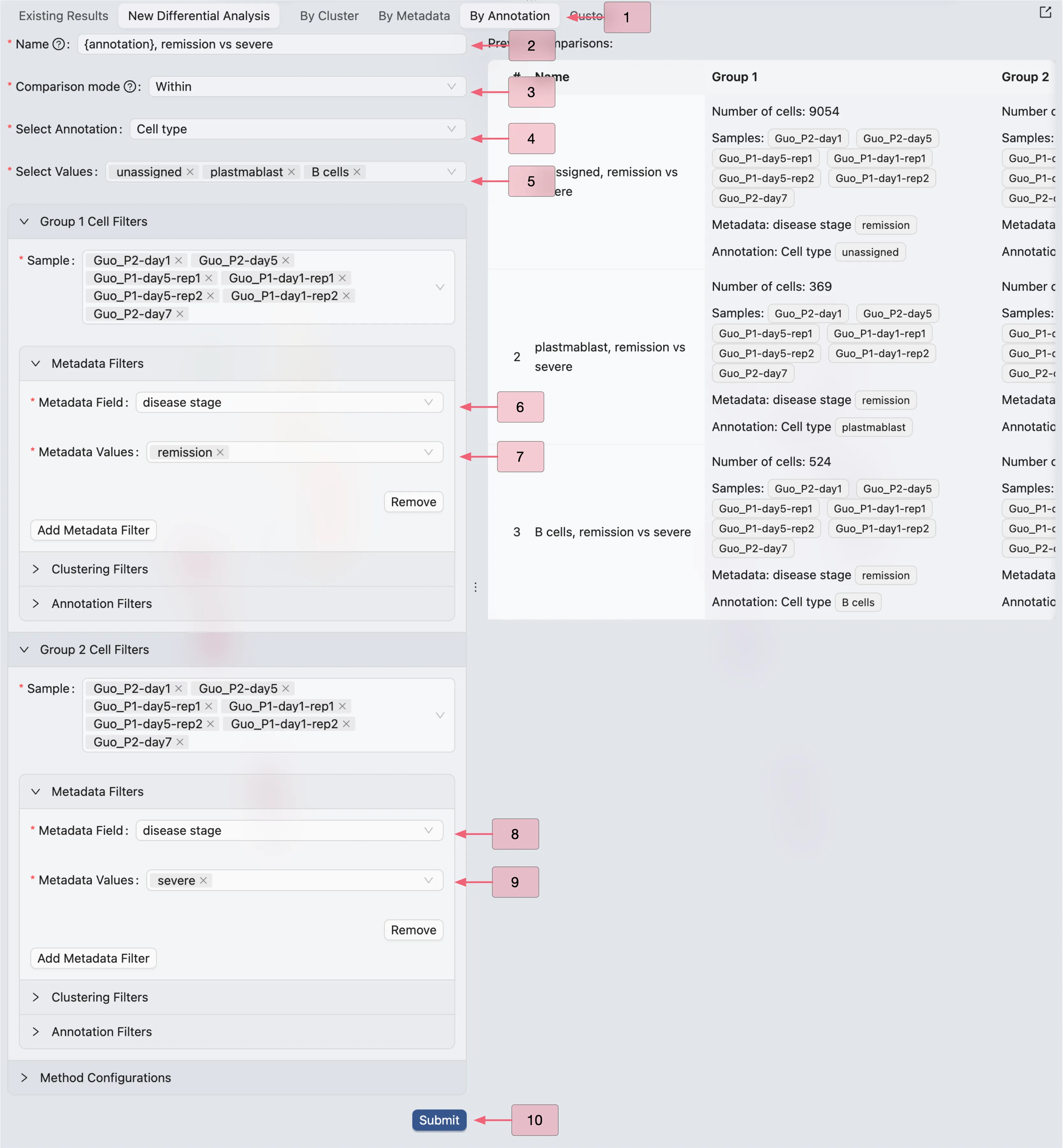
In this example, we are creating 3 DE analyses for the plasmablasts, B cells, and unassigned cells.
Browse and Visualize DE Results
Once the DE analysis is completed, the results will be added to the Differential Expression Table in the Existing Results tab.
CytoAnalyst allows you to view and visualize multiple DE results at once. To visualize the DE results, simply select the results you want to visualize in the table then click on the View selected button.
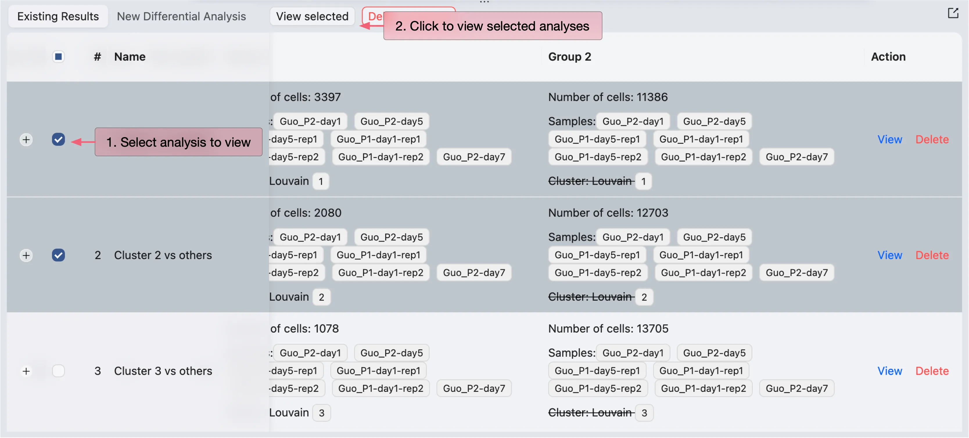
The DE results will be displayed in a separate window.
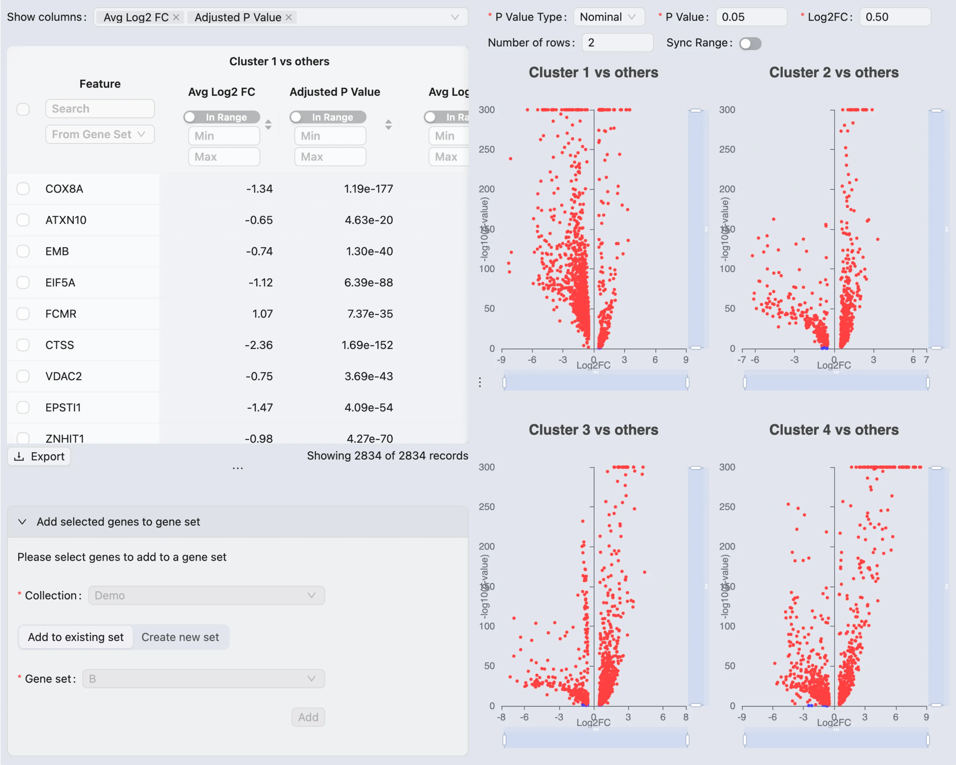
On this window, you can:
View all the statistics for the DE results and the volcano plots
Select and add genes to the gene set collection based on the DE results