Data Visualization
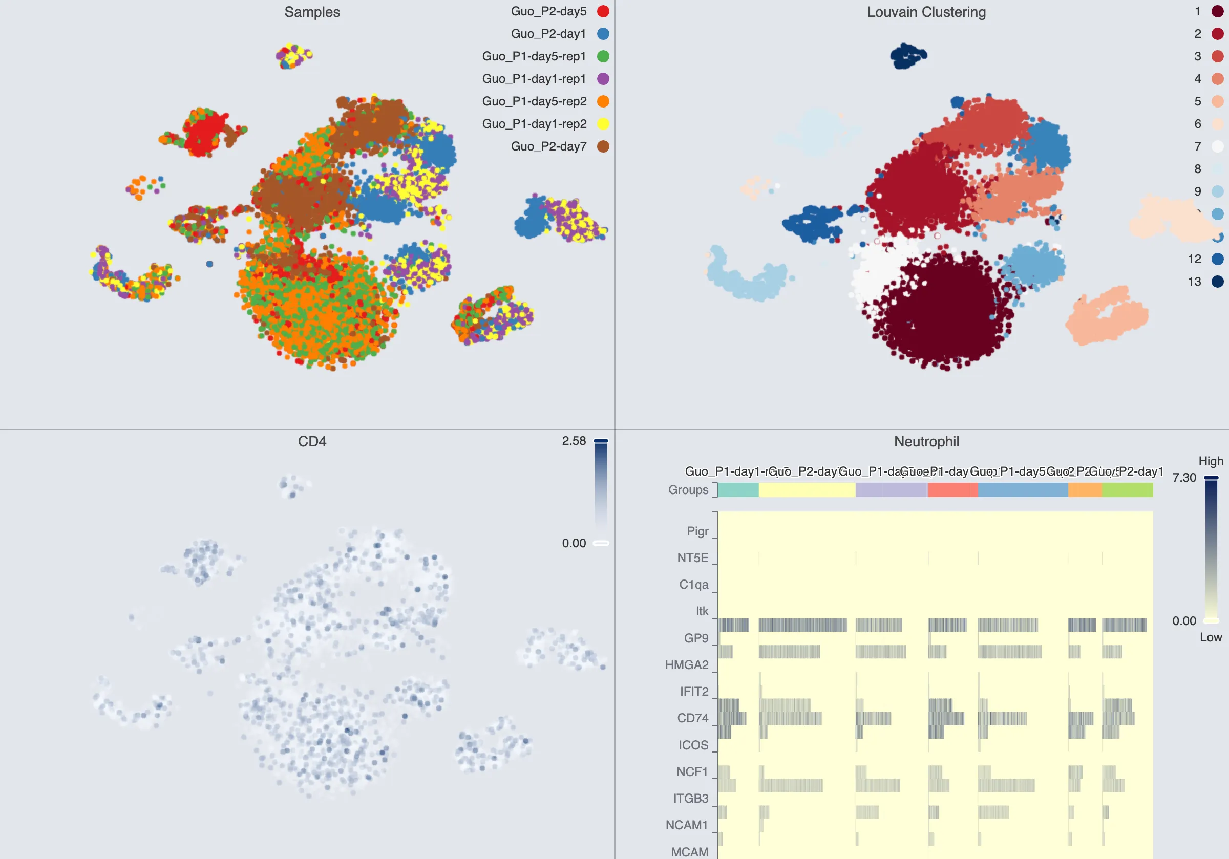
CytoAnalyst provides a variety of data visualization tools to help you explore and analyze your data. The visualization tools are flexible and interactive, allowing you to customize the visualization to suit your needs.
CytoAnalyst's standout features include:
Multiple chart types, including scatter plots, heatmaps, dot plots, and violin plots.
Multi-grid visualization which can display multiple plots at once.
Customizable color mapping, title, and labels.
Multiple blending modes
Blending modes are used to combine the colors of overlapping objects in a visualization. This can be useful when visualizing multiple groups or clusters in the data.
Using blending, you can combine different labels (categories and continuous values alike) in a single visualization.
For more information on blending modes, see Blend Mode.
Workflow
Top Visualization Toolbar
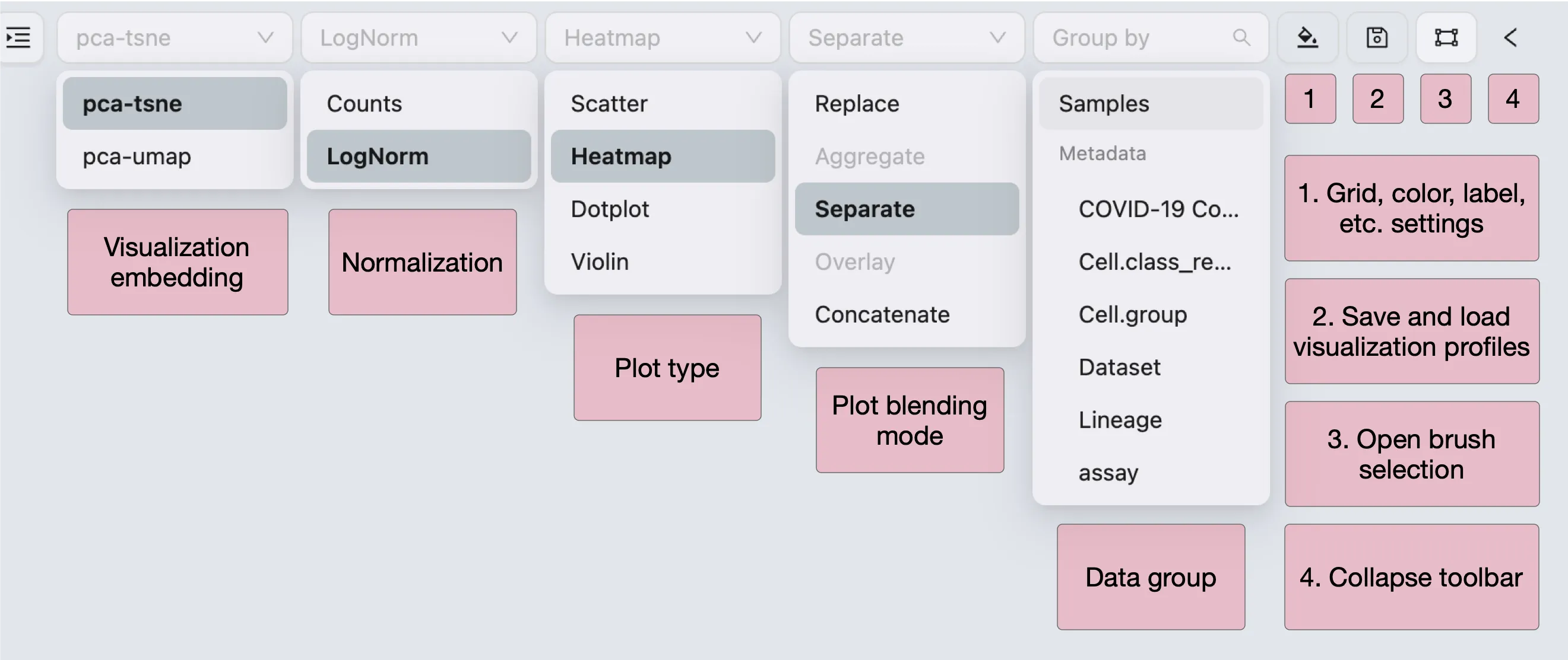
The top toolbar contains the following tools:
Embedding Selection: Select the embedding to visualize.
Normalization: Select the normalization method for the data.
Plot Type: Select the type of chart to display.
Blend Mode: Select the blending mode for the visualization. For more information, see Blend Mode.
Data grouping: Select the grouping for heatmap, dot plot, and violin plot. You can select multiple groupings, and they will be combined in the visualization.
Visualization Settings: Customize the visualization layout, labels, color mapping, and more. See Visualization Settings.
Save Visualization State: Save the current visualization settings for later use. See Save and Load Visualization State.
Open brush selection: Enable brush selection for the visualization.
Collapse/Expand Visualization Toolbar: Collapse or expand the visualization toolbar to maximize the screen space.
Label Selection
In the label selection panel, you can select the labels to be displayed on the visualization. The labels can be categorical or continuous. The selected labels will be used to color the data points in the visualization.
Observation
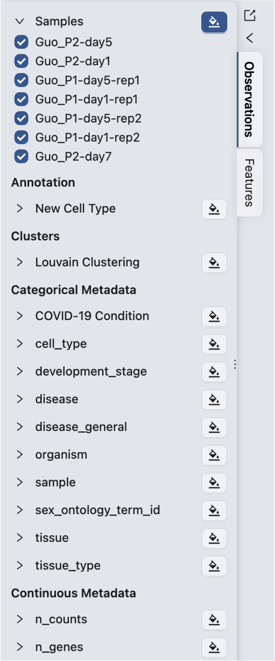
Observations are the data points in the visualization. Each observation represents a cell in a sample. There are 5 main types of observation labels:
Samples: The samples in the study.
Annotations: The annotation manually added to the samples using the
Annotationtool in CytoAnalyst.Clusters: The clusters generated by the clustering algorithm.
Categorical Metadata: The categorical metadata associated with the samples.
Continuous Metadata: The continuous metadata associated with the samples.
To select a label, click on the ![]() button next to the name of the label. To unselect a label, simply click on the same button again.
button next to the name of the label. To unselect a label, simply click on the same button again.
To expand and collapse the values of a label, click on the arrow > button next to the label name.
Observation Value Selection
By default, all values of a label are selected. If a value is deselected, the data points with that value will not be displayed in the visualization.
You can combine the value selection of any group of labels to filter the data points based on multiple labels. For example, as in the following image, the data points are filtered based on the
disease stateandtime pointlabels. Note that you do not need to visualize the label for the selection to take effect.

Feature
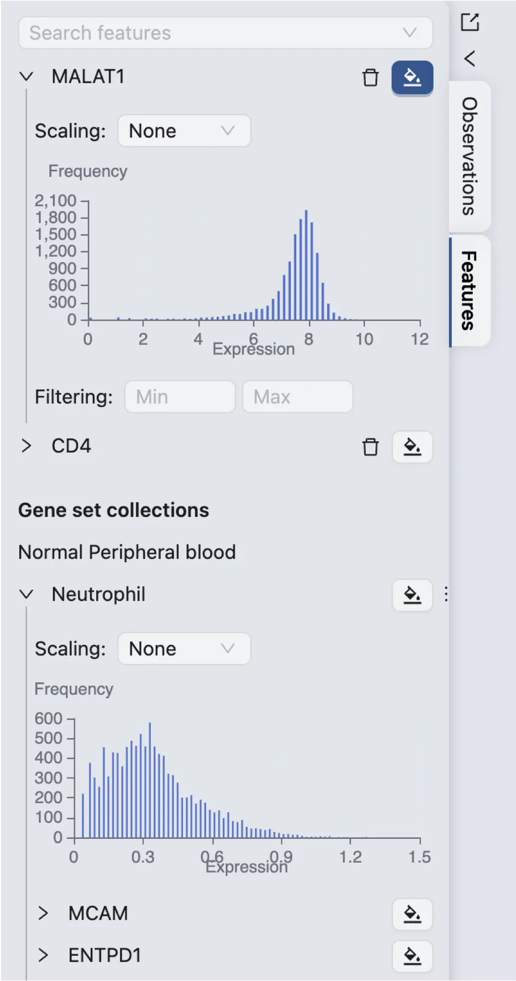
Features are the variables in the visualization. Each feature represents a gene or protein expression level. There are 2 main types of feature labels:
Individual features: Individual genes or proteins selected from the data.
Gene Sets: Predefined gene sets uploaded to the study or selected from CytoAnalyst's database.
A Histogram accompanies each feature label to show the distribution of the feature values. If the feature is a gene set, the histogram will show the distribution of the aggregated (i.e., average) expression values of the genes in the set.
To select a feature, click on the ![]() button next to the name of the label. To unselect a feature, simply click on the same button again.
button next to the name of the label. To unselect a feature, simply click on the same button again.
Feature Expression Filtering
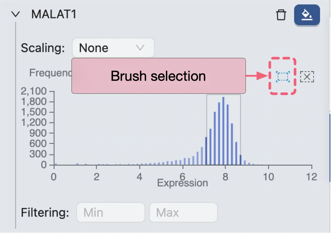
Under the histogram, you can filter the feature expression values by providing the minimum and maximum values.
You can also use the brush selection tool to select a range of values in the histogram. The data points with expression values within the selected range will be displayed in the visualization.
Visualization Settings

The visualization in CytoAnalyst is capable of displaying multiple plots at once.
These plots can be arranged in a grid layout, allowing you to compare different visualizations side by side.
Each visualization plot can be customized with different settings, such as color mapping, title, and labels.
The grid layout can also be adjusted to display the plots in different configurations.
To open the visualization settings, click on the ![]() button in the top toolbar.
button in the top toolbar.
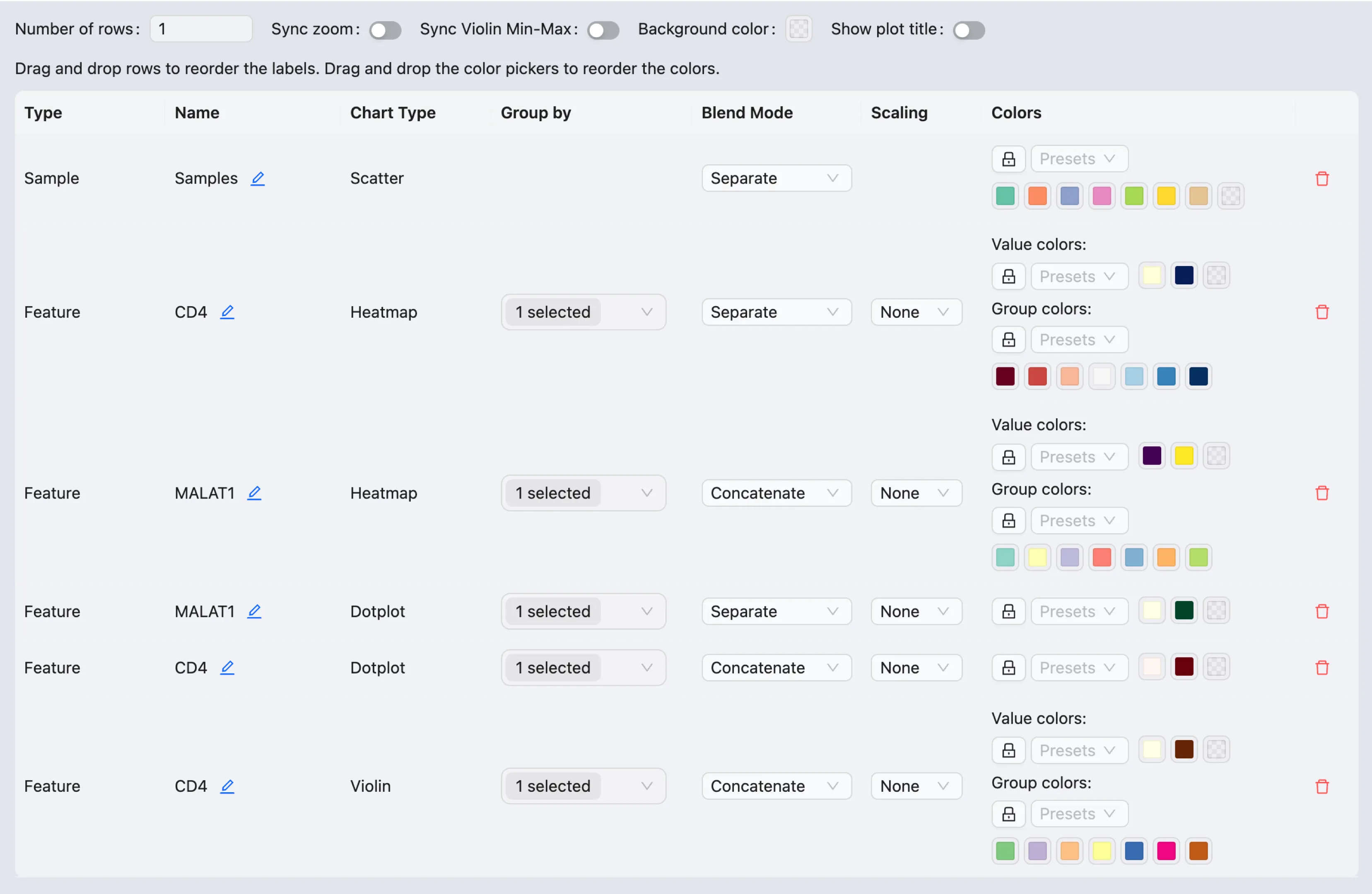
The general settings available in the visualization settings include:
Number of rows: Set the number of rows in the grid layout.
Sync zoom: Enable or disable the synchronization of zooming across plots in the grid. When this option is enabled, zooming in one scatter plot will zoom in all scatter plots in the grid. Similarly, zooming in one heatmap or violin plot will zoom in all heatmaps or violin plots in the grid.
Sync Violin Min-Max: Synchronize the minimum and maximum values of the violin plots in the grid.
Background color: Set the background color of the visualization grid.
Show plot title: Show or hide the title of each plot in the grid. There are 3 options for the position of the title:
left,center, andright.
In the visualization settings table, you can customize the settings for each plot in the grid. The settings include:
Drag and drop the plots to rearrange them in the grid.
The table contains the following columns:
Type: The type of plot, the values are:
Sample: Plot showing the samples in the study.Cluster: Plot showing the clusters generated by the clustering algorithm.Annotation: Plot showing the annotations manually added to the samples.Categorical Metadata: Plot showing the categorical metadata associated with the samples.Continuous Metadata: Plot showing the continuous metadata associated with the samples.Feature: Plot showing the expression of an individual gene or protein.Gene Set: Plot showing the aggregated expression of a gene set.Enrichment *: Plot showing the enrichment results of a gene set.*indicates the statistic.
Name: The name/title of the plot.
You can edit the name by clicking on the
Editicon next to the name.
Chart Type: The type of chart used in the plot. The values are:
Scatter PlotHeatmapDot PlotViolin Plot
You cannot change the chart type in this table. To change the chart type, select the desired chart type in the top toolbar and re-add the plot to the grid by re-selecting the label.
Group By: The grouping used in the plot. This column is only available for
heatmap,dot plot, andviolin plot.Blend Mode: The blending mode used in the plot. The blend mode can be used to combine multiple plots into one visualization. See Blend Mode for details how to use blending modes.
Scaling: Scale the expression values in the plot.
Color: The color mapping used in the plot. Depending on the chart type, the color mapping can have two types:
Value: The color mapping is based on the expression values, e.g., the minimum and maximum expression values.Group: The color mapping is based on the groupings, e.g., the metadata, clusters, or annotations.
By default, a random colormap is used every time a new plot is added to the grid. To freeze a colormap, click on the
Lockicon next to the color mapping.
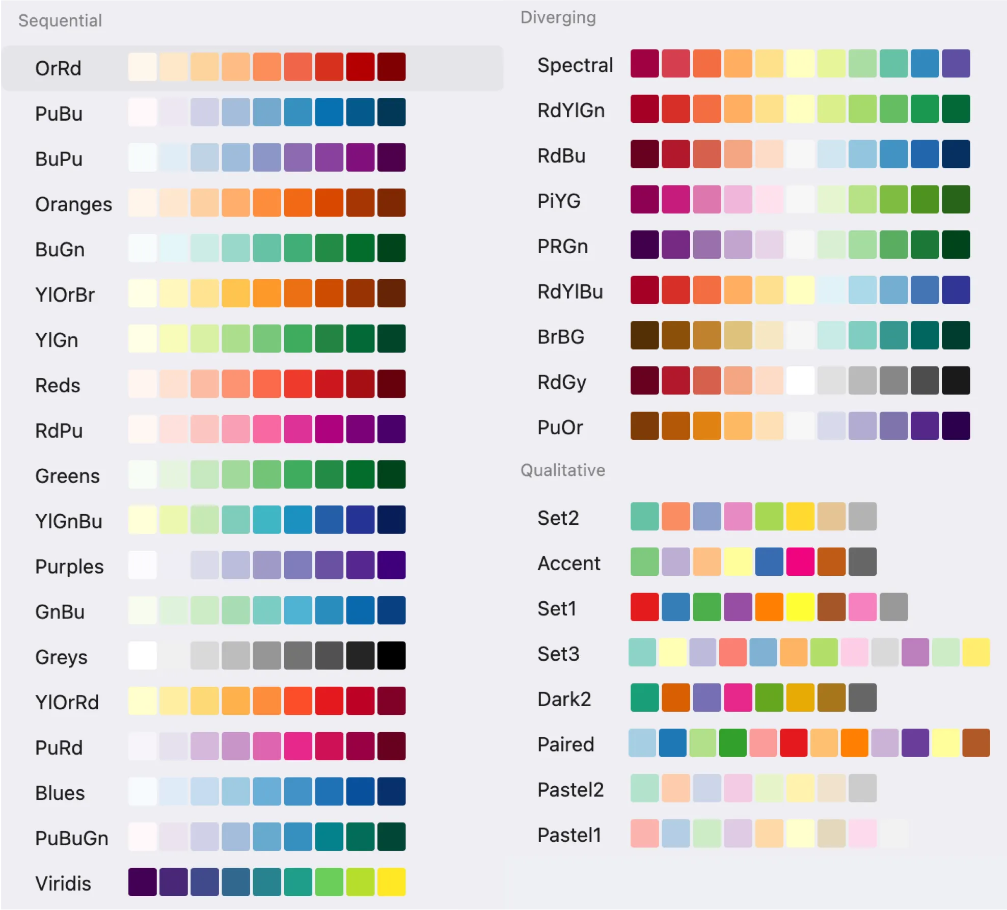
CytoAnalyst provides a variety of presets for the color mapping. You can select a preset from the dropdown
Presetsmenu.
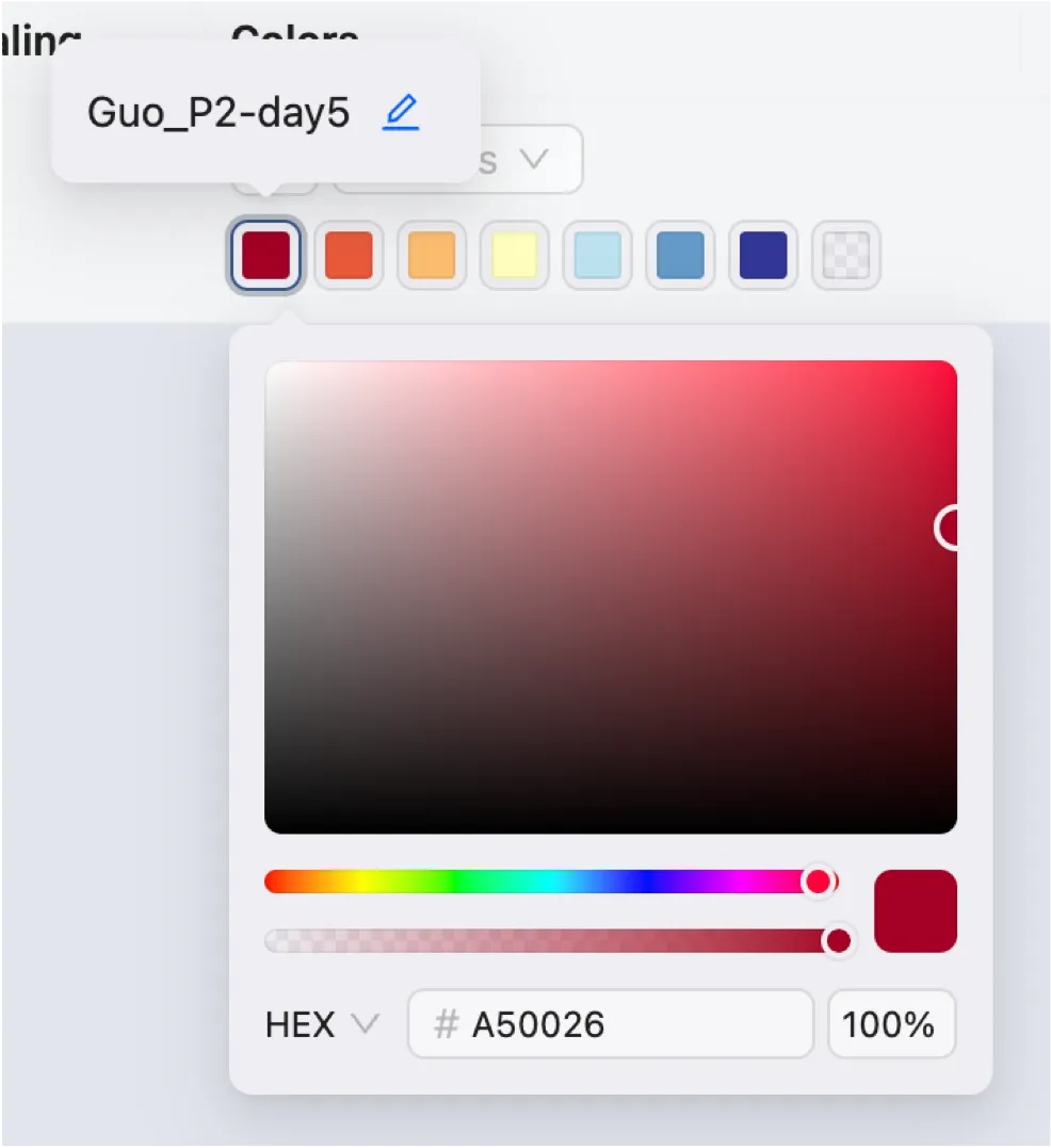
To edit a color, click on the corresponding color box and select a new color from the color picker.
To edit the label for a color, hover over the color box and click on the
Editicon
To arrange the order of the colors, drag and drop the color boxes.
Actions:
Click on the
Removeicon to remove the plot from the grid.
Save and Load Visualization State
To open the save and load visualization state dialog, click on the ![]() button in the top toolbar.
button in the top toolbar.
A dialog will appear with the following options:
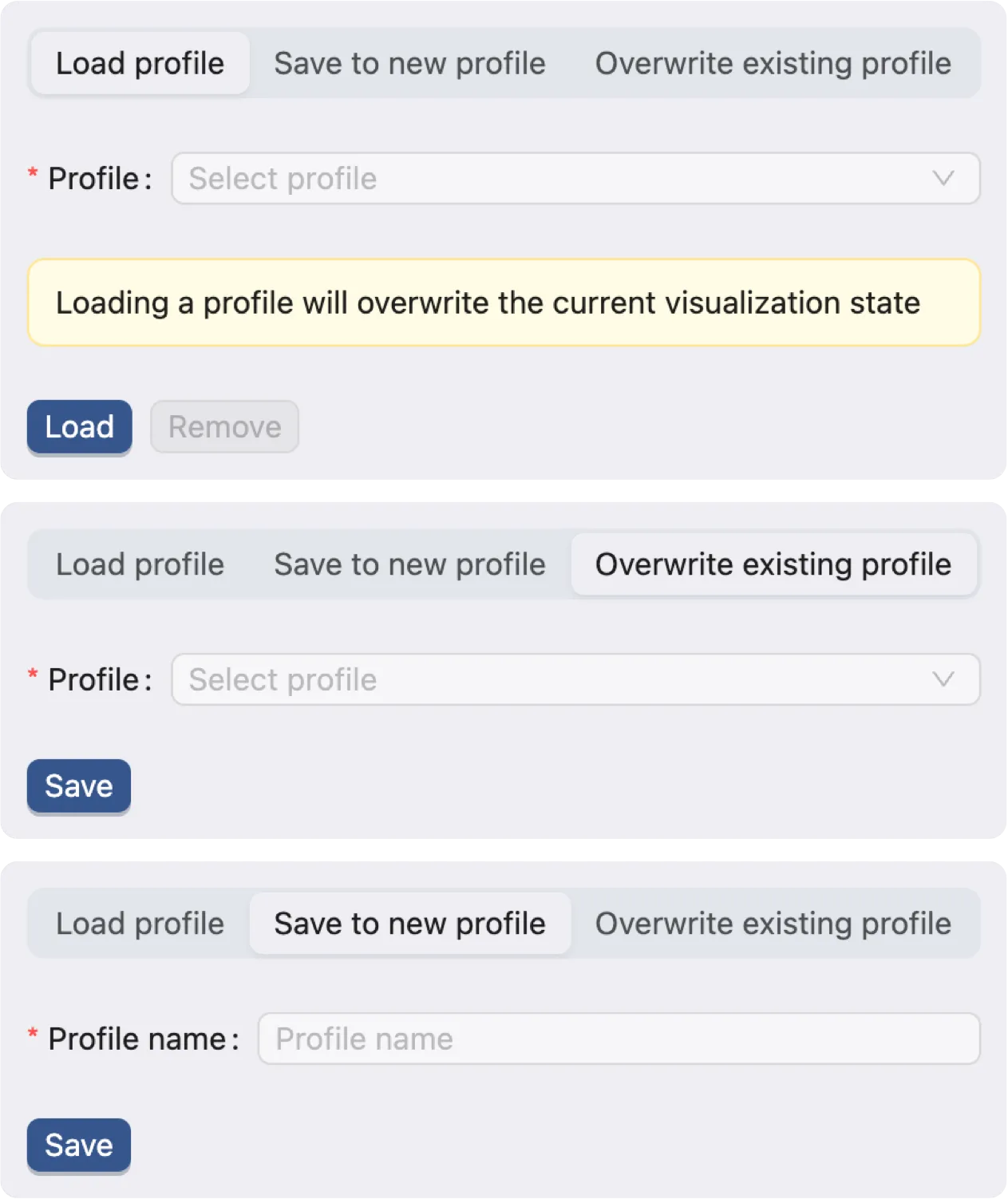
Load profile: Load a saved visualization state profile.
Save to new profile: Save the current visualization state to a new profile.
Overwrite existing profile: Save the current visualization state to an existing profile.
Blend Mode
Blend modes are useful when you want to combine multiple labels (categories and continuous values alike) in a single visualization. There are 5 options for Blend Mode:
Replace: Replace the current plot with the new plot.
Separate: Add the new plot to the grid as a separate plot.
Aggregate: Aggregate the new plot with the current plot. The visualization engine will try to combine the grouping and the color mapping of the new plot with the current plot.
Overlay: Overlay the new plot on top of the current plot.
Concatenate: Concatenate the elements of the new plot with the current plot. This applies to
HeatmapandDot Plot.
To change the blend mode, select the desired blend mode from the dropdown menu in the top toolbar, or go to the visualization settings and change the blend mode for each plot.
Separate Blend Mode
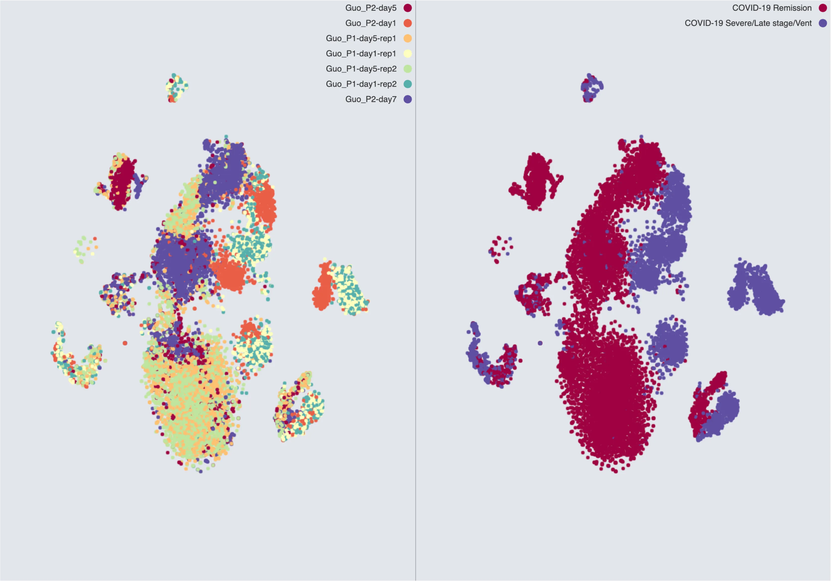
The Separate blend mode adds the new plot to the grid as a separate plot.
Aggregate Blend Mode
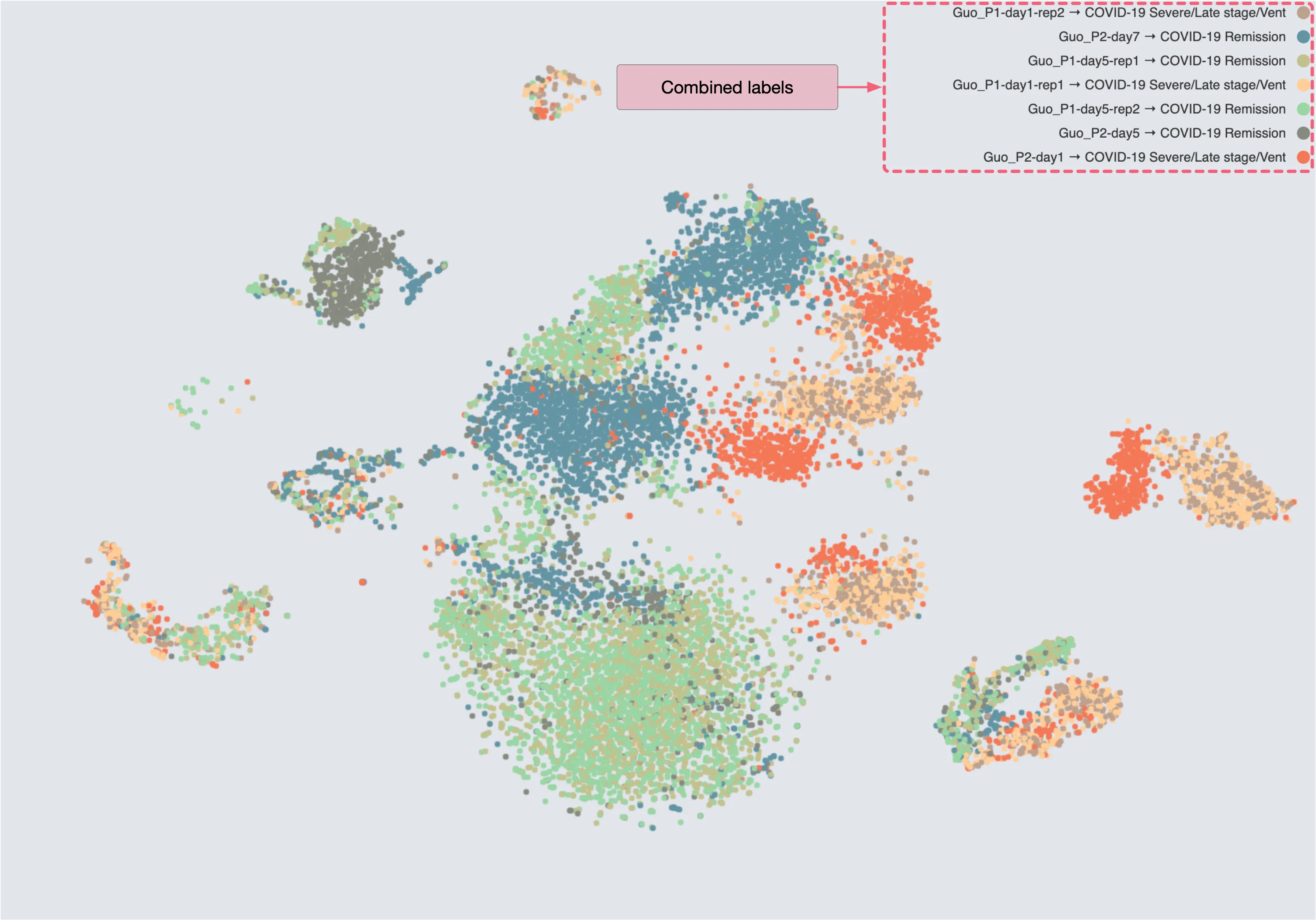
When using the Aggregate blend mode, the visualization engine will try to combine the grouping and the color mapping of the new plot with the current plot.
If the labels of both plots are categorical, the engine will try to merge the categories of the two plots. For example, the two labels in the Separate Blend Mode image are merged into a single plot as shown below:
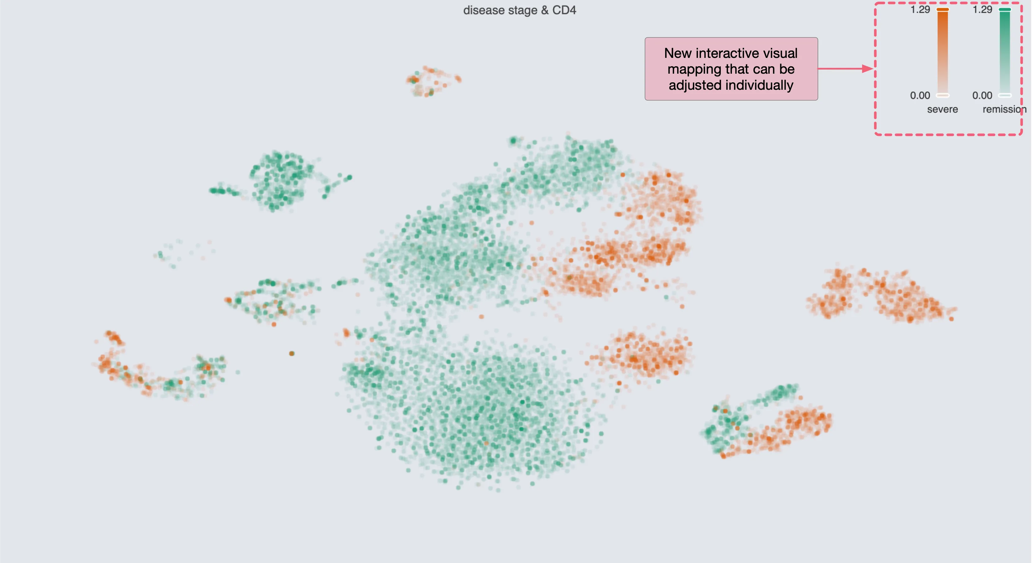
If one plot has a categorical label and the other has a continuous label, the engine will add adjustable sliders for each of the categorical values. For example, with the following two plots, the Separate blend mode and the Aggregate blend mode will result in the following visualization:
Separate blend mode:
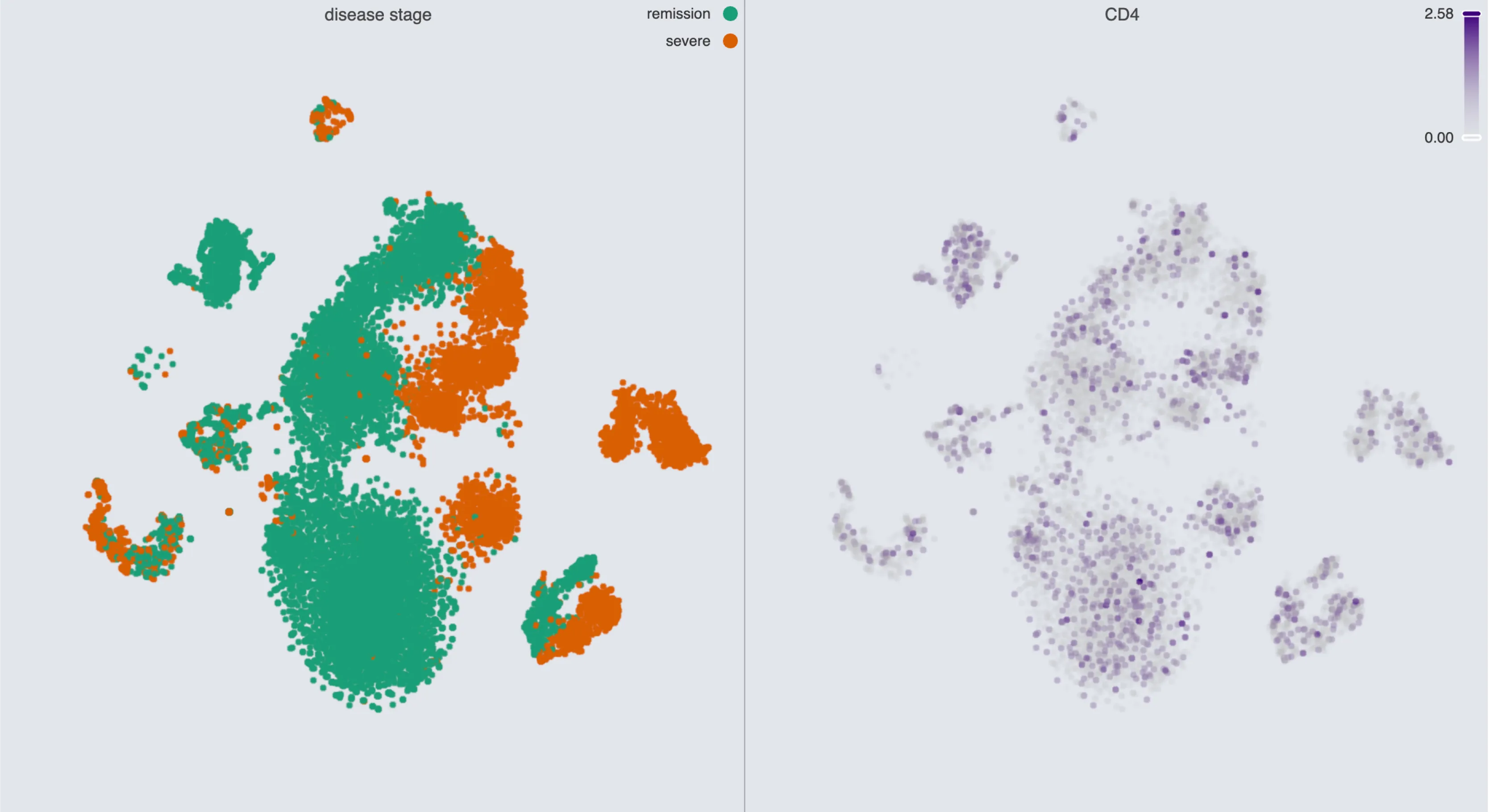
Aggregate blend mode:
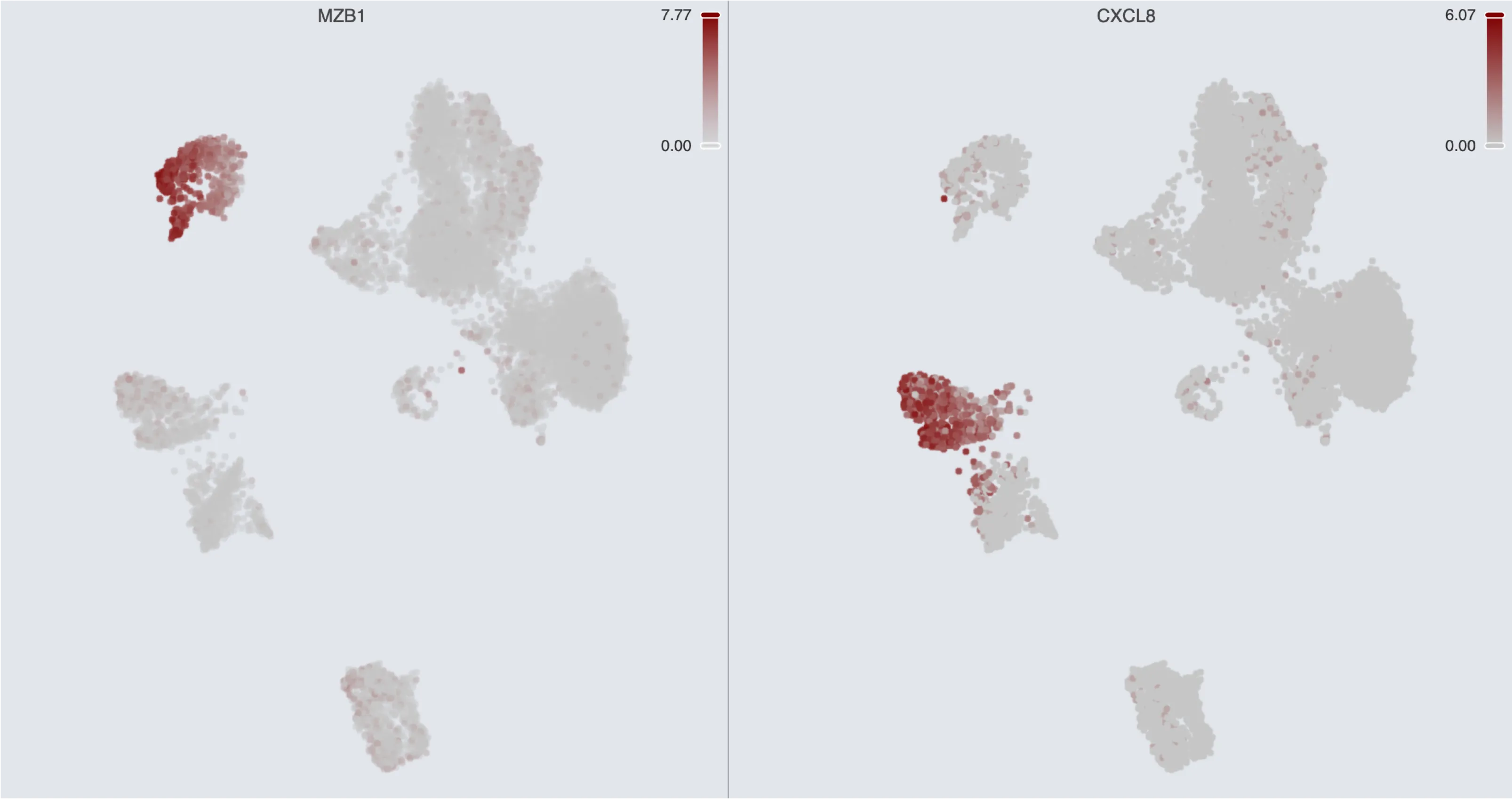
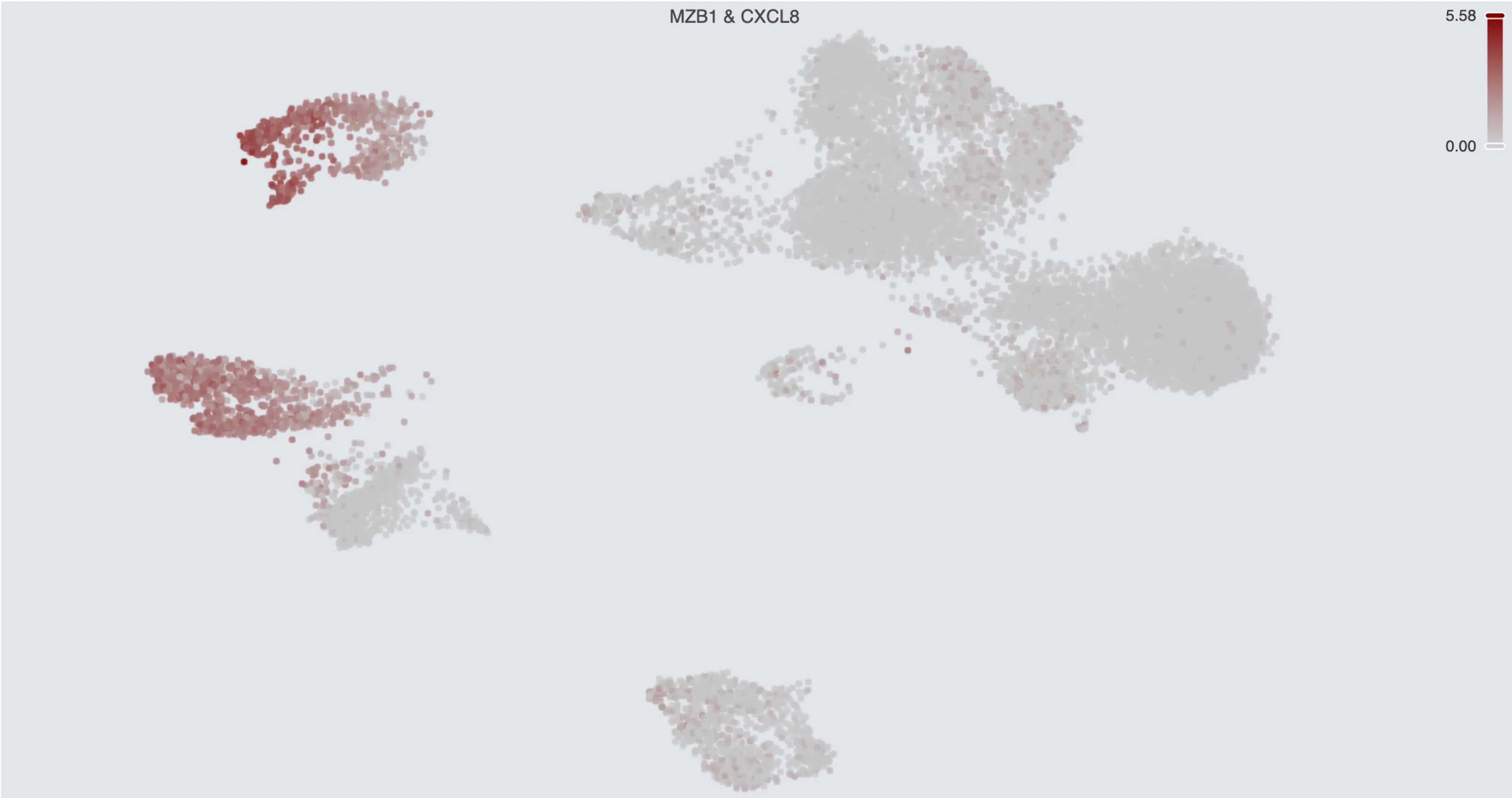
If both plots have continuous labels, the engine averages the values of the two plots. This is similar to the plots of Gene Sets. For example, with the following two plots, the Separate blend mode and the Aggregate blend mode will result in the following visualization:
Separate blend mode:
Aggregate blend mode:
Overlay Blend Mode
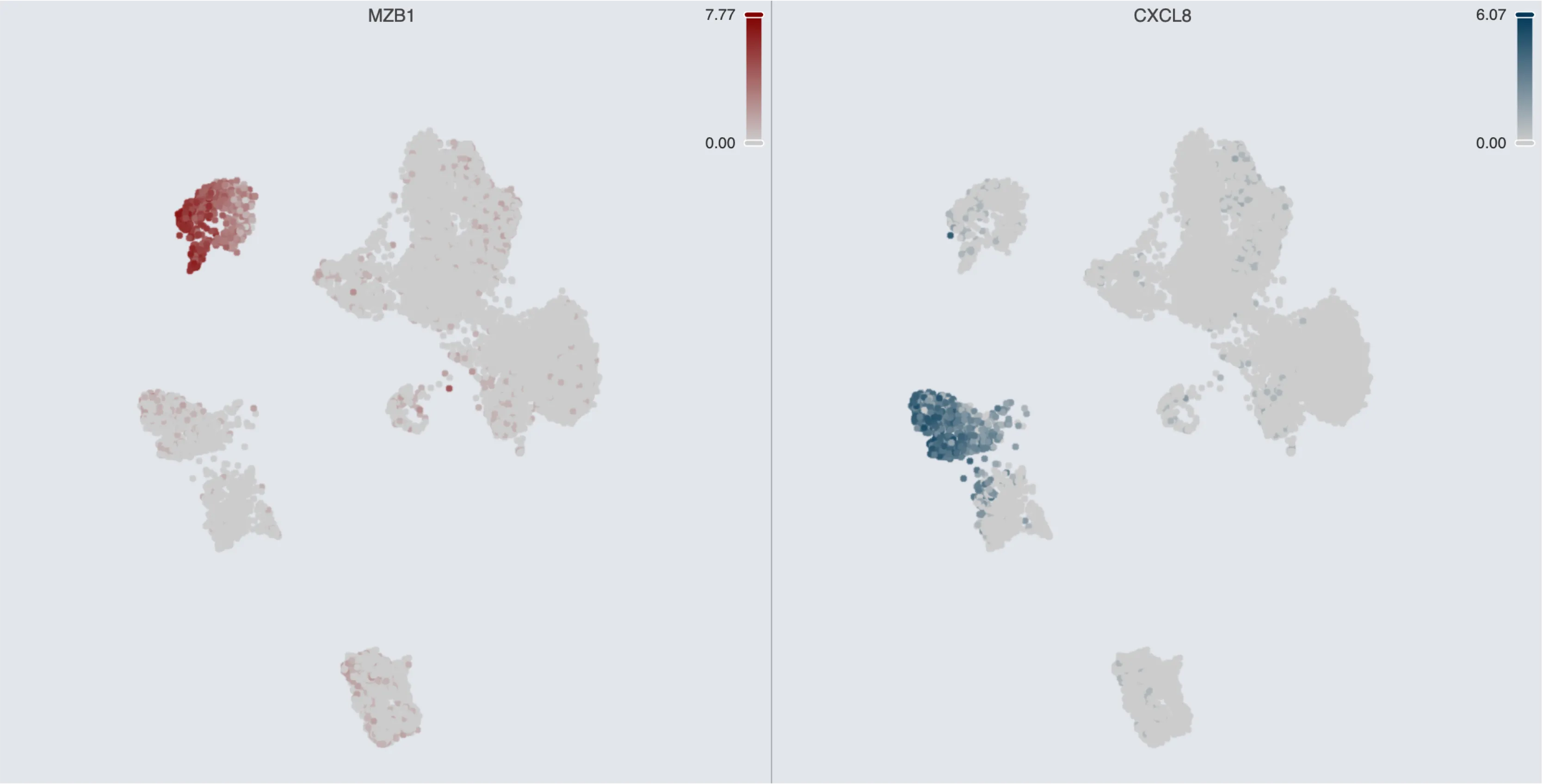
The Overlay blend mode allows you to overlay the new plot on top of the current plot. For example, with the following two plots, the Separate blend mode and the Overlay blend mode will result in the following visualization:
Separate blend mode:
Overlay blend mode:
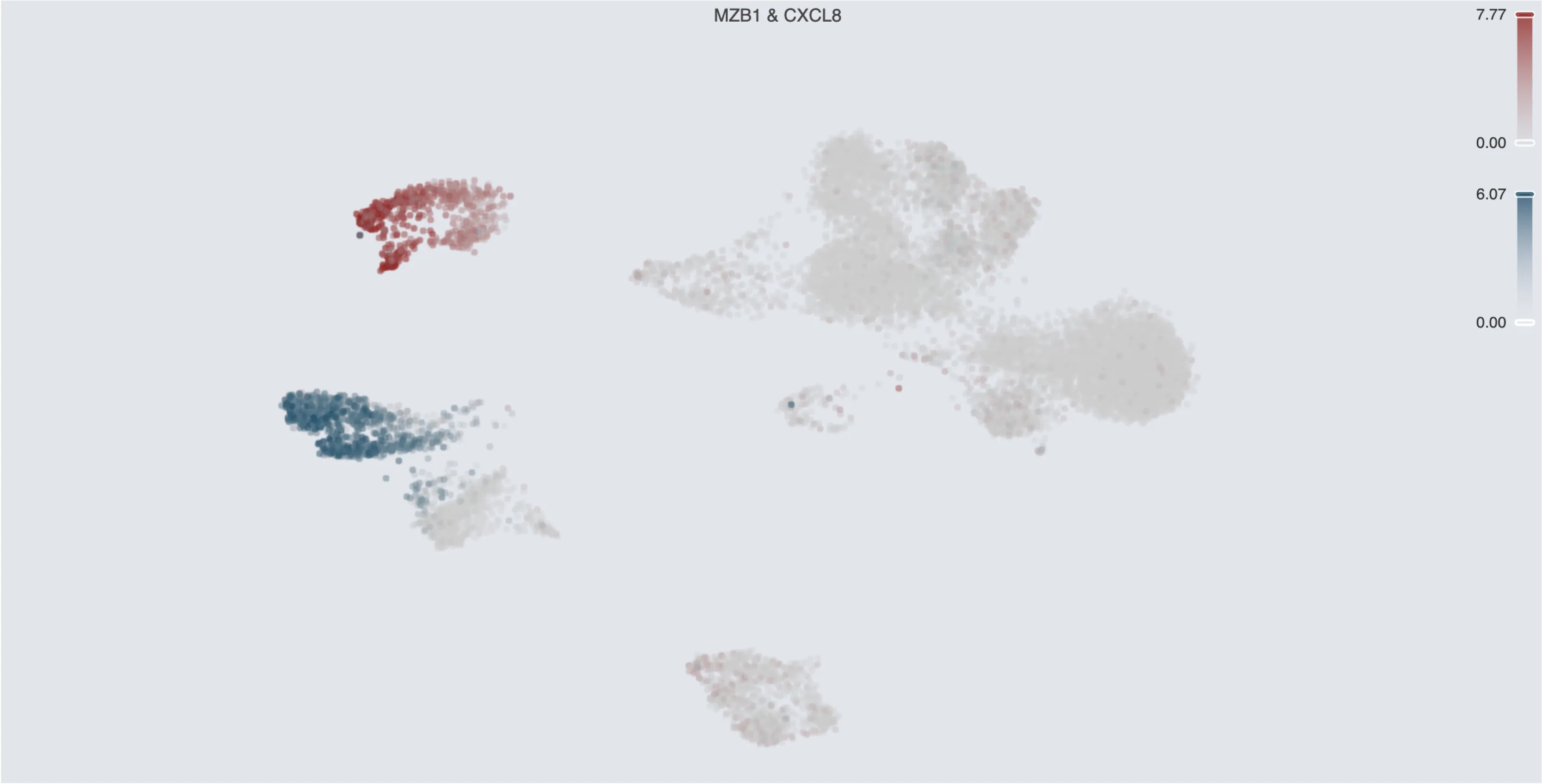
Unlike the Aggregate blend mode, the Overlay blend mode does not try to merge the categories or values of the two plots. You can still control the legend of each plot separately.
Concatenate Blend Mode
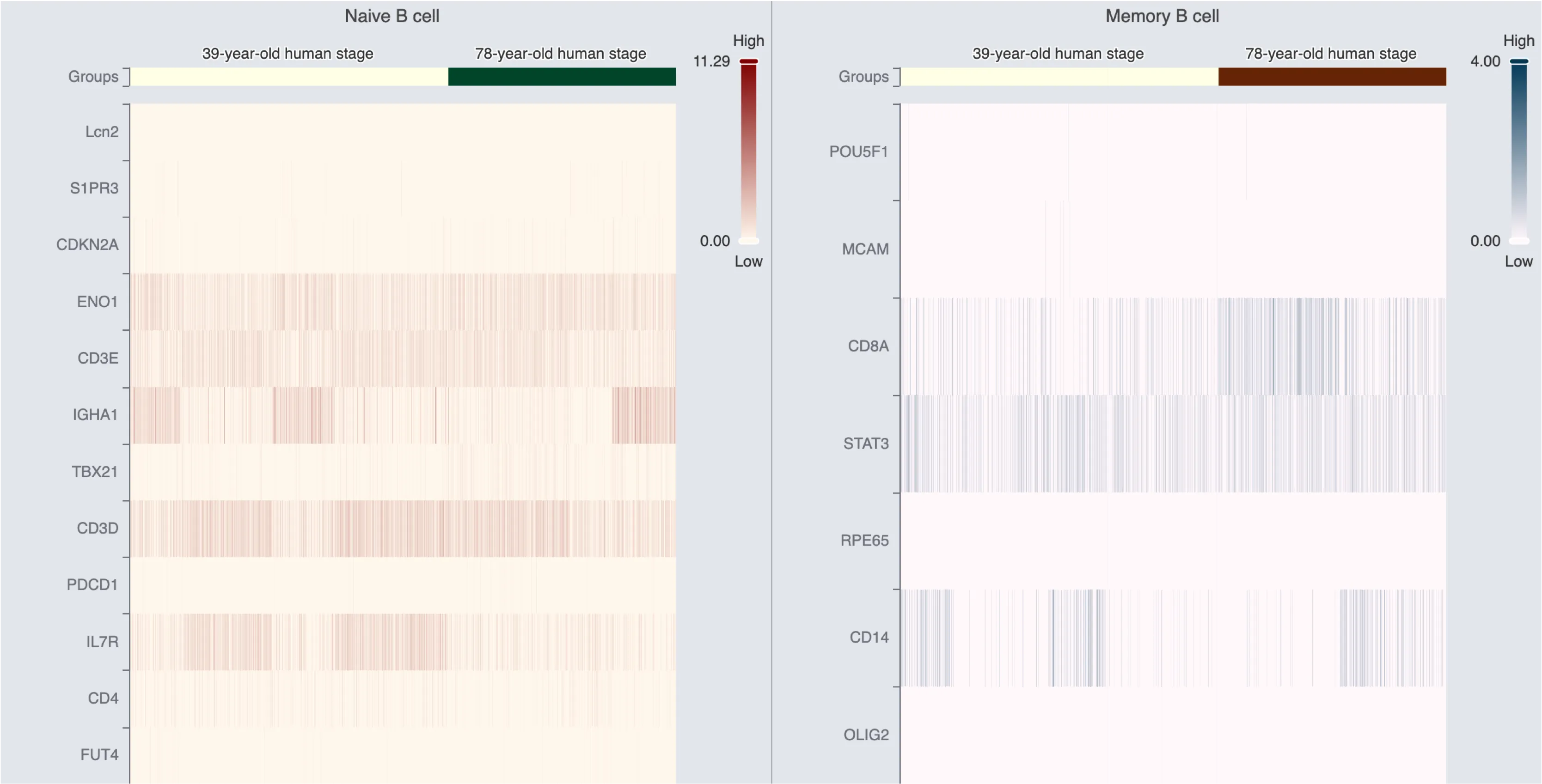
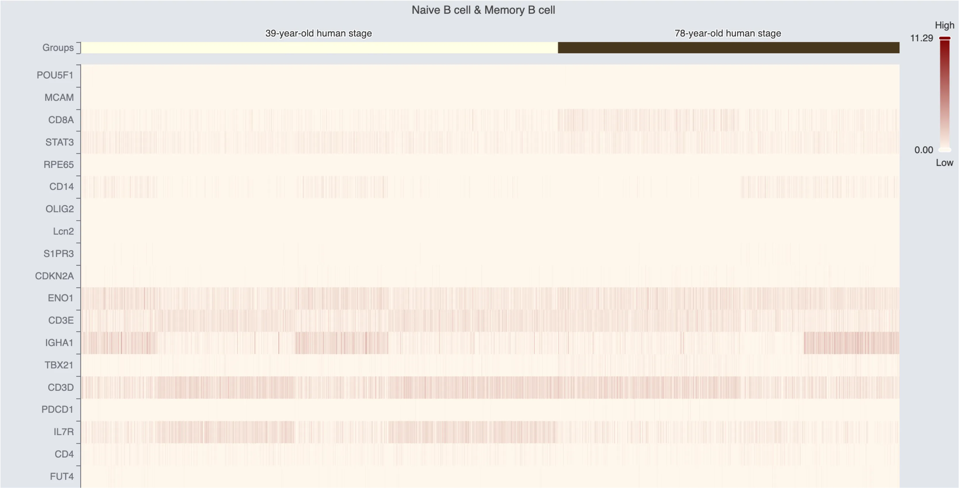
The Concatenate blend mode is used for Heatmap and Dot Plot charts. When using the Concatenate blend mode, the elements of the new plot are concatenated with the current plot. For example, with the following two plots, the Separate blend mode and the Concatenate blend mode will result in the following visualization:
Separate blend mode:
Concatenate blend mode:
Order of Blending
The following image shows how the blend order works in CytoAnalyst:
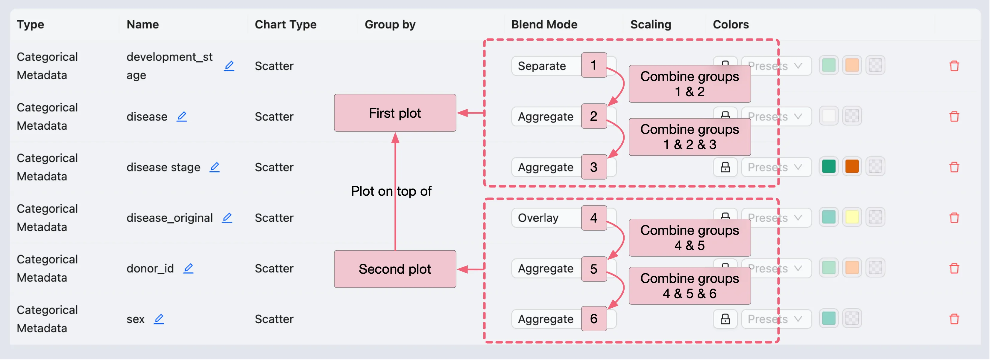
In the example above:
Plots
1,2, and3will be aggregated into a single plot (First plot).Plots
4,5, and6will be aggregated into another plot (Second plot).Finally, the
Second plotwill be overlaid on top of theFirst plot.