Age-Associated Differential Gene expression Analysis in Human Skin
In this case study, we explore differential gene expression patterns across clustered cell populations in human skin samples, aiming to uncover transcriptional signatures unique to specific cell states or subpopulations.
For a comprehensive guide to the general workflow of differential expression analysis, please refer our step-by-step Differential Expression Analysis documentation.
You can import the study in this tutorial with view-permission to your study list using the following link: https://cytoanalyst.tinnguyen-lab.com/studies/import/Nuqggzj4BTCRo38jW
Case Study Workflow
Dataset
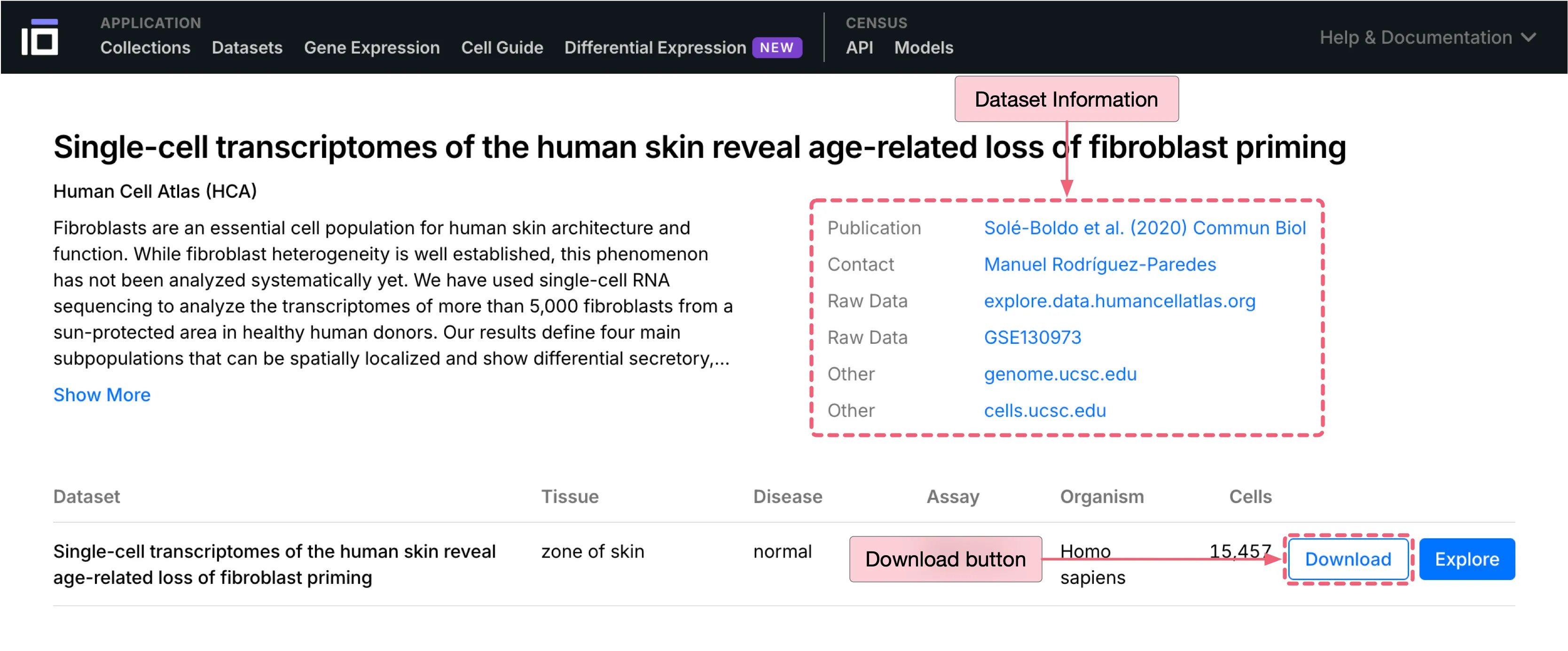
This case study uses a human skin dataset sourced from CZ CELLxGENE for analysis. Below are the dataset details:
Authors: Solé-Boldo et al.
Publication: Single-cell transcriptomes of the human skin reveal age-related loss of fibroblast priming
Dataset download link: Human Skin Dataset
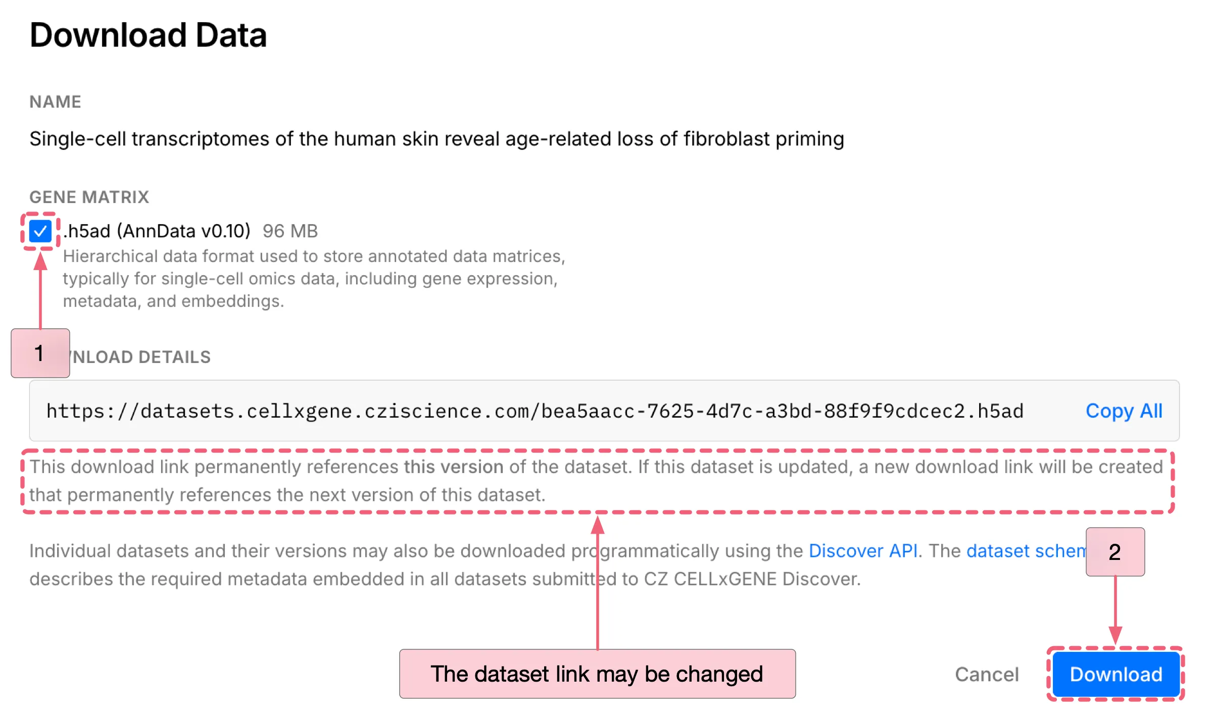
To download the dataset:
Click the
Downloadbutton to open the download dialog.Under
DATA FORMAT, select the.h5ad (AnnData v0.10)as the file format.Click the
Downloadbutton at the bottom of the dialog to start download.
Notes: While this dataset may be periodically updated, you can access the specific dataset version used in this tutorial through the link below:
Create a New Study
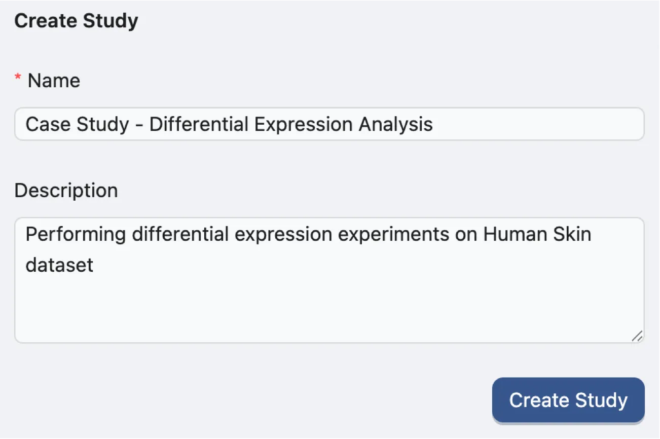
To create a new study, navigate to the Study Management page and fill in the required fields in the Create Study form with the following information:
Name:
Case Study - Differential Expression Analysis. A descriptive title for the case study.Description:
Performing differential expression experiments on Human Skin dataset. A brief summary of the case study.
Upon creation of the study, you will be automatically redirected to the Data page of the new study.
Note: To modify the study name or description, click the Studies button in the Study navigation bar at the top of the page. For additional information about managing studies, please refer to the Study Management page.

Upload data
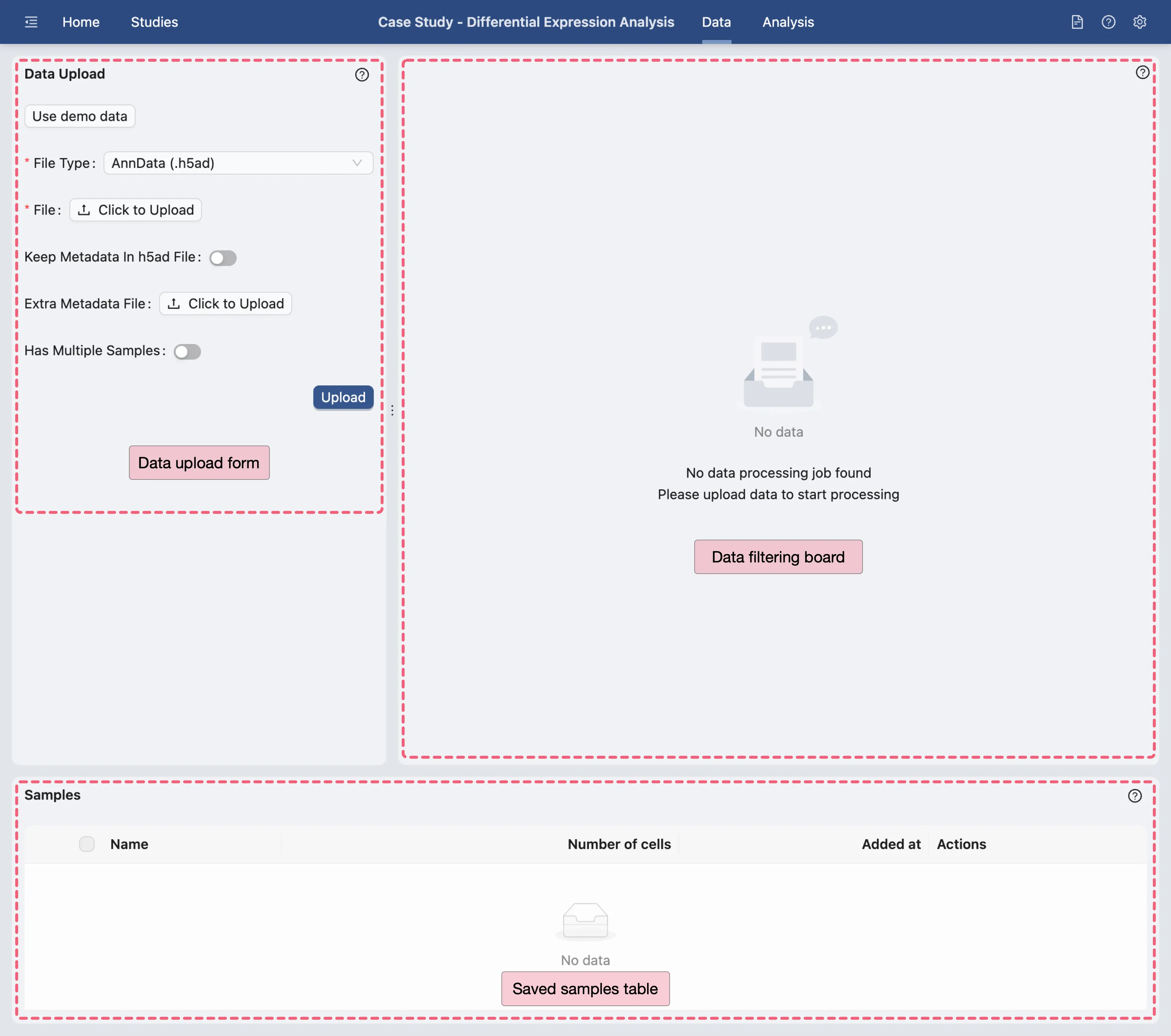
On the Data Management page, we will upload the downloaded dataset. Click the Click to Upload button on the Data Upload Form to open the file selection dialog and select the downloaded .h5ad file from your local storage.
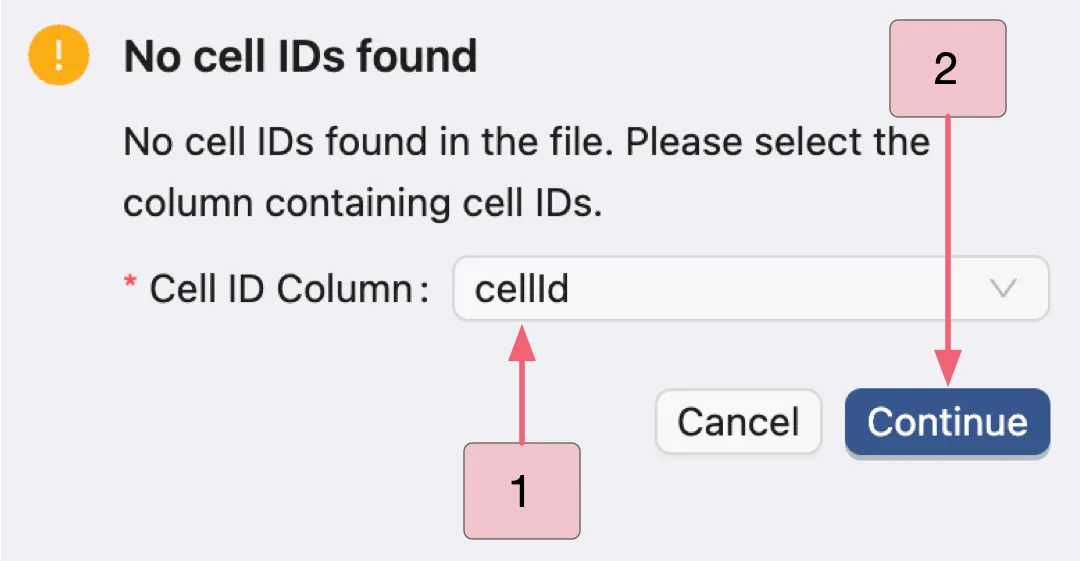
Note: In standard single-cell datasets, cell IDs (barcodes) are typically stored as either the index or _index of the obs dataframe in AnnData objects. These identifiers are automatically detected by CytoAnalyst. If this format is not detected, a model dialog will prompt you to manually select the cell IDs.
In this dataset, the cell IDs named cellid in the obs dataframe instead of using the default format. After uploading:
In the modal dialog, select the
cellidcolumn as the cell identifiers.Click the
Continuebutton to proceed.
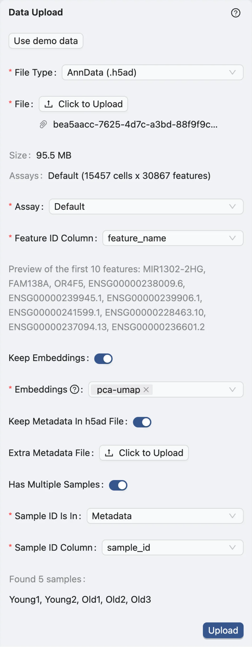
After uploading the data, configure the following parameters in the Data Upload Form:
File Type:
AnnData (.h5ad)- Specifies the dataset file format.Assay:
Default- Indicates the type of assay used in the dataset. In this case, it is the default assay.Feature ID Column:
feature_name- Identifies the column in the dataset that contains the feature IDs, which include both gene symbols (e.g., MIR1302-2HG, FAM138A, OR4F5) and versioned Ensembl gene identifiers (e.g., ENSG00000239945.1, ENSG00000239906.1) in this case.Keep Embeddings:
True- Indicates precomputed embeddings will be retained.Embeddings:
pca-umap- Specifies the precomputed visualizations and embeddings to be retained.Keep Metadata in h5ad file:
True- Indicates maintaining the metadata within the.h5adfile.Extra Metadata File:
Empty- Specifies an additional metadata file if needed. In this case, no extra metadata file is provided.Has Multiple Samples:
True- Indicates that the dataset contains multiple samples.The dataset was derived from sun-protected inguinal skin regions of donors aged 23, 25, 27, 53, 69, and 70 years
To track the origins of each sample, we will use the
sample_idcolumn in the metadata to distinguish between the samples.
Sample ID Is In:
Metadata- Indicates that the sample IDs are present in the metadata file.Sample ID Column:
sample_id- Specifies the column in the metadata that contains the sample IDs.
Click the Submit button to start the data processing.
A job will be created in the background to process the data. Once the job completes, the right panel will display options for data filtering. Visit Study Logs to learn more about monitoring analysis jobs and system status.
Data filtering
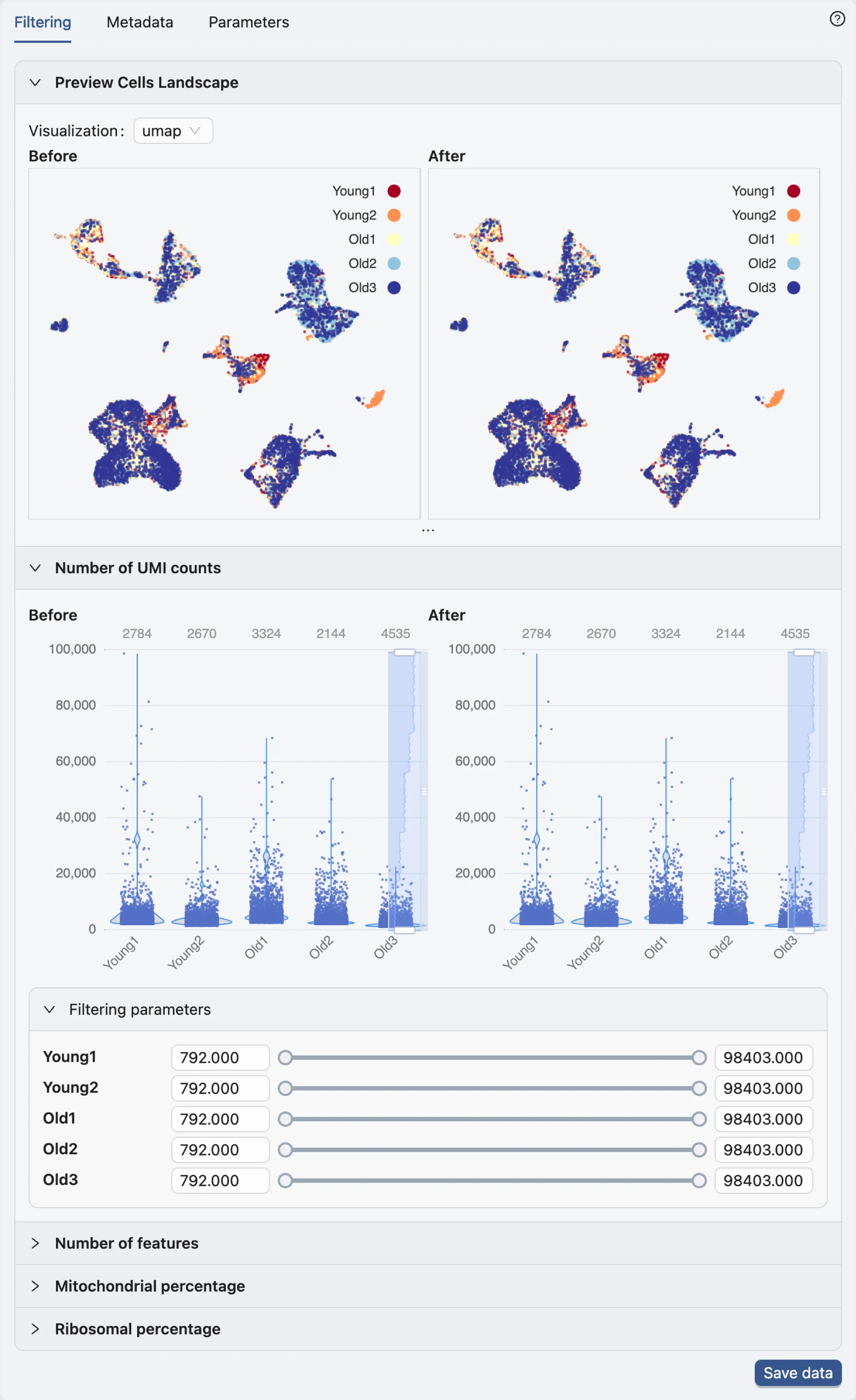
Once the data processing is complete, the filtering options will be displayed in the Data Filtering panel.
Note: The authors have already removed potential doublets (cells expressing more than 75,000 genes), and potential apoptotic cells (cells with more than 5% of mitochondrial reads). For additional details on the filtering methodology, refer to the publication.
Therefore, no further filtering is required in this case.
Save data
Click the Save data button in the Data Filtering panel to open the data saving dialog.
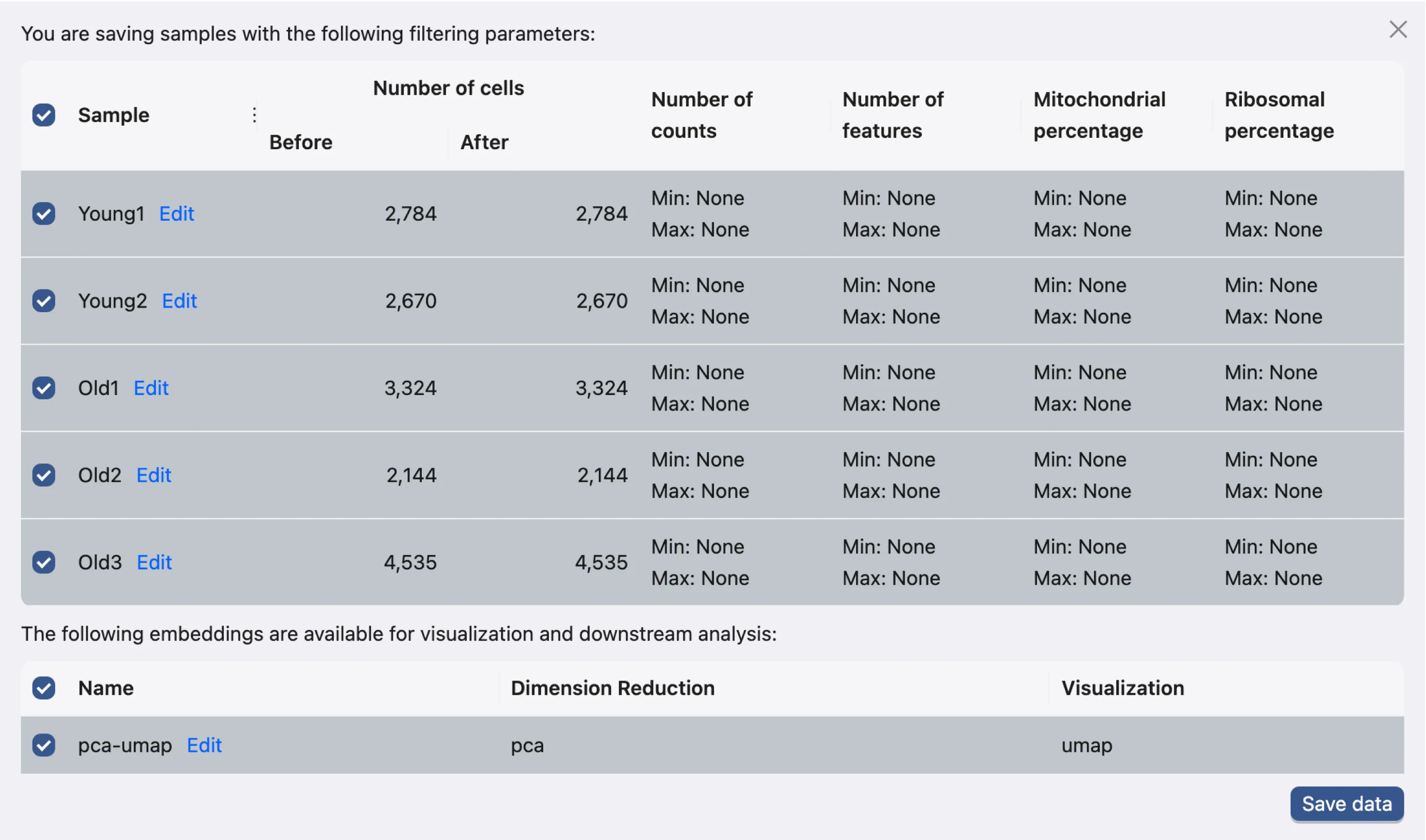
This dialog enables you to choose which samples and embeddings to save. For this tutorial, we will save all samples and embeddings.
Click the Save data button to proceed. The newly saved data will then be added to the data table.
In the saved samples table, you can import and export metadata files for individual samples. Additionally, you can export data in the AnnData format.
For more details on the data management page, see the Samples Table documentation.

Navigate to the Analysis page.
Once the data is saved, click the Analysis button in the Study navigation bar at the top of the page to navigate to the Analysis page.
The Analysis page provides a comprehensive view of the data and analysis tools. The basic layout of the Analysis page is shown below:
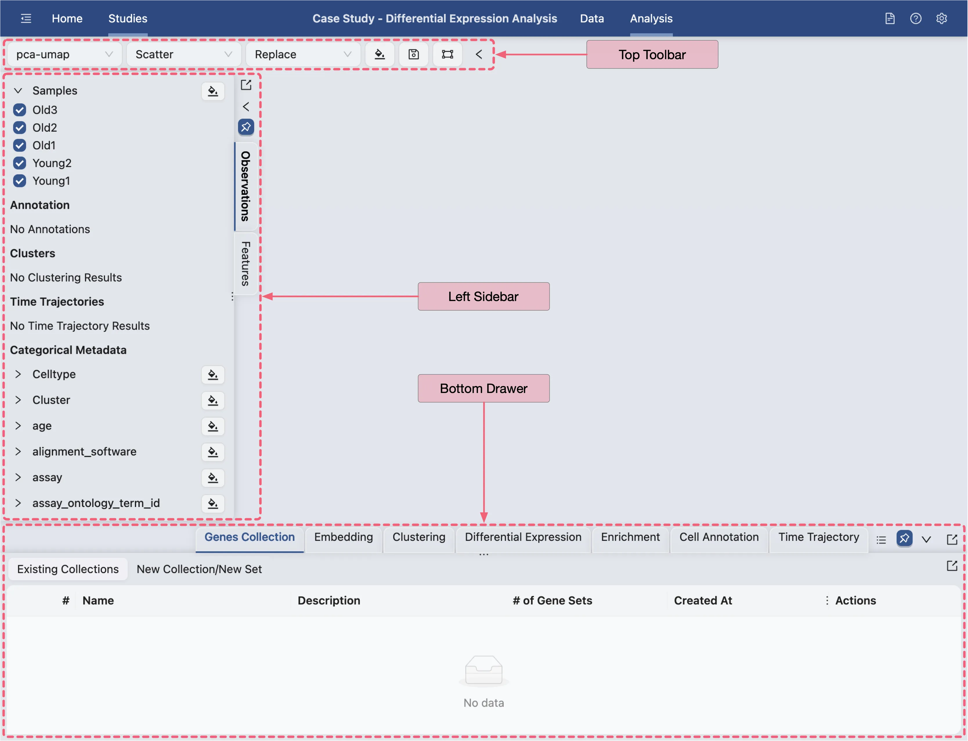
Top Toolbar: Contains dropdown menus for selecting embedding, data normalization, plot type, blending mode, and color map.
Left Sidebar: Contains the label selection panel for selecting labels to visualize.
Bottom Drawer: Contains all analysis tools
For more details about navigation and understanding the layout of the Analysis page, refer to Data Analysis.
Data Exploration
In the beginning, the authors integrated the dataset using Seurat's standard pipeline. Following this, they scaled the integrated data and performed Principal Component Analysis (PCA), retaining 20 dimensions to construct a Shared Nearest Neighbor (SNN) graph.
The SNN graph was subsequently clustered using the Louvain algorithm with a resolution of 0.4, resulting in the identification of 17 distinct clusters.
Given that these processing steps have already been computed and are included in the dataset metadata, we can proceed directly to clusters visualization without the need to repeat the integration and clustering steps.
For more comprehensive information regarding the data processing methodology, please consult the publication.
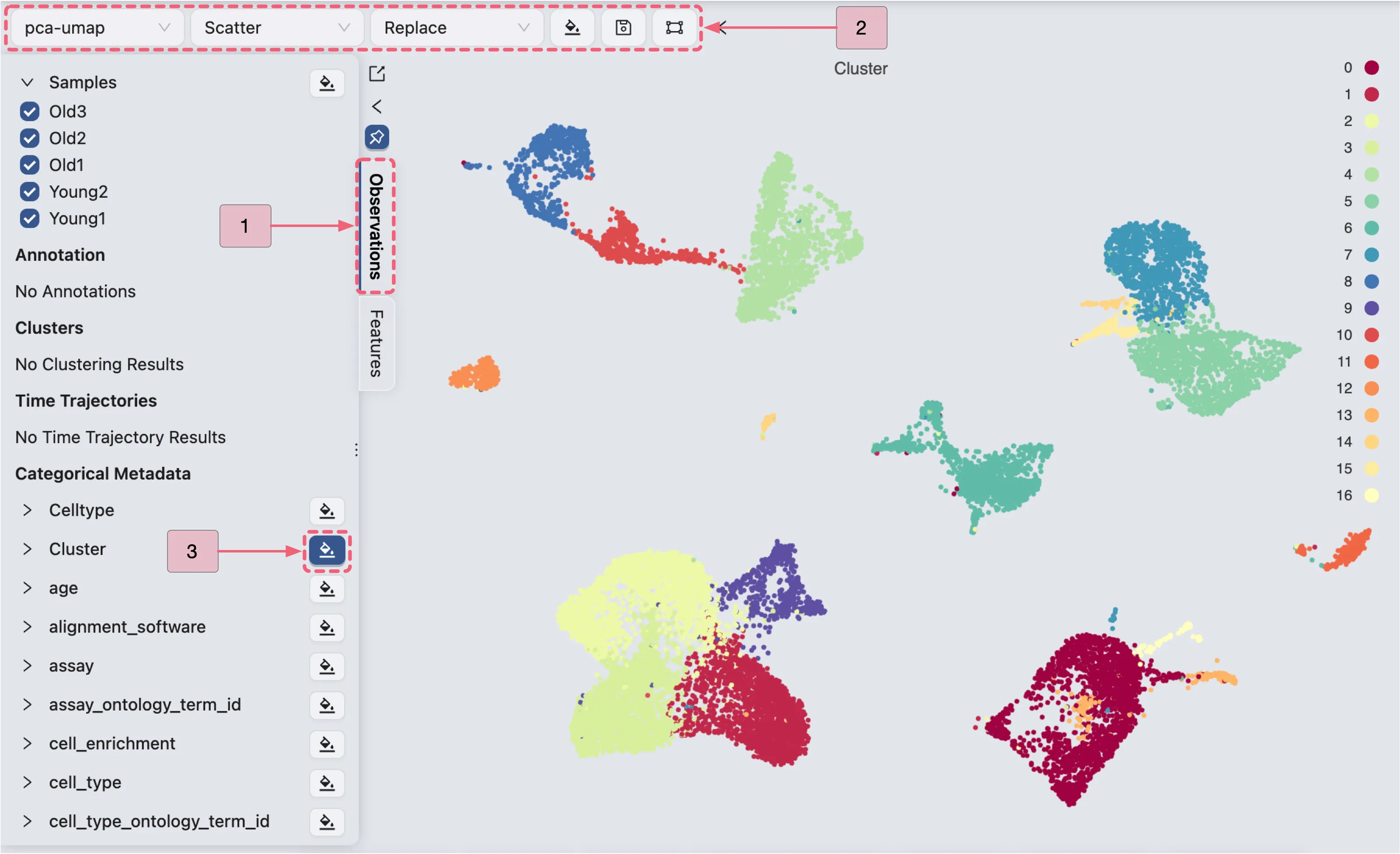
To visualize the clustering result, follow these steps:
In the Left Sidebar, select the
Observationstab.Ensure that the
Top Toolbarsettings are configured as follows:pca-umap: Indicates the embedding to be used for visualization.Scatter: Defines the plot type to be displayed.Replace: Specifies the blending mode for the visualization.
In the
Left Sidebar, locate theCategorical Metadatalabel, and then:Click the
 button adjacent to the
 Clusterlabel to visualize the clustering result.Click the
 button adjacent to the
 Celltypelabel to visualize annotated cell types.
Perform Differential Expression (DE) Analyses across clusters
In this section, we will perform differential expression (DE) analyses to identify cluster-specific marker genes. Finally, we will compare the results obtained from CytoAnalyst with those reported in the original study.
Follow these steps to navigate to the creation form for differential expression analysis:
Click the
Differential Expressiontab located on the Bottom Drawer to access the analysis panel.Click the
New Differential Expressionbutton to open the analysis creation form.Select the
By metadataoption to generate analyses for each cluster.
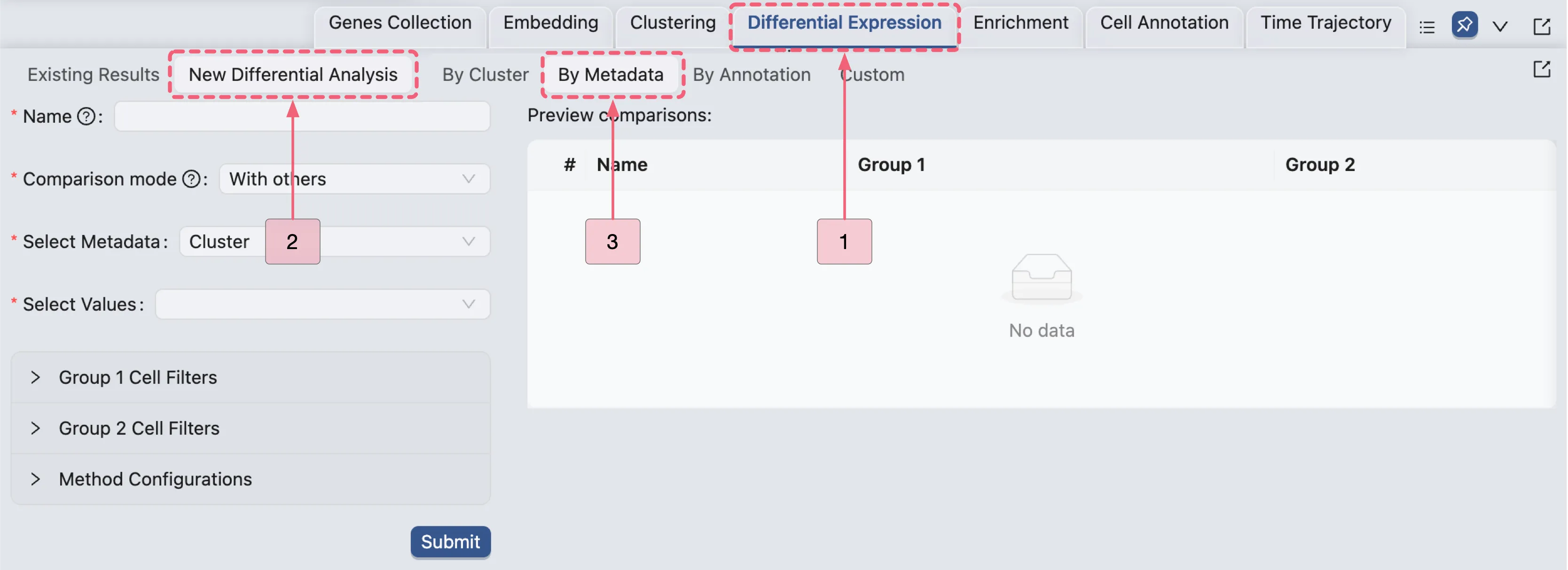
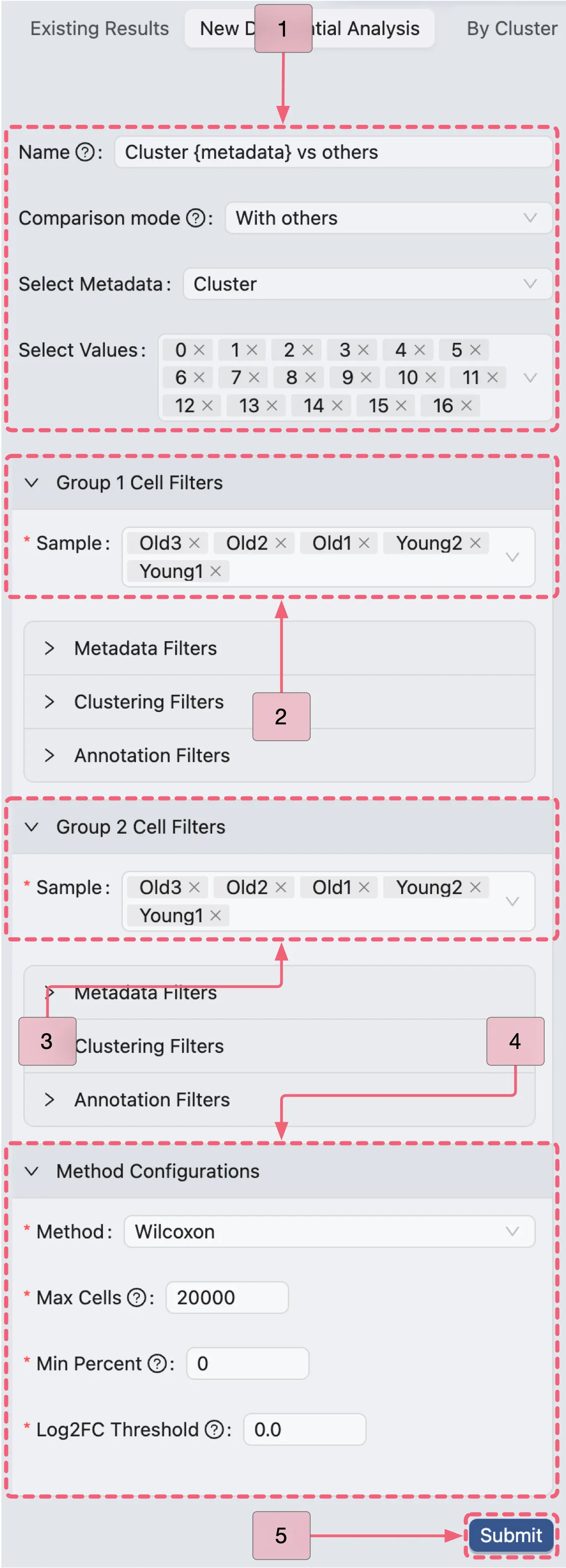
In the analysis creation form, expand the following sections to configure the analysis:
Group 1 Cell FiltersandGroup 2 Cell Filters: Specify the cell filters for each group.Method Configurations: Choose the method for the analysis and define its parameters.
Subsequently, configure the analysis by following these steps:
Name:
Cluster {metadata} vs others- A descriptive name for the analysis. The{metadata}placeholder will dynamically populate with selected metadata values.Comparison mode:
With others- Specifies the comparison strategy, indicating that the selected group versus all other groups within the chosen category. In this study, we will compare each cluster in theClustermetadata column against all other clusters.Select Metadata:
Cluster- Indicates the metadata column containing the cluster information.Select Values:: From
0to16- Specify the clusters to be compared (all 17 clusters in this analysis).Group 1 & Group 2 Cell Filters:
Old3,Old2,Old1,Young2,Young1- Indicates all samples are included in both groups for the comparison.Method Configurations: Select the method and parameters for the differential expression analysis.
Method:
Wilcoxon- Indicates the statistical test to be used for the analysis.Max Cells:
20000- Specifies the maximum number of cells to use for the analysis.Min Percent:
0- Indicates that only gene expressed in at least this percentage of cells will be included in the analysis. In this case, we include all genes.Log Fold Change:
0.0- Indicates that only genes with a log fold change greater than this value will be included in the results. In this case, we include all genes.
After configuring the cell filters for each group and setting up the method parameters, you can preview the analysis before execution. The preview table displays the following details:
Name: Shows the designated name for the analysis.
Group 1:
Number of cells: Indicates the total number of cells included in Group 1 based on the applied filters.
Samples: Specific samples that have been selected for Group 1.
Metadata:
Cluster 0- Specifies that only cells belonging to cluster0have been selected for Group 1.
Group 2:
Number of cells: Indicates the total number of cells included in Group 2 based on the applied filters.
Samples: Specific samples that have been selected for Group 2.
Metadata:
Cluster 0- Indicates all clusters except cluster0have been selected for Group 2.
Total Cells: The total number of cells from both Group 1 and Group 2 that will be included in the DE analysis.
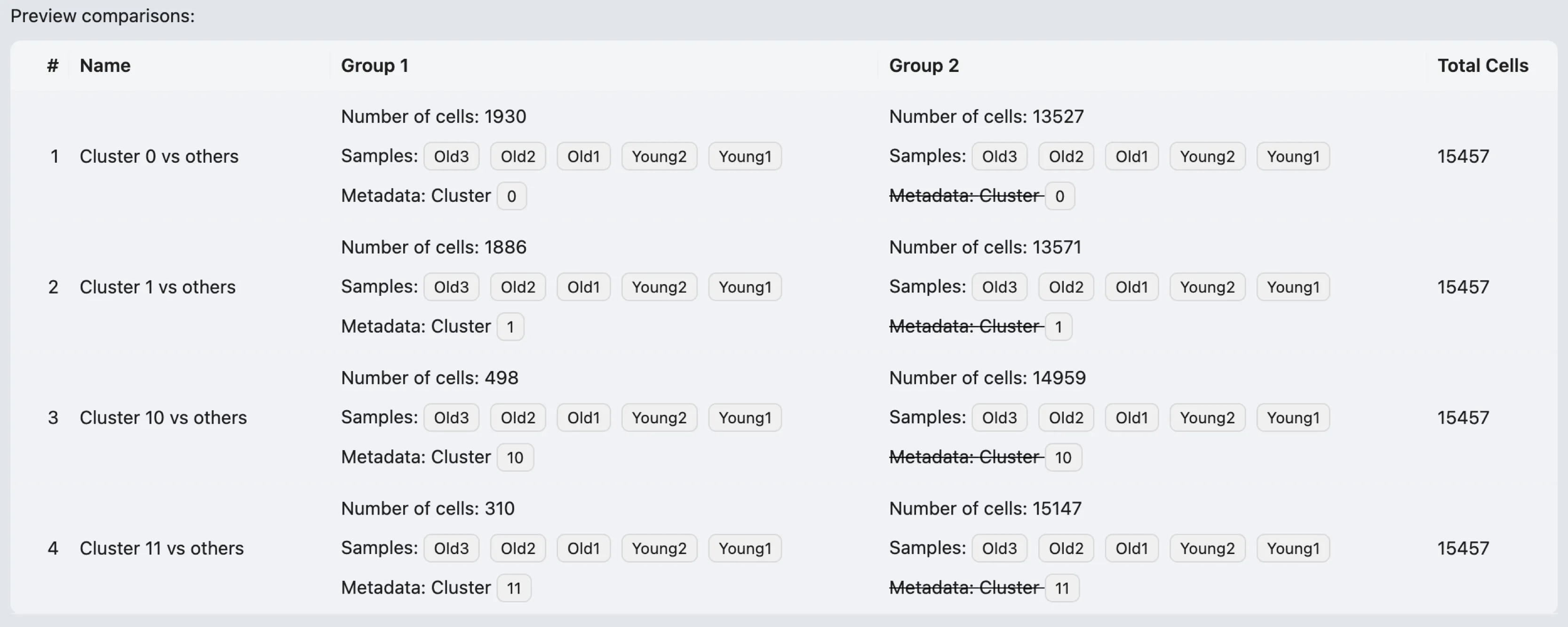
Once reviewed, click the Submit button to run the analysis.
Manage The Differential Expression (DE) Results
When the differential expression (DE) analysis completes, the results will appear in the Differential Expression Table, which is located under the Existing Results tab.
The results table includes the following columns for each analysis:
Name: Unique identifier for the analysis.
Method: Statistical method applied (e.g.,
Wilcoxon).Max Cells: The maximum cell count parameter used in the analysis.
Min Pct: The minimum percentage of cells expressing the gene.
Min Log2FC: Minimum log2 fold change threshold for significance.
Group 1: Metadata groups compared.
Group 2: Comparison counterpart to Group 1
Action:
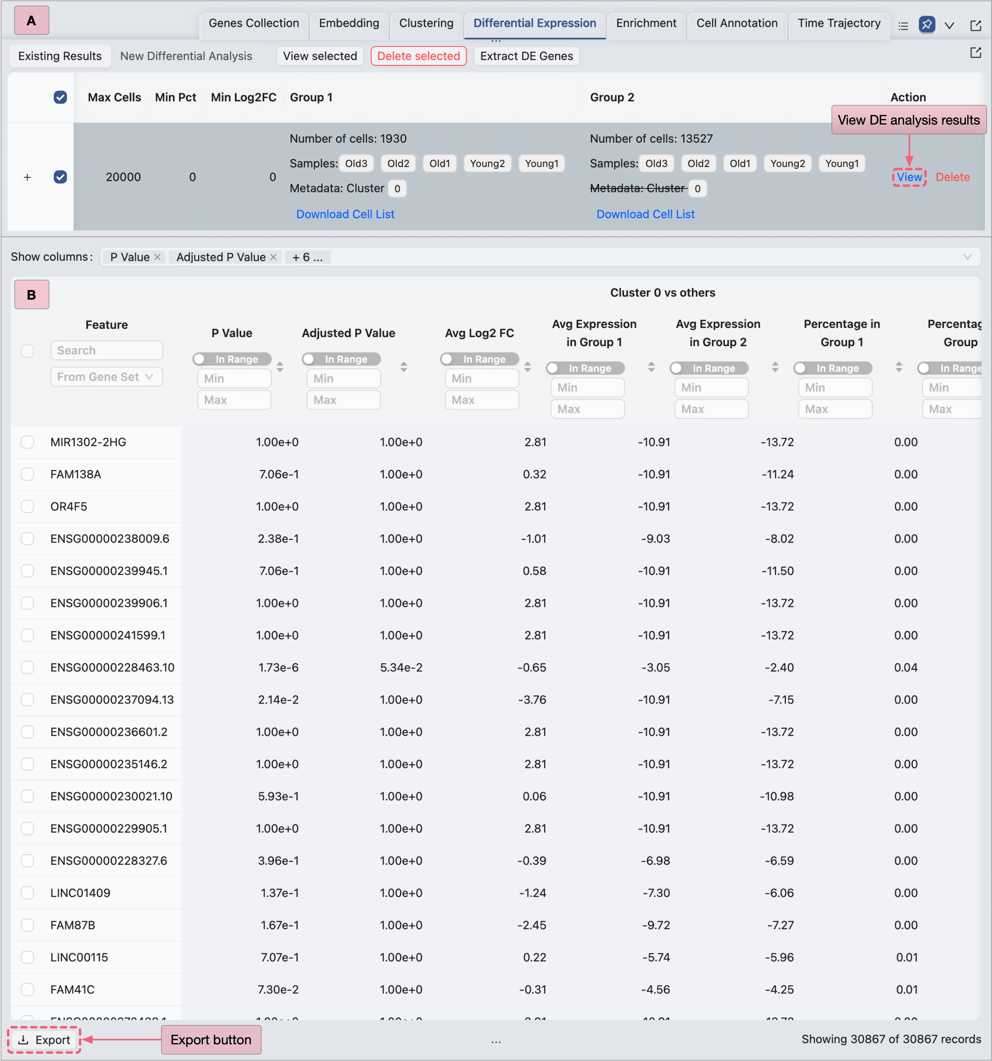
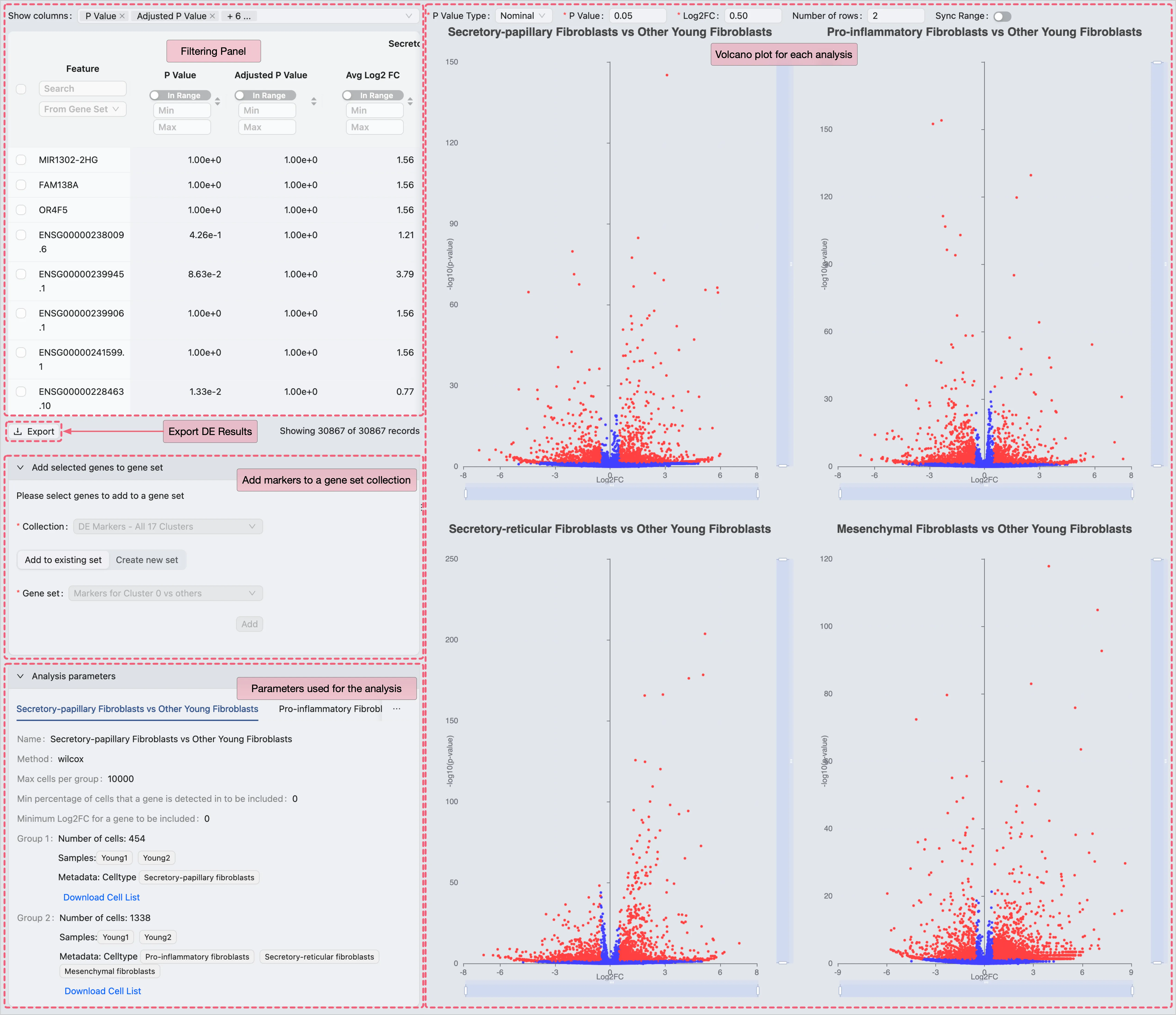
View: View the complete DE analysis results, including a detailed gene expression table, relevant statistics, and a volcano plot for visualization.
Delete: Permanently remove the analysis and its results.
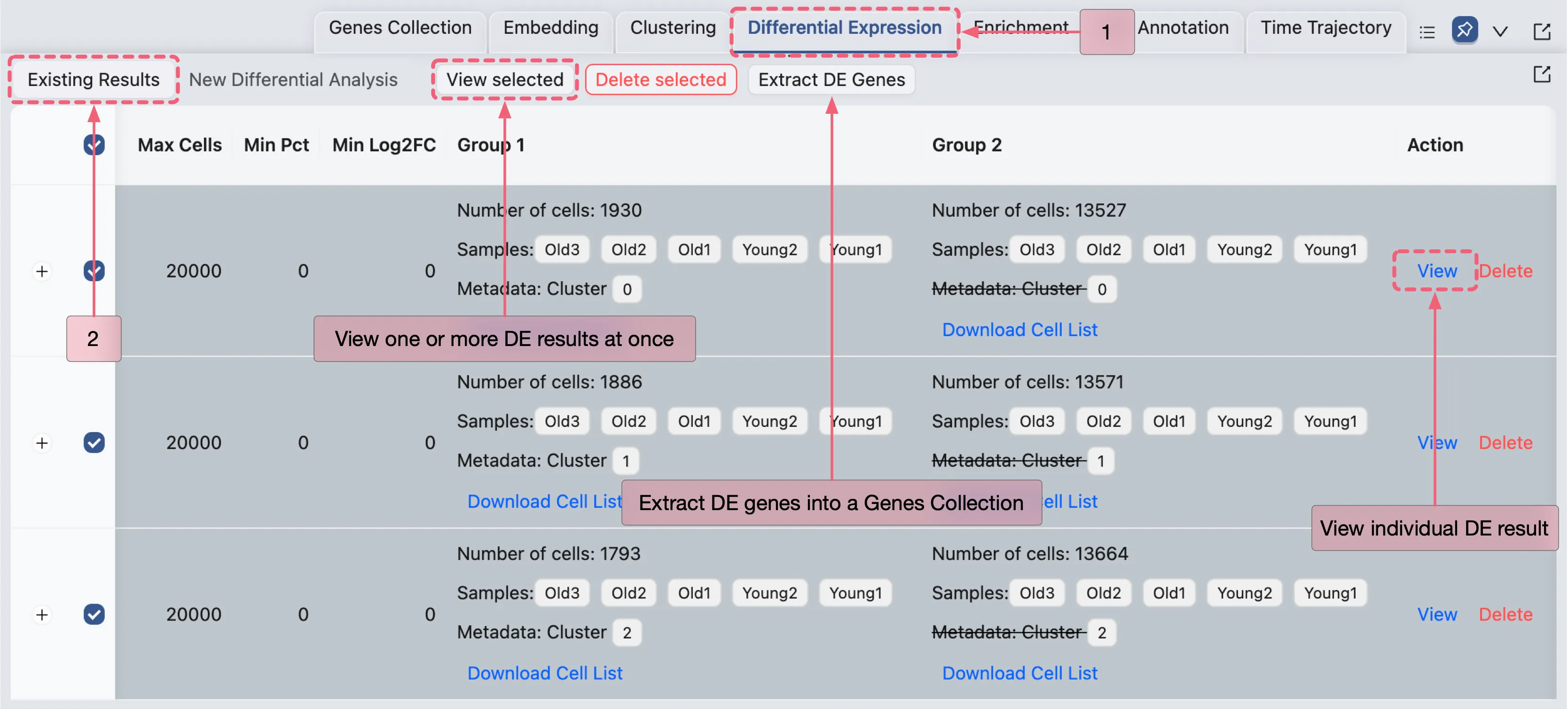
For comprehensive guidance on managing DE results, see the Differential Expression Analysis page.
Viewing the DE Results
To view the results of a specific analysis, click the View button in the Action column of the corresponding analysis entry.

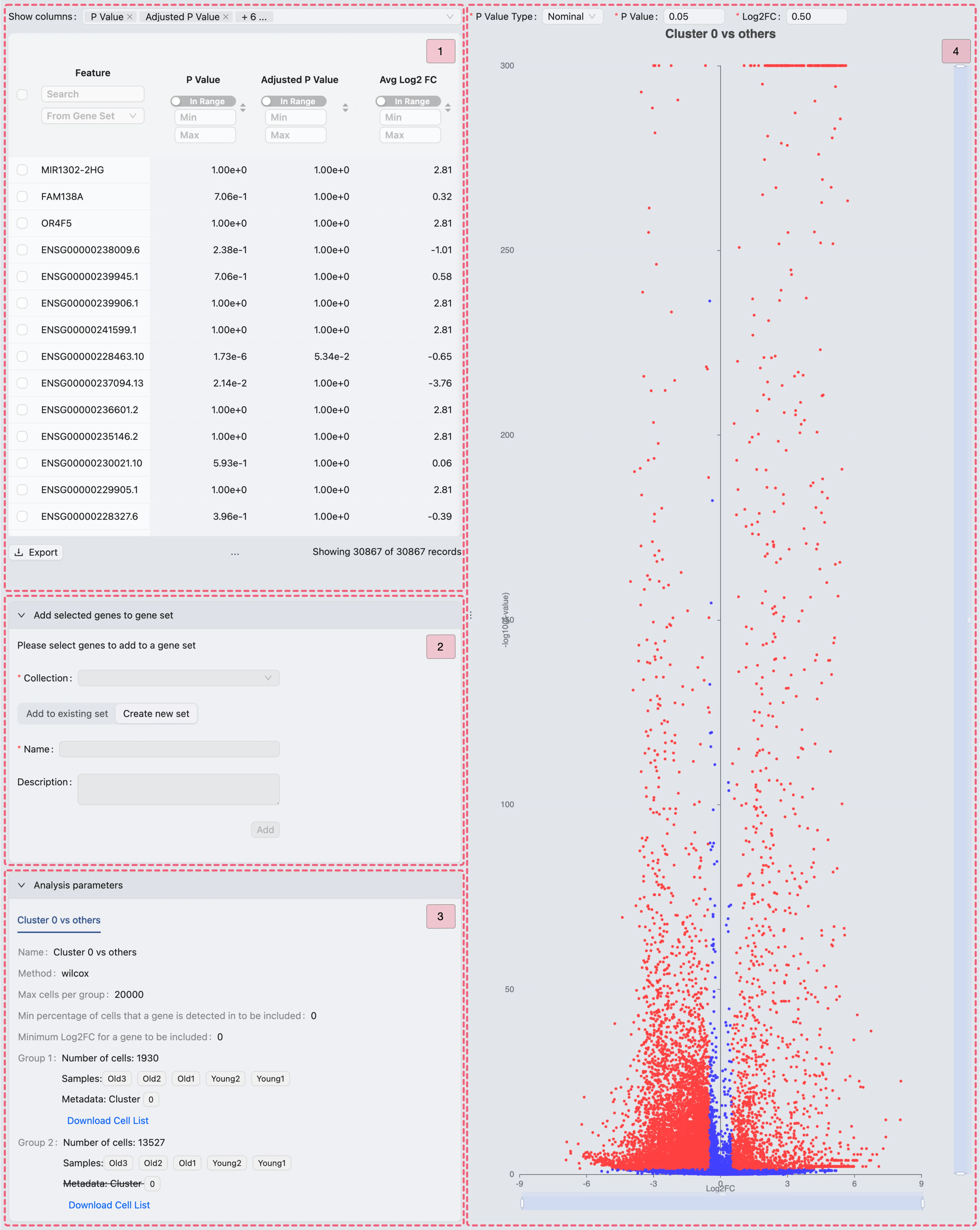
The differential expression (DE) results page consists of four main components:
Results table - This table displays DE results with statistical metrics. Utilize the
Show columnssection to customize the visible columns.Add selected genes to gene set - This panel enables you to add selected genes to a gene set collection, offering two options:
Add to existing set: Append selected genes to a predefined gene set within your collection.
Create new set: Establish a new set within the selected collection.
Analysis parameters - This section displays the parameters used for the DE analysis.
Volcano plot - This plot visualizes significant DE genes:
X-axis: Show the log2 fold change
log2FCof genes.Y-axis: Represents the adjusted p-value
-log10(p-value)of the genes.
Export DE Results
Following the viewing of the DE results, we can export the results of each DE analysis as a CSV file for external processing.
To export the DE results, follow these steps:
In the Action column of each analysis entry, click the
Viewbutton to access the detailed DE analysis results.Click the
Exportbutton to download the DE results as a CSV file.
Validation Against Original Study Findings
After exporting the DE results, we validate our findings by comparing them to those reported in the original study using the following filtering criteria:
Adjusted P Value ⩽ 0.05 (statistical significance threshold)
Avg Log2 FC ⩾ 0.5 (minimum expression fold change)
Percentage in Group 1 ⩾ 0.25 (at least 25% of the cells in Group 1 express the gene)
Applying these criteria filters the DE results to identify the marker genes for each cluster, which can then be cross-referenced with the marker genes listed in Supplementary Data 1 of the original publication.
We observe that our analysis shows strong concordance between the results generated in CytoAnalyst and the original study, with the platform identifying 88.4% of the genes previously reported in the publication.
The discrepancies arise because we utilized Seurat version 5 for differential expression analysis, while the original study employed Seurat version 3.
Seurat version 5 includes enhanced methodologies for calculating log2 fold change and p-values, which may explain these variations.
Extract DE Genes
In this section, we will extract DE genes for visualization.
Note: This extraction is for visualization purposes only. We do not apply the same criteria as the original study, as its inclusion of thousands of genes would dilute the signal.
Follow these steps to extract significant DE genes:
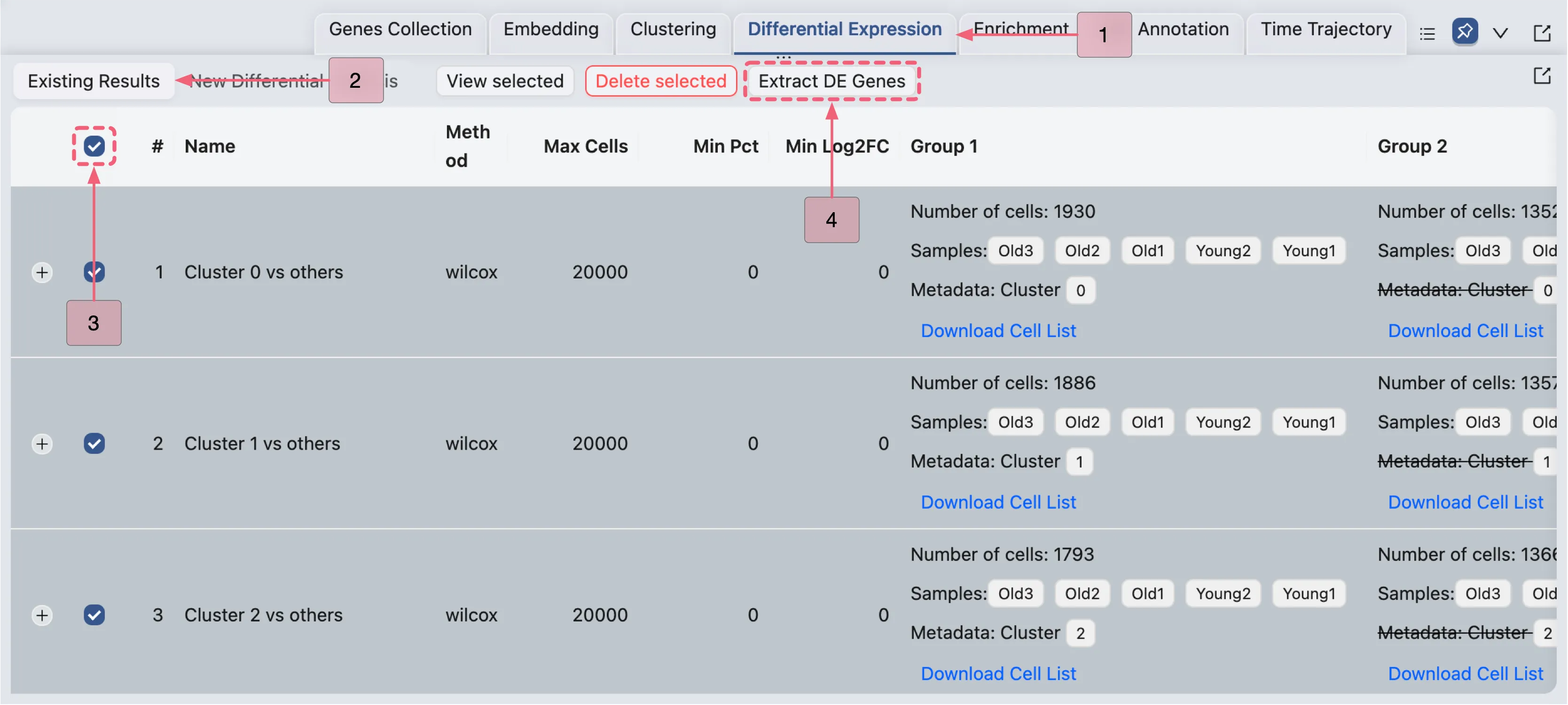
Navigate to the Existing Results tab in the
Differential Expressionpanel.Select all the DE analyses by checking the box in the table header row (next to the
#symbol).Click the
Extract DE Genesbutton to open the Extracting DE Genes dialog in a pop-up window.
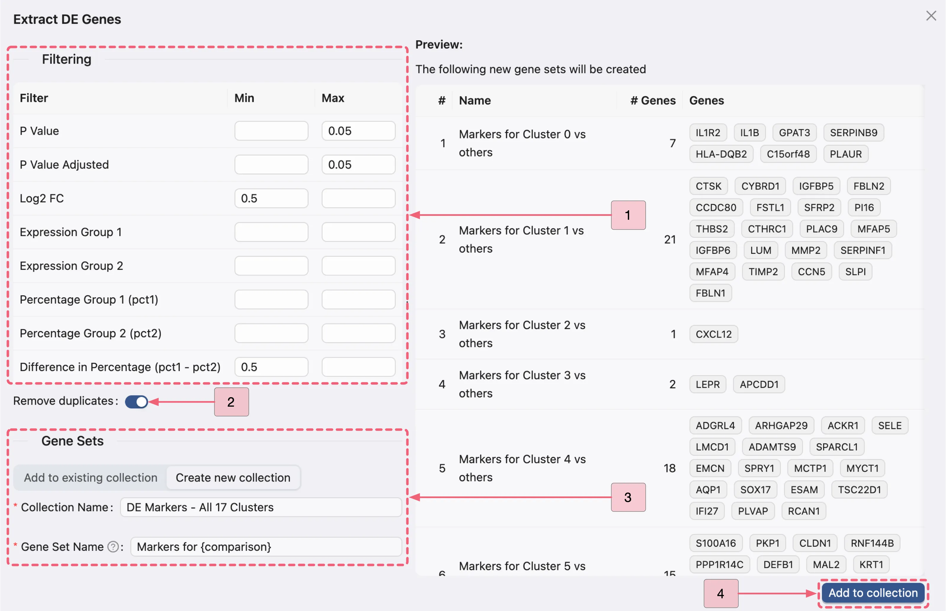
In the Extract DE Genes dialog, configure the following:
Filtering criteria:
P Value:: Min:
[empty]- Max:0.05P Value Adjusted: Min:
[empty]- Max:0.05Log2 FC: Min:
0.5- Max:[empty]Difference in Percentage (pct1 - pct2): Min:
0.5- Max:[empty]
Remove duplicates: Enable this option to eliminate duplicate marker genes across gene sets.
Gene Sets panel:
Click the
Create new collectionbutton to access the gene set creation form.Name the new collection
DE Markers - All 17 Clusters.Name each set at once by entering
Markers for {comparison}.Note: The
{comparison}placeholder will automatically populate with the corresponding analysis name.Click the
Add to collectionbutton to finalize the new collection and gene sets.
Additionally, you can manage the gene sets in the Genes Collection panel, which is located in the Bottom Drawer.
Click the
Genes Collectionbutton in the Bottom Drawer.Navigate to the Existing Collections tab to view your created gene set collection.
For the comprehensive guide on managing gene sets, refer to the Gene Set Collection

Visualize DE Genes
In this section, we will visualize the expression of DE genes using various visualization methods integrated within CytoAnalyst:
ScatterHeatmapDotplotViolin
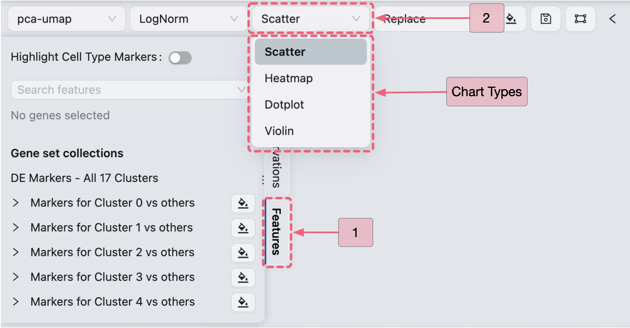
Follow these steps to select your preferred visualization type:
In the Left Sidebar, click the
FeaturestabIn the Top Toolbar, select your preferred char type.
Scatter Plot Visualization
In this section, we will visualize the expression of Cluster 0 marker genes using a scatter plot.
Configure the Top Toolbar settings as follows:
Visualization embedding:
pca-umap- Specifies the embedding used for visualization.Normalization method:
LogNorm- Specifies the normalization applied to the data.Plot Type:
Scatter- Specifies the type of chart to be displayed.Plot blending mode:
Separate- Specifies the blending mode used for visualization. In this case, we will render the expression of each gene in individual plots.
In the Left Sidebar:
Locate the
DE Markers - All 17 Clusterscollection.Click the
 button next to
 Cluster 0 markersto visualize the expression of its marker genes.
To inspect individual genes:
Expand the
Markers for Cluster 0 vs othersgene set to view the list of its marker genes.Click the

button beside
IL1R2to visualize its expression pattern.
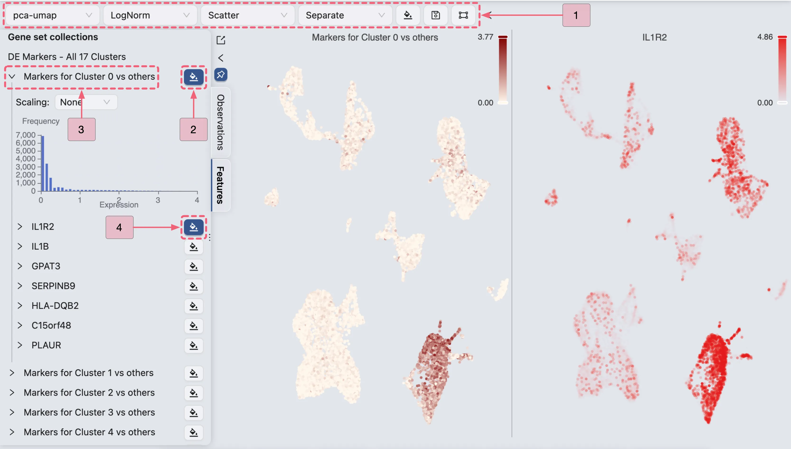
Additionally, the expression patterns of multiple genes can be visualized concurrently by employing the Overlay blending mode:
Add a secondary gene visualization:
In the Left Sidebar, click the
 adjacent to additional genes (e.g.,
 IL1Bin this demonstration).With the visualizations for both
IL1R2andIL1Binitially presented separately, we will reconfigure the visualization settings to overlay these genes within the same plot.
Open the visualization settings panel:
In the Top Toolbar, click the
 button to open the visualization settings panel.
Configure the visualization settings:
Layout settings:
Number of rows:
1- Defines the grid layout row count.Sync zoom:
Enable– Synchronizes zoom levels across all plots in the grid.Show plot title:
Enable– Adds titles to plots. You can position the title to theleft,center, orrightof the plot.
Customization settings (focus on the following key parameters):
Name: The plot title. You can edit the name by clicking the
 icon if needed.
Blend Mode:
The blending mode applied to the plot.
Blend modes can be utilized to combine multiple plots into a unified visualization.
Refer to Blend Mode for comprehensive details on employing blending modes.
To overlay both
IL1R2andIL1Bgenes in the same plot, select theOverlayoption for the last row (configuration of the geneIL1B) on the customization table. This action will overlay the expression ofIL1Bonto theIL1R2gene expression.Color: The color mapping used in the plot. Depending on the chart type, the color mapping can be of two types:
Value: Based on the expression values, such as the minimum and maximum expression values.Group: Based on groupings, such as metadata, clusters, or annotations. For more details about color customization, refer to Visualization Settings.
Action:
Click the
Removeicon to remove the plot from the grid if necessary.
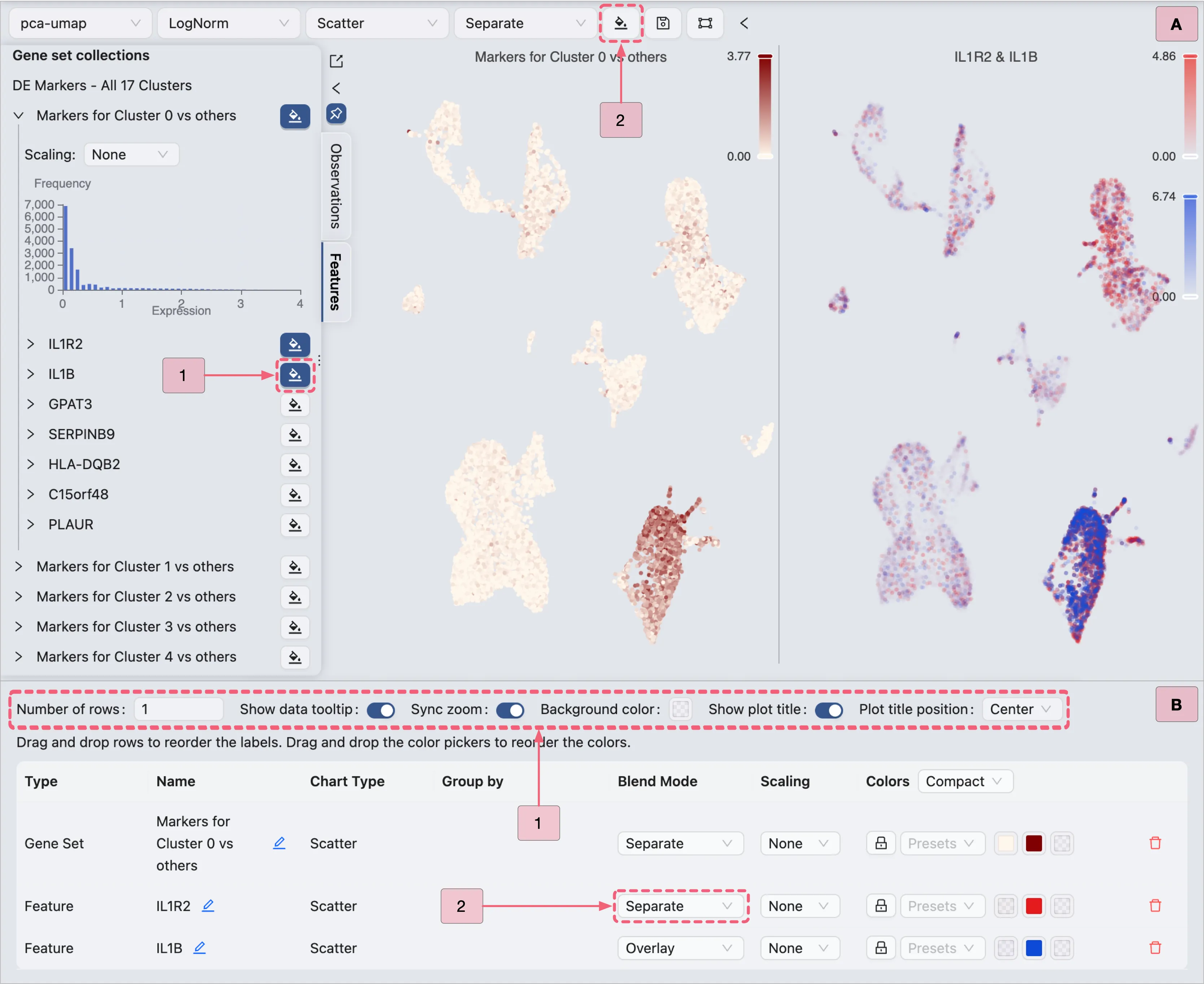
Key annotations in the image above:
A: Adding the
IL1Bgene to the visualization.B: Visualization settings panel with the
Overlayblending mode applied toIL1Bgene.
Heatmap Visualization
To visualize the expression of Cluster 0 marker genes using a Heatmap, follow these steps:
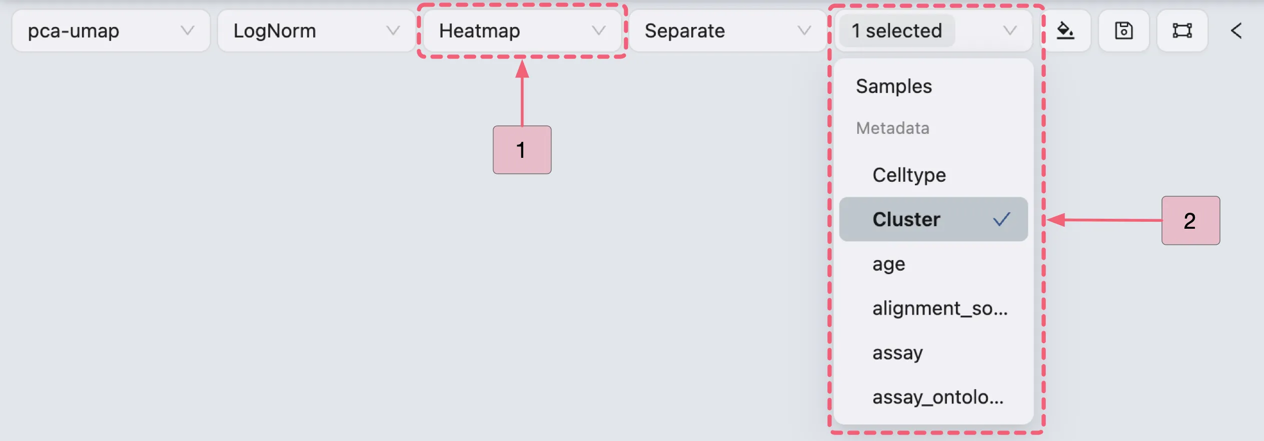
Select
Heatmapas the plot type in the Top Toolbar.(Optional) Use the Group By dropdown in the Top Toolbar to organize cells by metadata or samples
Select a metadata variable (e.g.,
Cluster) to reorganize the heatmap into distinct columns, enabling visualization of DE markers across predefined categories.This helps identify group-specific expression patterns (e.g., genes upregulated in a particular cluster or cell type) or compare biological conditions (e.g., young vs aged samples).
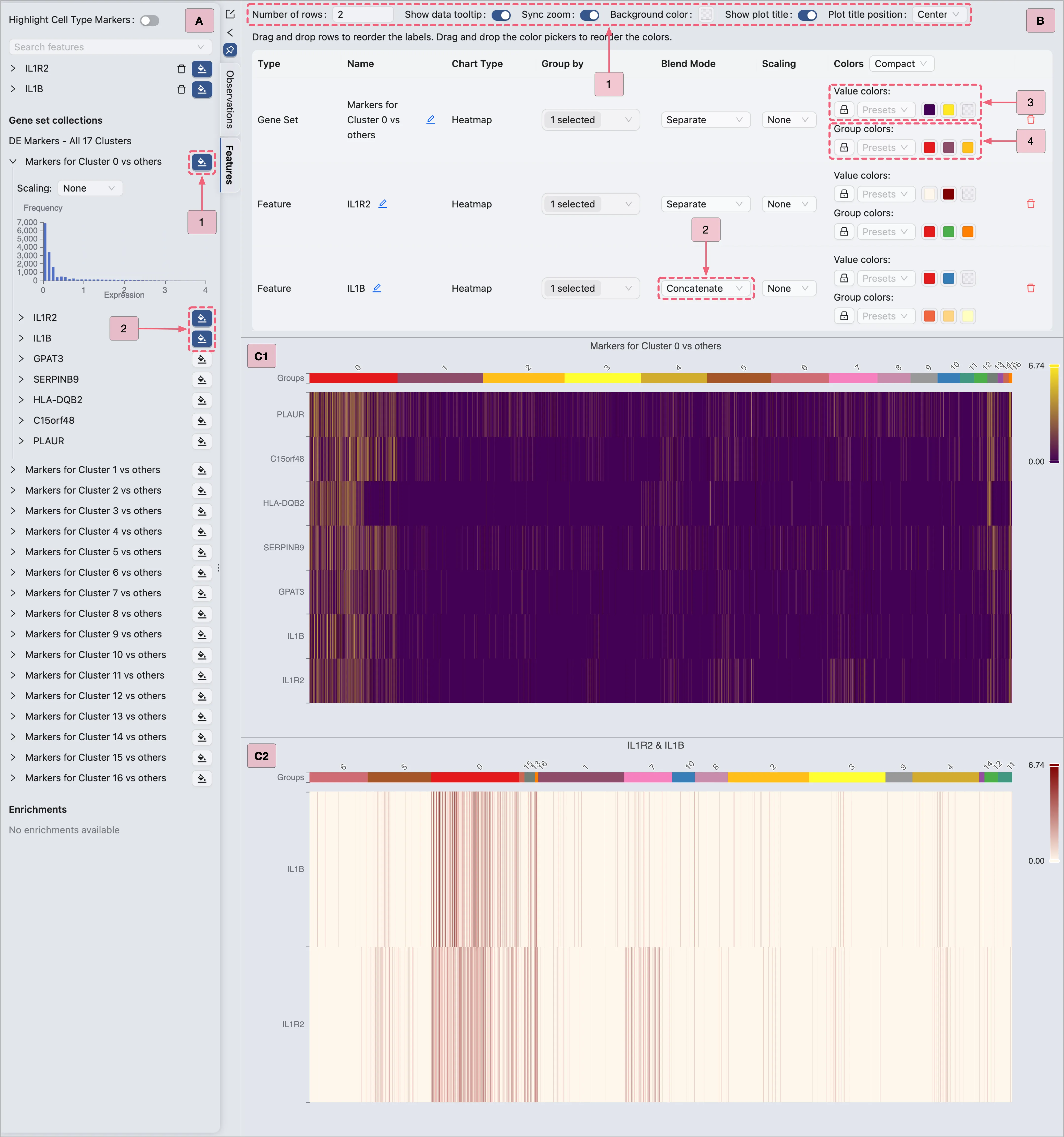
Then, proceed with the steps below to visualize Cluster 0 marker genes (as shown in the image):
A: Gene selection
Select all genes from the
Markers for Cluster 0 vs othersgene set to display all markers simultaneously.Select specific genes (e.g.,
IL1R2,IL1B) for targeted visualization.
B: Plot configuration
Step 1: Adjust layout settings to optimize display.
Step 2: Combine multiple genes (e.g.,
IL1R2,IL1B) into a single plot.Step 3: Modify the heatmap color scale if needed.
Step 4: Modify the group colors (e.g., cluster or annotations) if necessary.
C1 & C2: Examine the finalized heatmap results.
Dot Plot Visualization
In the Top Toolbar, select the Dotplot option to visualize the expression of Cluster 0 marker genes.
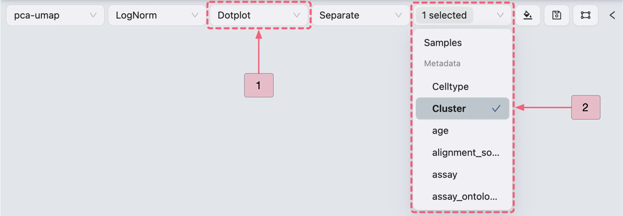
Then, follow the steps below (as depicted in the image) to visualize the expression of Cluster 0 marker genes using a dot plot:
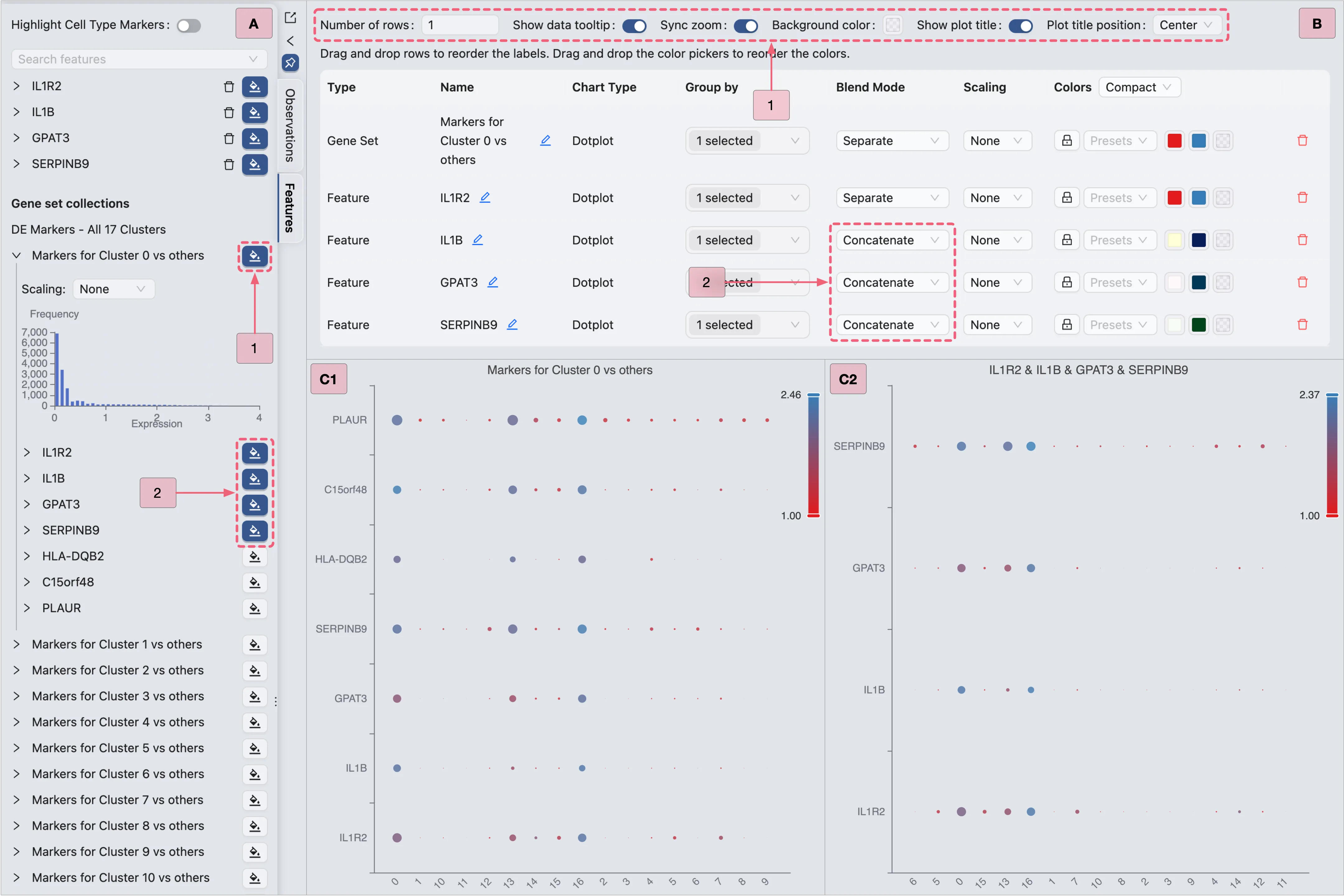
Proceed with the steps below to visualize Cluster 0 marker genes (as depicted in the image):
A: Gene selection
Select all genes from the
Markers for Cluster 0 vs othersgene set to display all markers simultaneously.Select specific genes (e.g.,
IL1R2,IL1B,GPAT3,SERPINB9) for targeted visualization.
B: Plot configuration
Step 1: Adjust layout settings for optimal display.
Step 2: Combine multiple genes (e.g.,
IL1R2,IL1B,GPAT3,SERPINB9) into a single plot.
C: Review the finalized dot plot results.
Violin Plot Visualization
In the Top Toolbar, select the Violin option to visualize the expression of Cluster 0 marker genes.
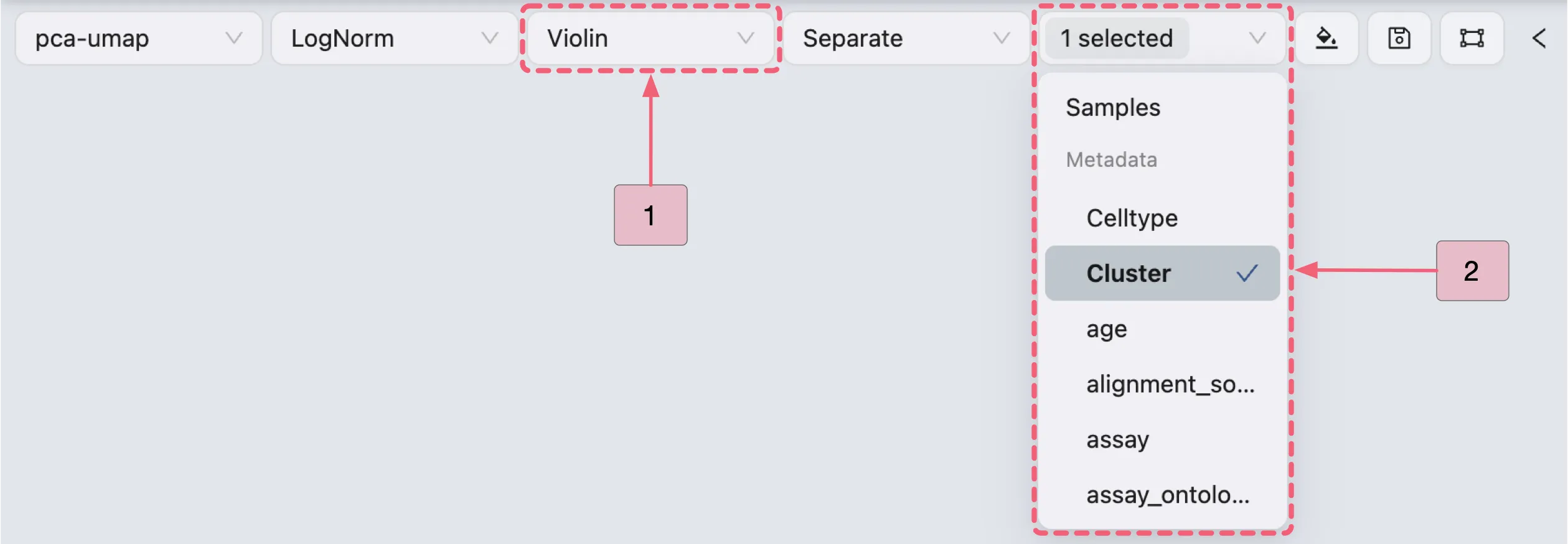
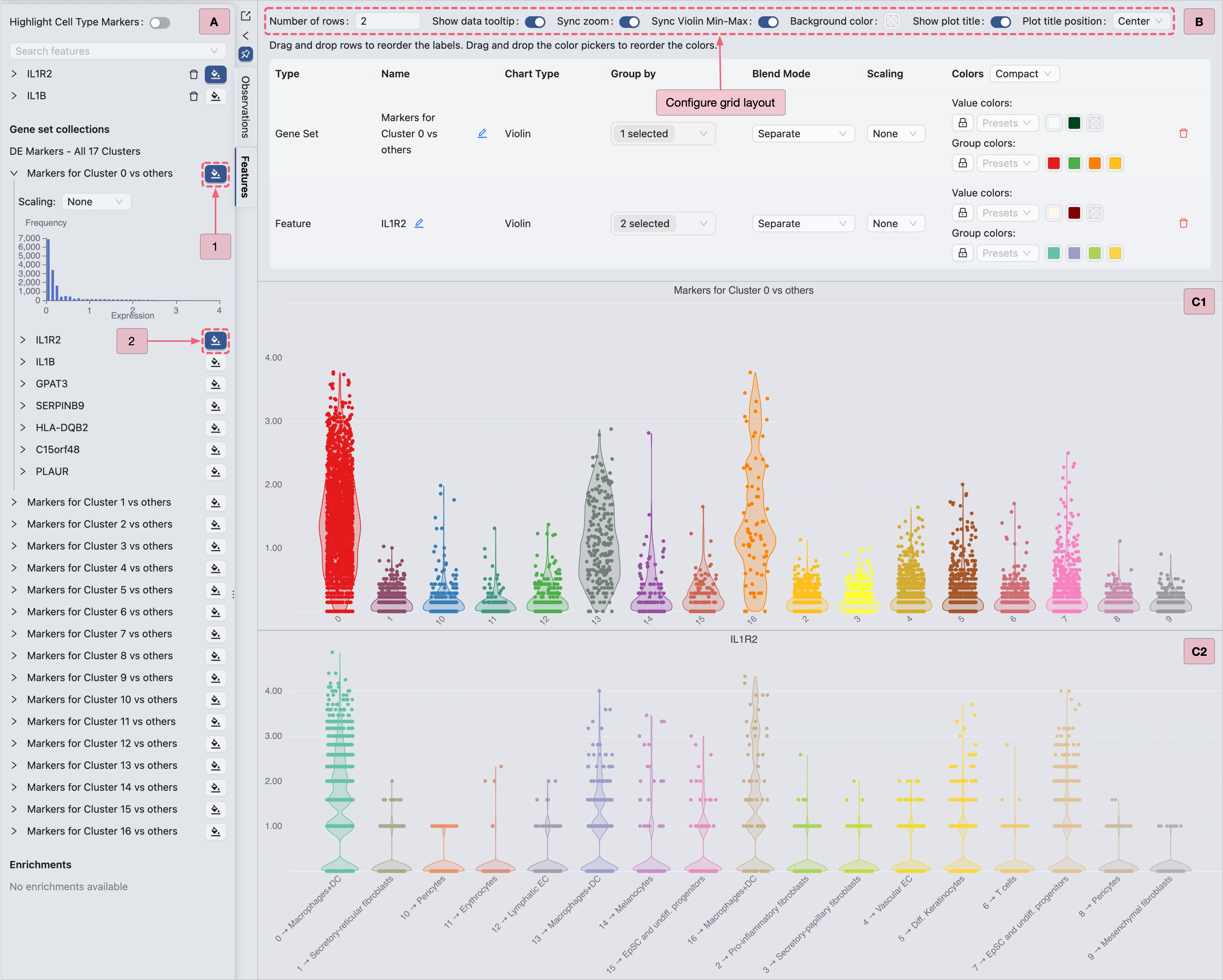
Then, proceed with the steps below to visualize Cluster 0 marker genes (as shown in the image):
A: Gene selection
Step 1: Select the
Cluster 0 markersgene set for visualization.Step 2: Select an individual gene (e.g.,
IL1R2) for visualization.
B: Configure the layout settings.
Adjust layout settings for optimal display.
Note: Enable the
Sync Violin Min-Maxoption to standardize value ranges across plots.C: Review the finalized violin plot results.
DE Analysis to Identify Fibroblast-Specific Markers in Young Samples
In the original study, the authors identified clusters 1, 2, 3, and 9 as fibroblast subpopulations.
In this section, we will analyze these clusters to identify subpopulation-specific markers in young samples by comparing each fibroblast subpopulation against all other cells within the young samples.
Young Fibroblast Analysis Configuration Guide
Navigate to the
Differential Expressionpanel.Click the
New Differential Analysisbutton.Select the
By metadataoption.Configure the analysis as depicted in the image below:
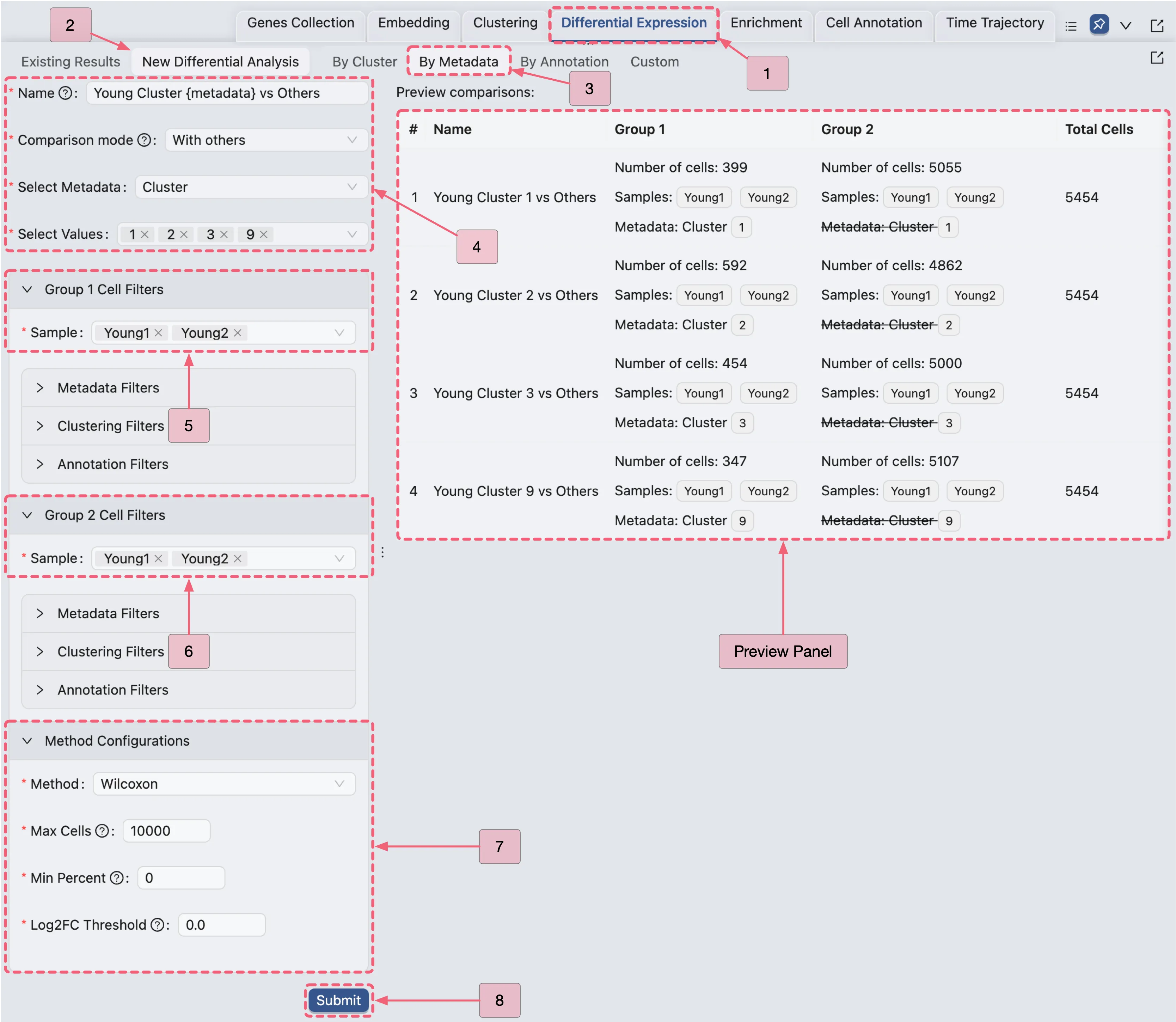
Open the Young Fibroblast Analysis Results
Once the analysis completes, results will appear in the Existing Results Table of the Differential Expression panel.
You can visualize results in two ways:
View Multiple Analyses Simultaneously
Select analyses by checking the boxes in the corresponding rows.
Click the View Selected button to display results for the selected analyses.
View Individual Analyses:
Click the
Viewbutton in the Action column of the corresponding analysis entry.
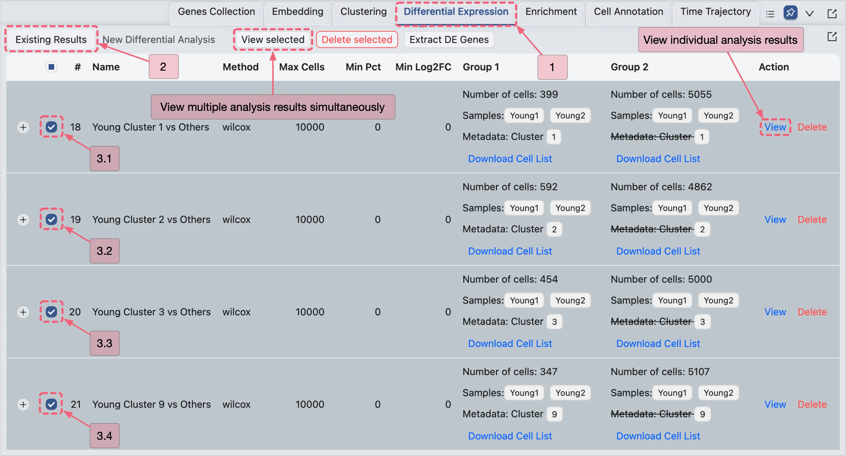
View the Young Fibroblast Analysis Results
On the DE analysis results page, you can:
View DE results with statistical metrics.
Add selected genes to a gene set collection for management and further visualization.
Export results as a CSV file for external processing.
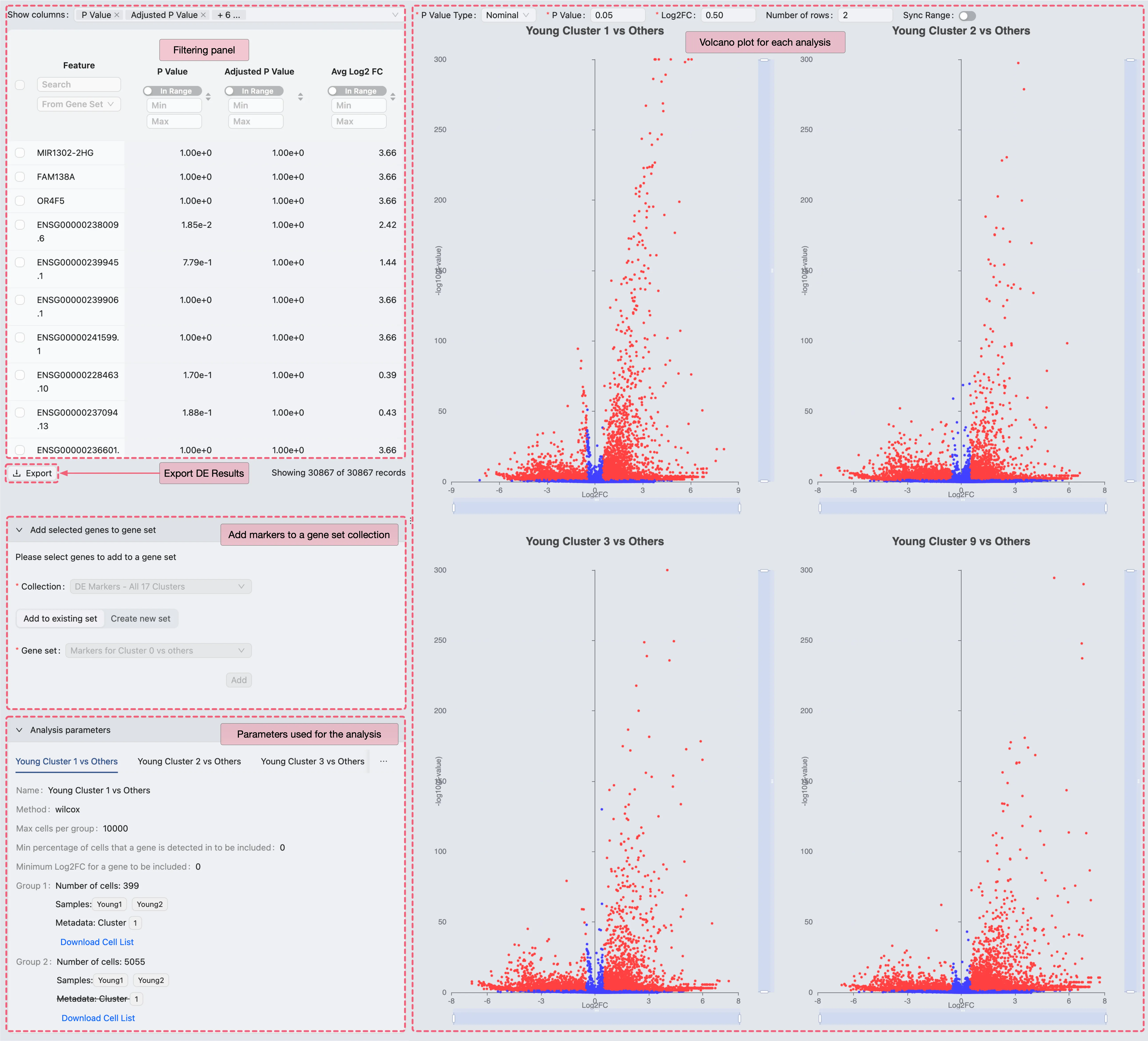
Comparative Validation of Young Fibroblast Markers in the Original Study
To validate results, we identify significant DE genes for each analysis using the following criteria:
Adjusted P Value ⩽ 0.05 (statistical significance threshold)
Avg Log2 FC ⩾ 0.5 (minimum expression fold change)
Applying these criteria filters the DE results to identify significant DE genes, which can then be cross-referenced with marker genes listed in Supplementary Data 2 of the original publication.
Our analysis demonstrates strong concordance between results generated in CytoAnalyst and the original study, with the platform identifying 91.9% of the genes reported in the publication.
Extract Young Fibroblast DE Genes
In this section, we will extract DE genes for visualization.
Note: This extraction is for visualization purposes only. We do not apply the same criteria as the original study, as including thousands of genes from the original dataset would dilute the biological signal.
Steps to Extract DE Genes:
Navigate to the Existing Results tab in the
Differential Expressionpanel.Follow the steps depicted in the image below to extract significant DE genes:
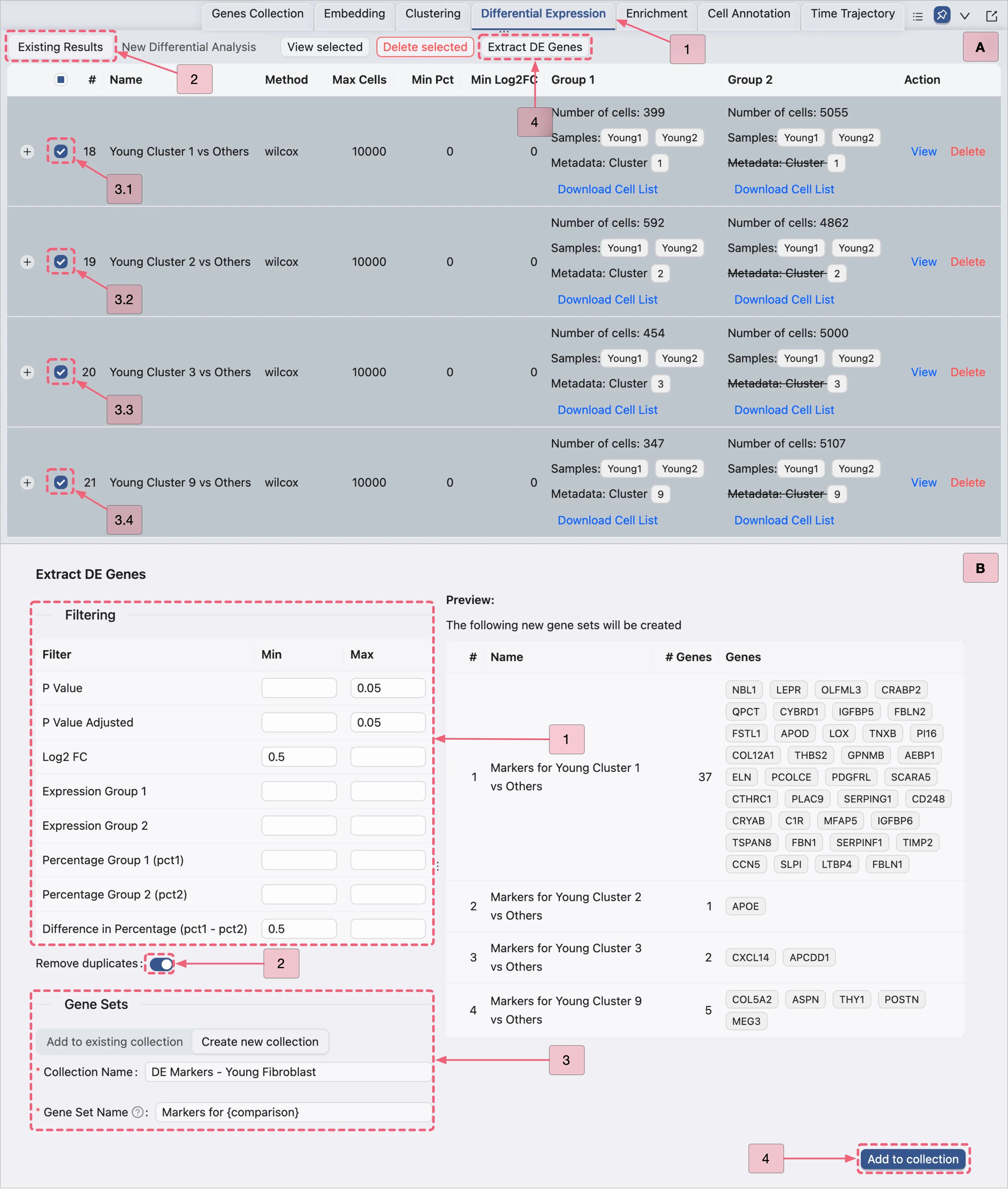
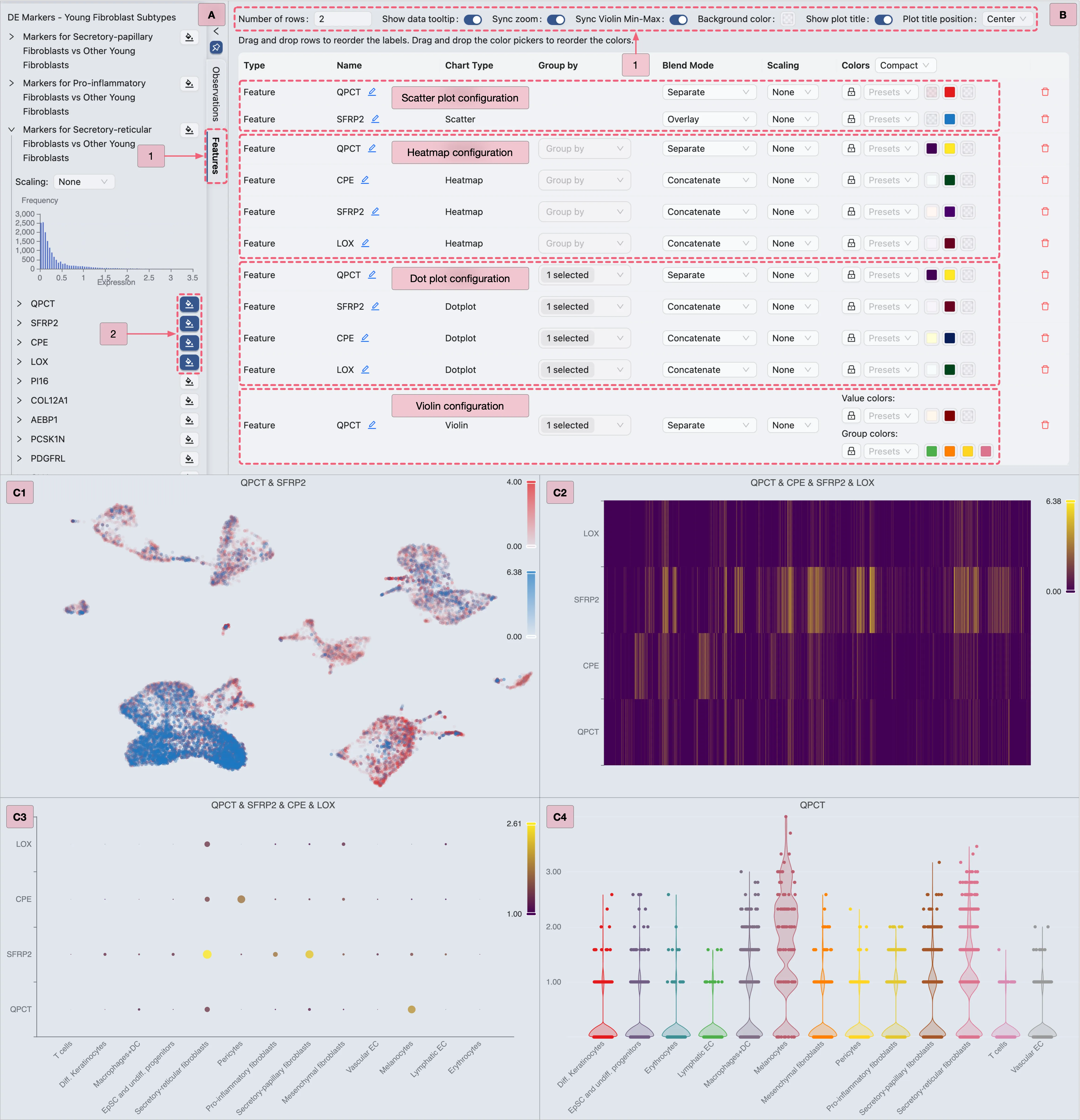
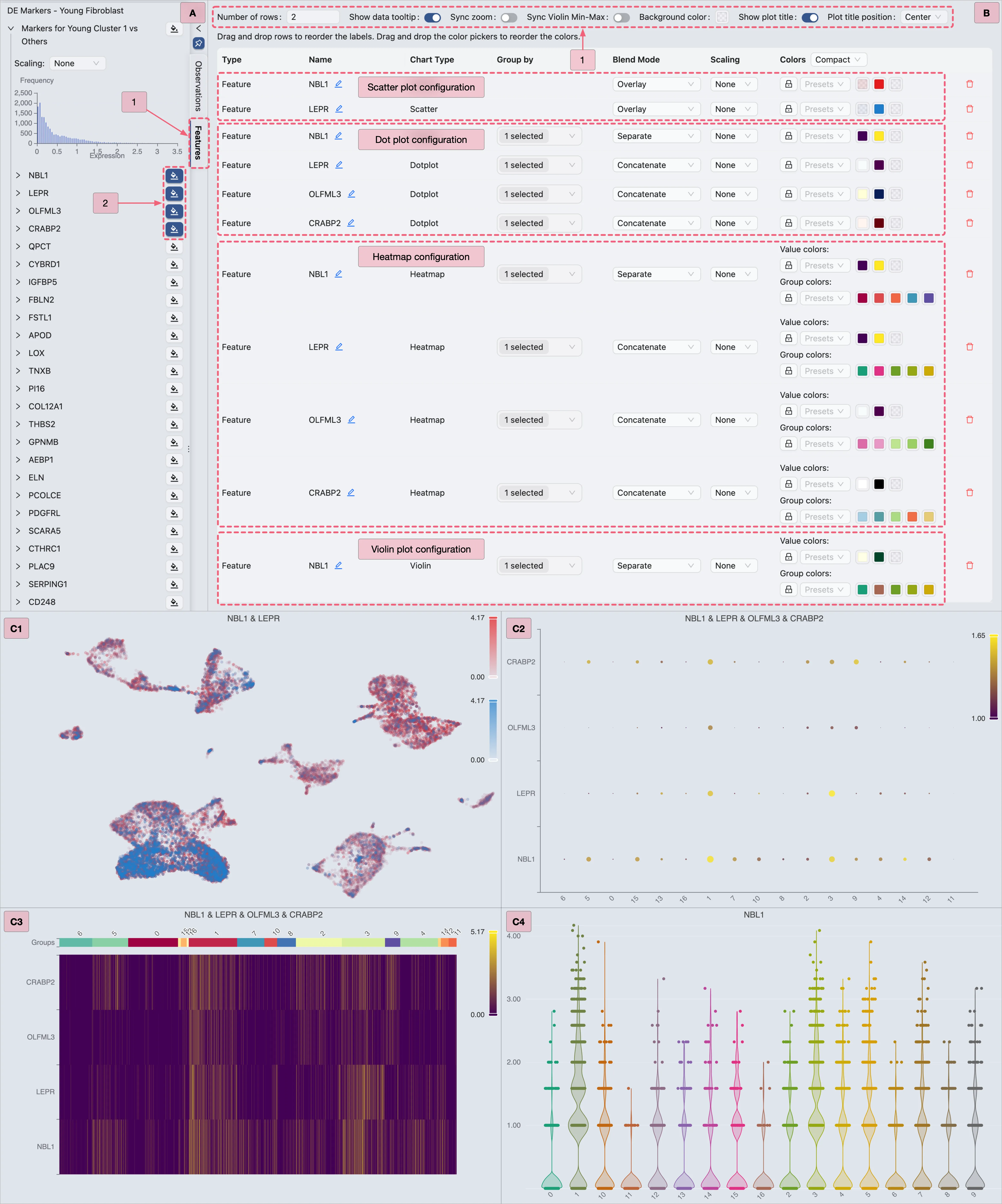
Visualize the Young Fibroblast DE Genes
To visualize DE gene expression using integrated methods in CytoAnalyst:
Switch to the
Featurestab in the Left Sidebar.Locate the
DE Markers - Young Fibroblastcollection.Expand the
Markers for Cluster 1 vs Othersgene set to view its marker genes.For each chart type:
Select your preferred genes.
Configure visualization settings as depicted in the image below.
Proceed to the next chart type.
Additional Resources:
For a comprehensive guide on data visualization, refer to the Data Visualization page.
Detailed instructions for visualizing DE results are also available in the previous sections.
DE Analysis to Identify Fibroblast-Specific Markers in Old Samples
As previously mentioned, the authors identified clusters 1, 2, 3, and 9 as fibroblast subpopulations.
In this section, we aim to analyze these clusters to identify subpopulation-specific markers in old samples by comparing each fibroblast subpopulation against all other cells within the old samples.
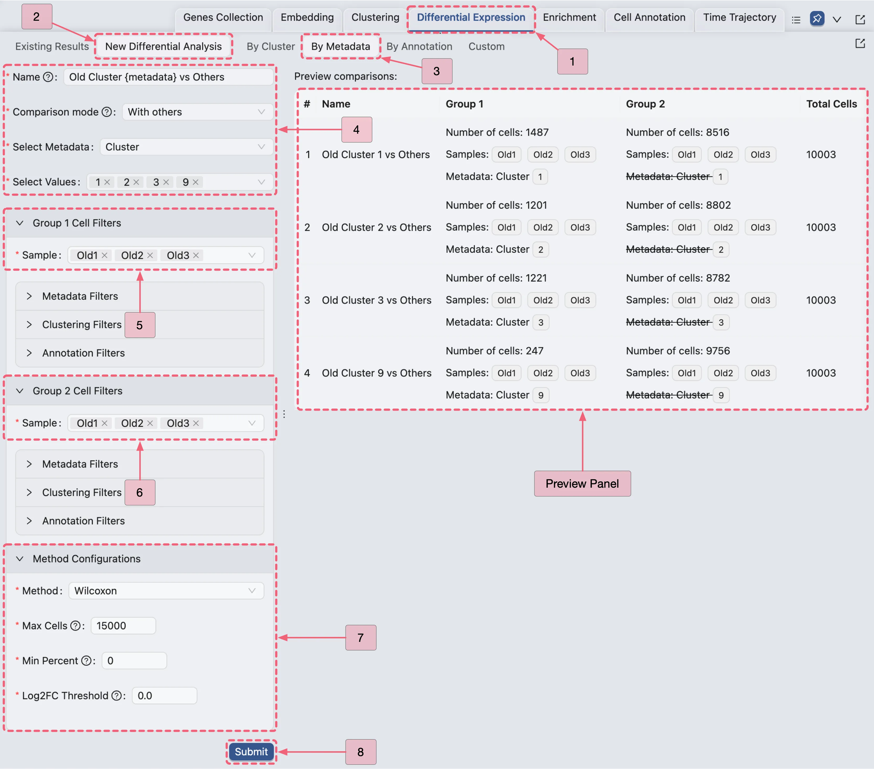
Old Fibroblast Analysis Configuration Guide
Navigate to the
Differential Expressionpanel.Click the
New Differential Analysisbutton.Select the
By metadataoption.Configure the analysis as depicted in the image below:
Open the Old Fibroblast Analysis Results
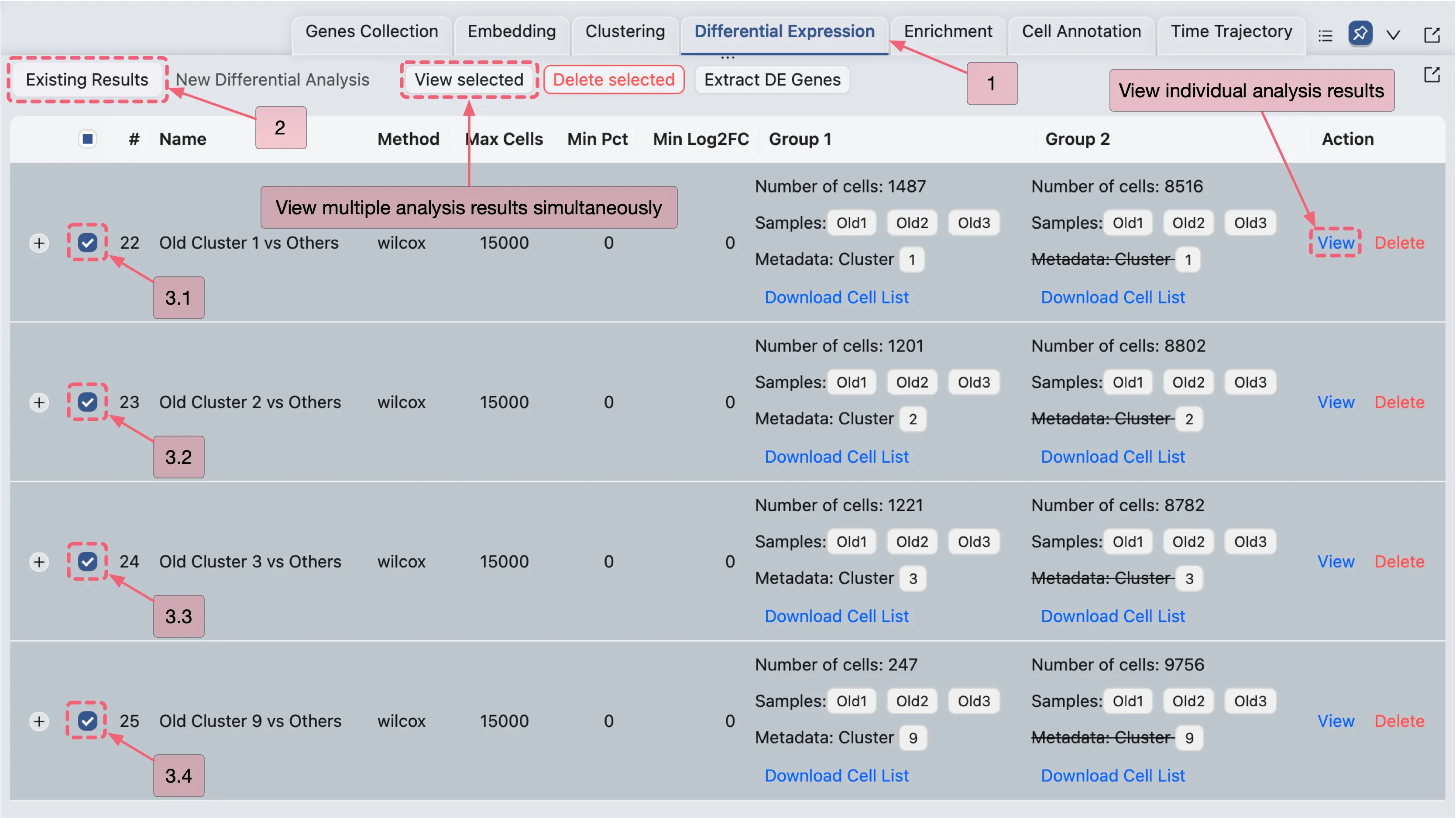
Once the analysis completes, results will appear in the Existing Results Table of the Differential Expression panel.
You can visualize results in two ways:
View Multiple Analyses Simultaneously
Select analyses by checking the boxes in the corresponding rows.
Click the View Selected button to display results for the selected analyses.
View Individual Analyses:
Click the
Viewbutton in the Action column of the corresponding analysis entry.
View the Old Fibroblast Analysis Results
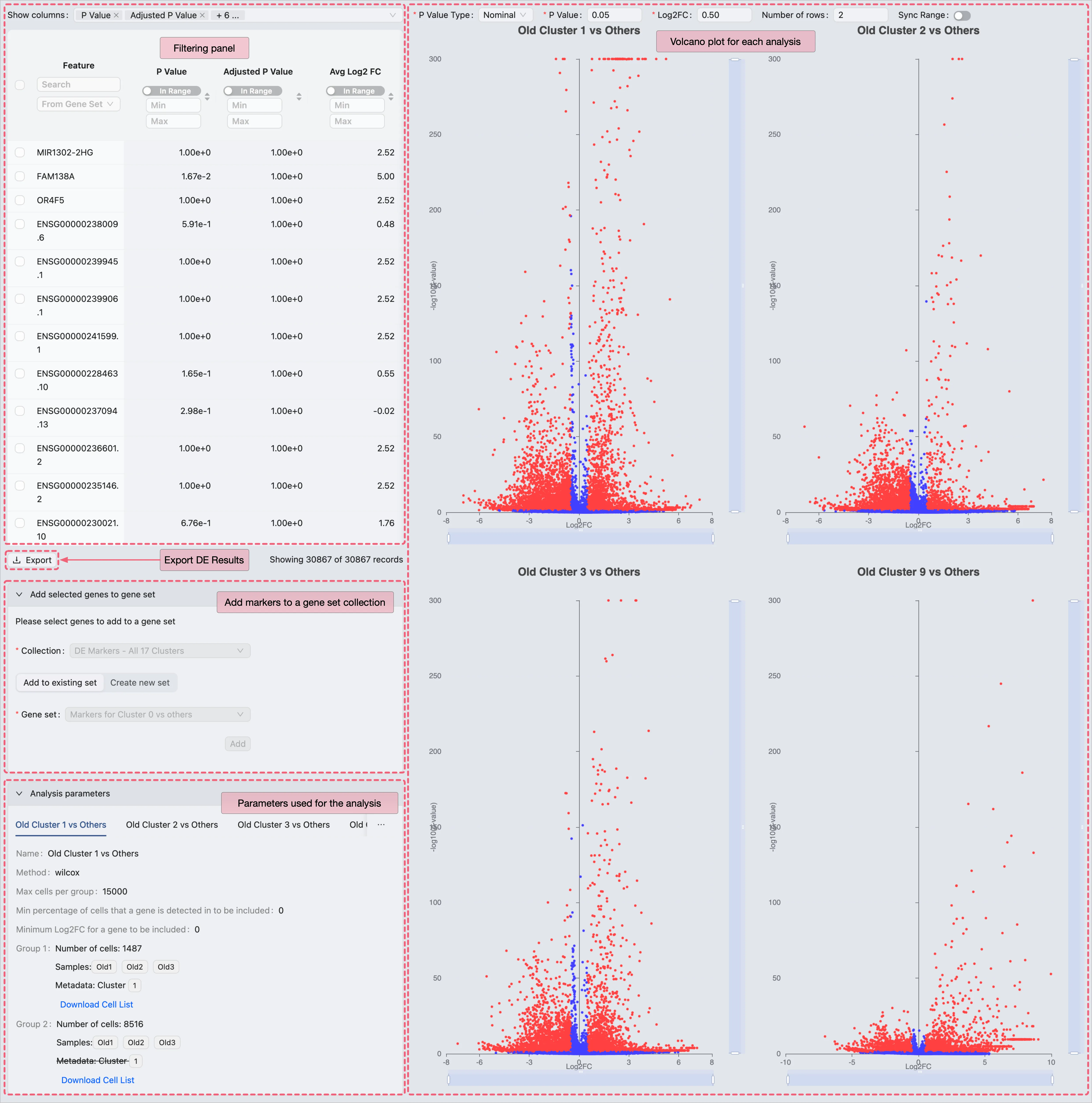
On the DE analysis results page, you can:
View DE results with statistical metrics.
Add selected genes to a gene set collection for management and further visualization.
Export results as a CSV file for external processing.
Comparative Validation of Old Fibroblast Markers in the Original Study
To validate results, we identify significant DE genes for each analysis using the following criteria:
Adjusted P Value ⩽ 0.05 (statistical significance threshold)
Avg Log2 FC ⩾ 0.5 (minimum expression fold change)
Applying these criteria filters the DE results to identify significant DE genes, which can then be cross-referenced with marker genes listed in Supplementary Data 4 of the original publication.
Our analysis demonstrates strong concordance between results generated in CytoAnalyst and the original study, with the platform identifying 91.1% of the genes reported in the publication.
Extract Old Fibroblast DE Genes
In this section, we will extract DE genes for visualization.
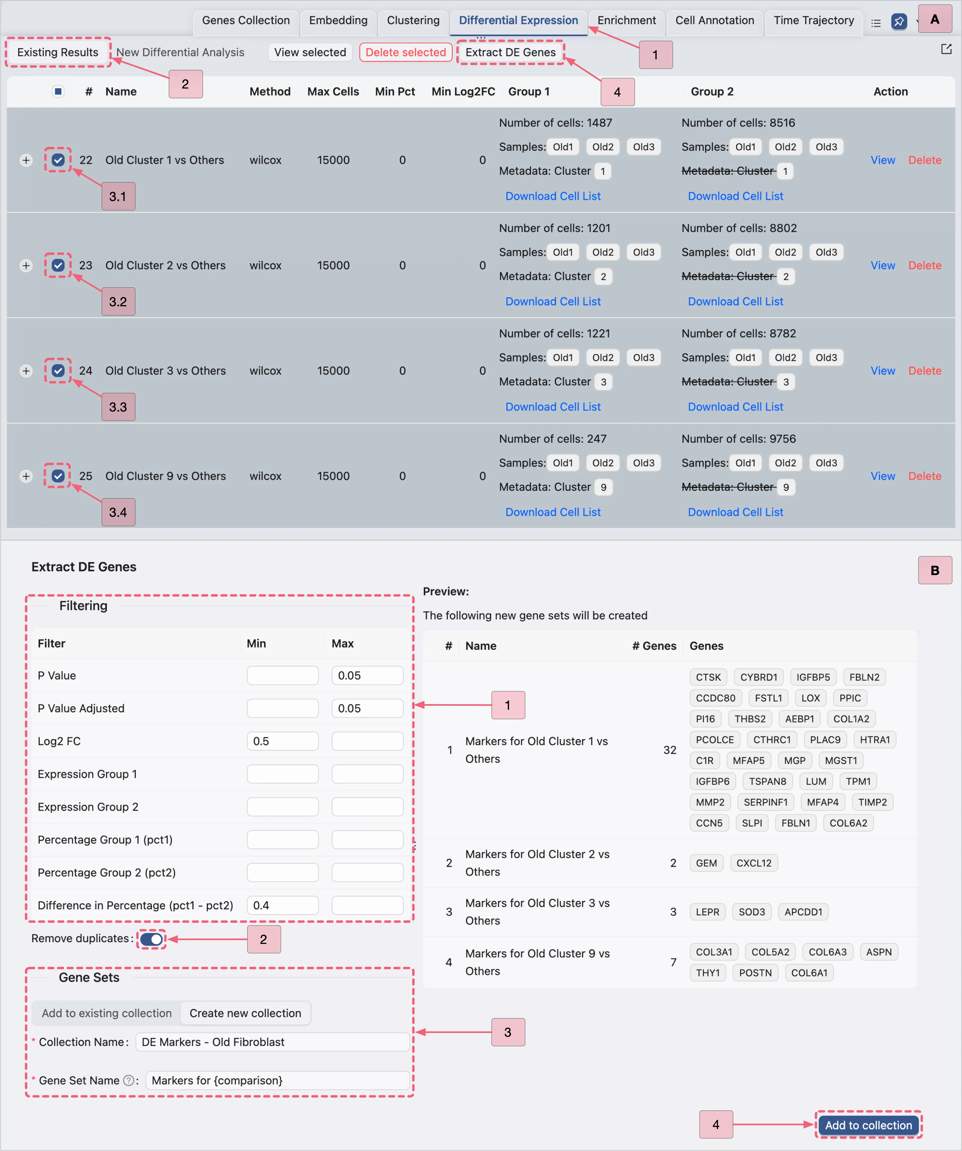
Note: This extraction is for visualization purposes only. We do not apply the same criteria as the original study, as including thousands of genes from the original dataset would dilute the biological signal.
Steps to Extract DE Genes:
Navigate to the Existing Results tab in the
Differential Expressionpanel.Follow the steps depicted in the image below to extract significant DE genes:
Visualize the Old Fibroblast DE Genes
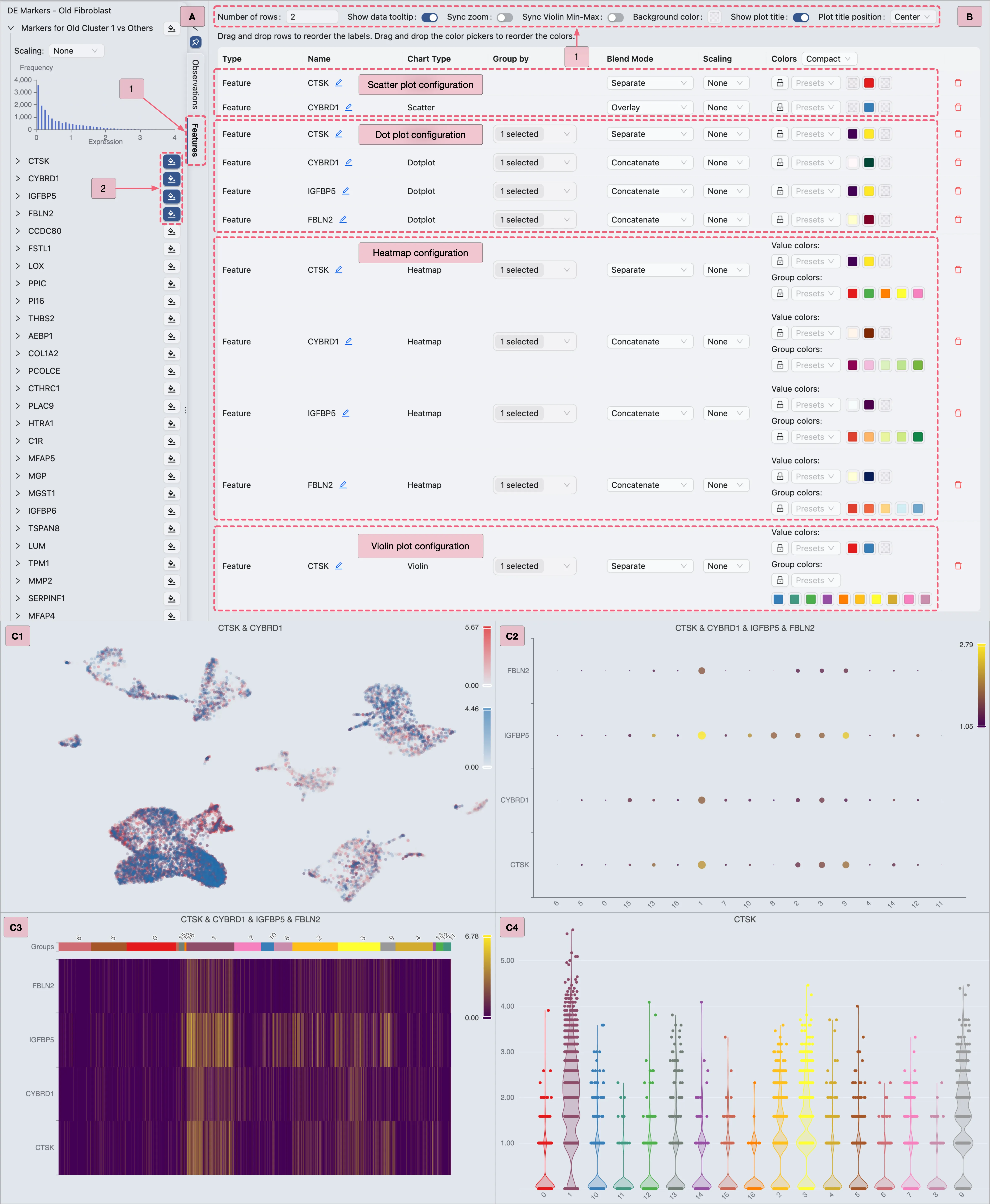
To visualize DE gene expression using integrated methods in CytoAnalyst:
Switch to the
Featurestab in the Left Sidebar.Locate the
DE Maarkers - Old Fibroblastcollection.Expand the
Markers for Cluster 1 vs Othersgene set to view its marker genes.For each chart type:
Select your preferred genes.
Configure visualization settings as depicted in the image below.
Proceed to the next chart type.
Additional Resources:
For a comprehensive guide on data visualization, refer to the Data Visualization page.
Detailed instructions for visualizing DE results are also available in the previous sections.
DE Analysis for Comparing Fibroblast Subtypes in Young Samples
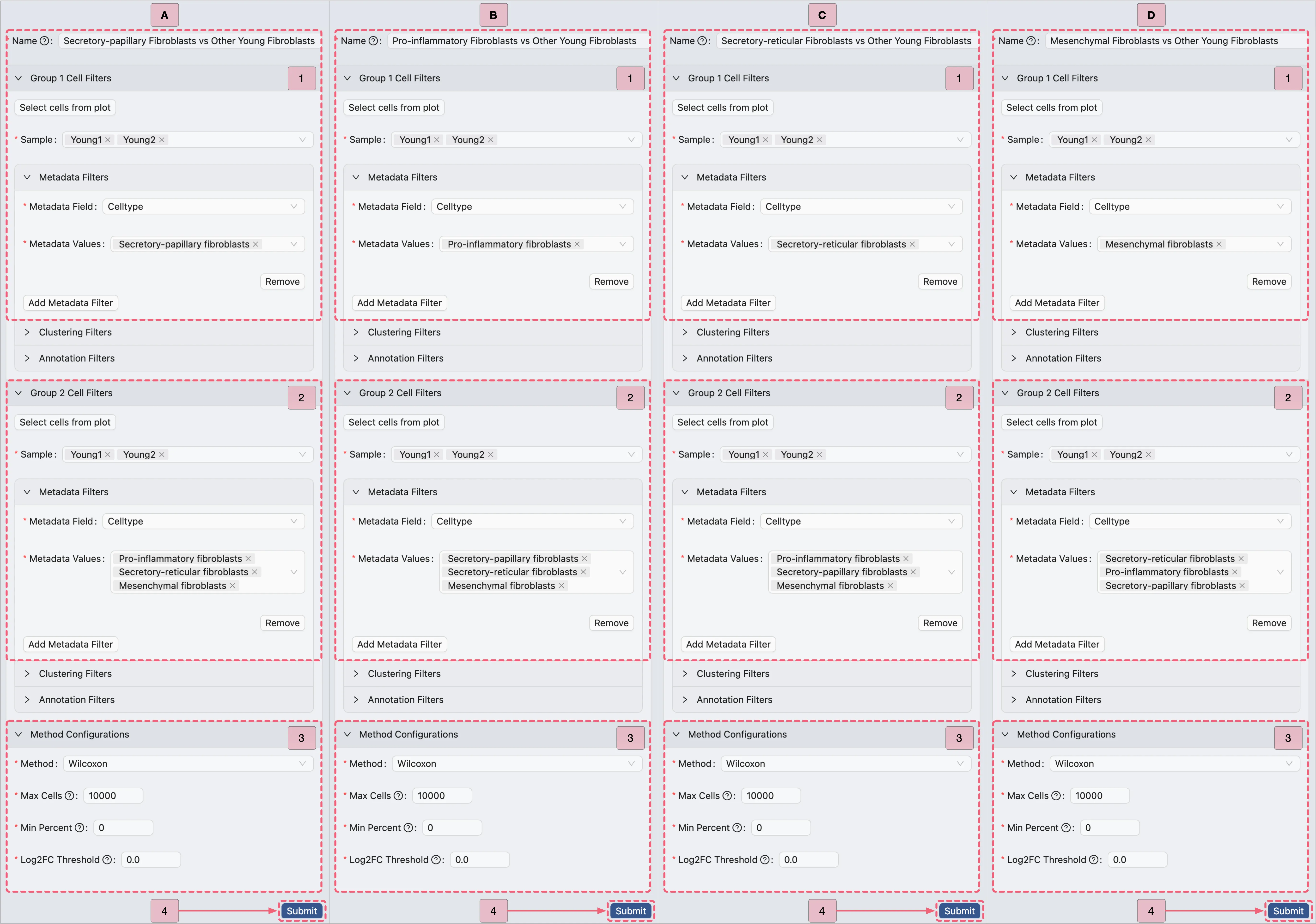
In this section, we use the annotated cell types from the original study to identify subtype-specific markers by comparing each fibroblast subpopulation against all other subpopulations within young samples.
Specifically, we analyze the following fibroblast subtypes:
Secretory-papillary FibroblastsPro-inflammatory FibroblastsSecretory-reticular FibroblastsMesenchymal Fibroblasts
Young Fibroblast Subtype Analysis Configuration Guide
Navigate to the
Differential Expressionpanel.Click the
New Differential Analysisbutton.Select the
By metadataoption.Configure the analyses as depicted in the image below:
Open the Young Fibroblast Subtype Analysis Results
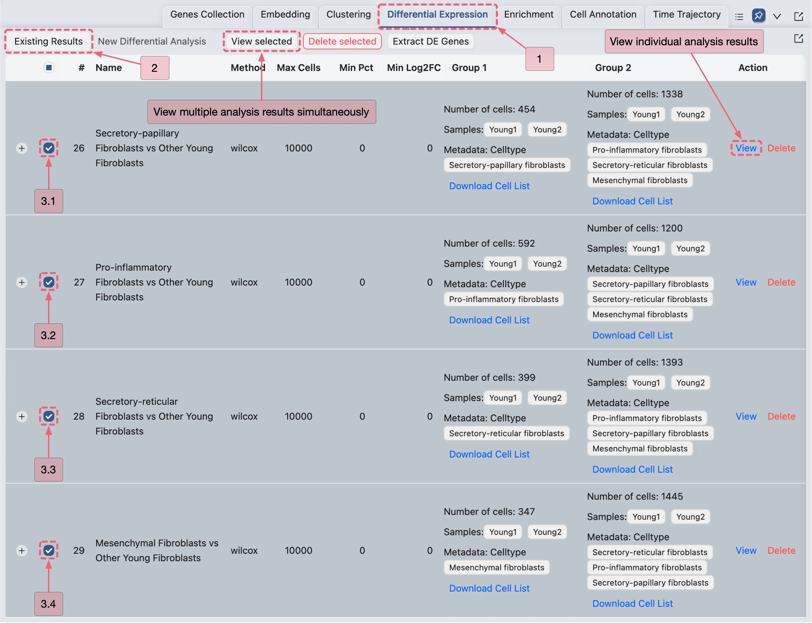
Once the analysis completes, results will appear in the Existing Results Table of the Differential Expression panel.
You can visualize results in two ways:
View Multiple Analyses Simultaneously
Select analyses by checking the boxes in the corresponding rows.
Click the View Selected button to display results for the selected analyses.
View Individual Analyses:
Click the
Viewbutton in the Action column of the corresponding analysis entry.
View the Young Fibroblast Subtype Analysis Results
On the DE analysis results page, you can:
View DE results with statistical metrics.
Add selected genes to a gene set collection for management and further visualization.
Export results as a CSV file for external processing.
Comparative Validation of Young Fibroblast Subtype Markers in the Original Study
To validate results, we identify significant DE genes for each analysis using the following criteria:
Adjusted P Value ⩽ 0.05 (statistical significance threshold)
Avg Log2 FC ⩾ 0.5 (minimum expression fold change)
Applying these criteria filters the DE results to identify significant DE genes, which can then be cross-referenced with marker genes listed in Supplementary Data 3 of the original publication.
Our analysis demonstrates strong concordance between results generated in CytoAnalyst and the original study, with the platform identifying 84.7% of the genes reported in the publication.
Extract Young Fibroblast Subtype DE Genes
In this section, we will extract DE genes for visualization.
Note: This extraction is for visualization purposes only. We do not apply the same criteria as the original study, as including thousands of genes from the original dataset would dilute the biological signal.
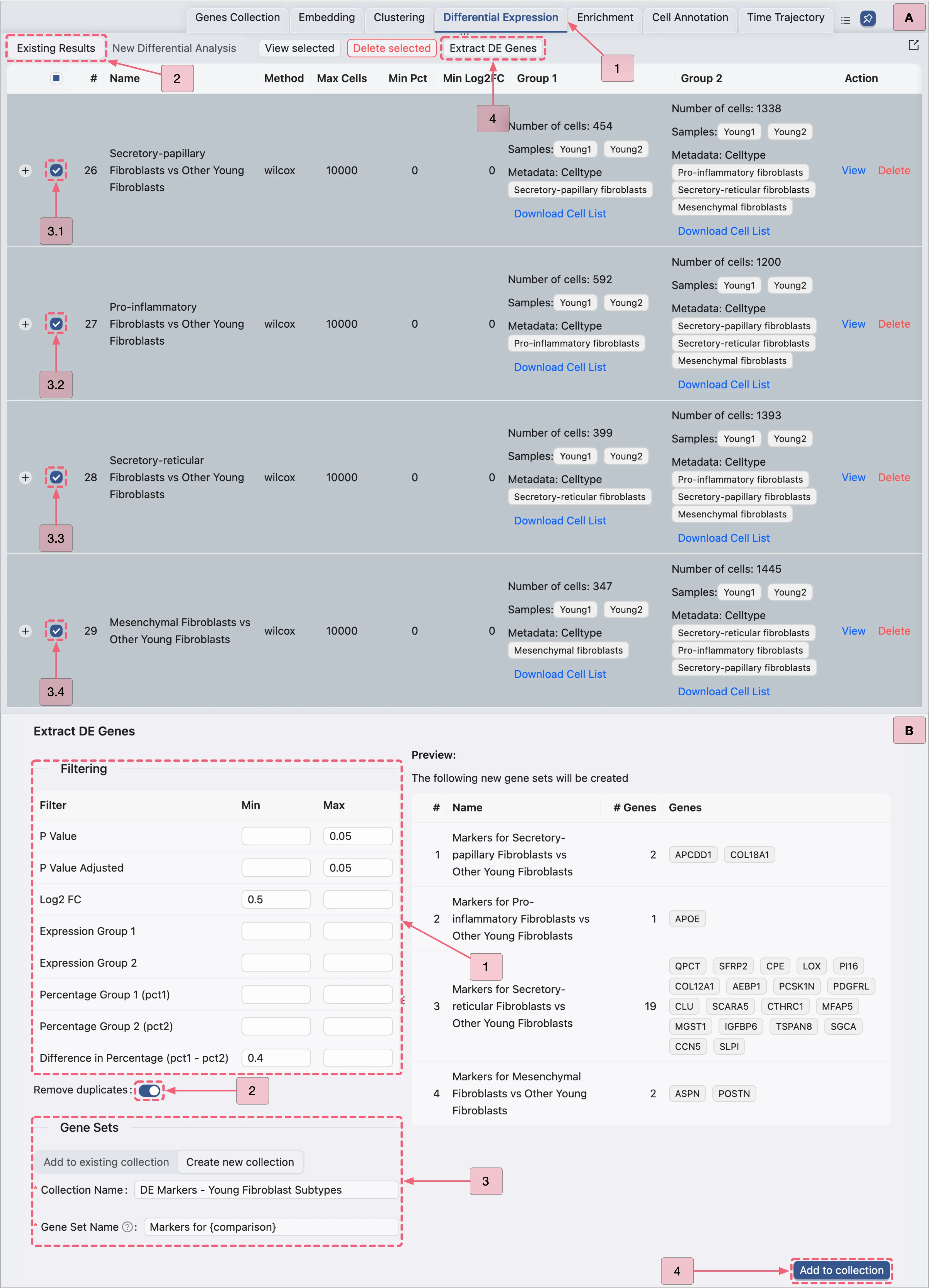
Steps to Extract DE Genes:
Navigate to the Existing Results tab in the
Differential Expressionpanel.Follow the steps depicted in the image below to extract significant DE genes:
Visualize the Young Fibroblast Subtype DE Genes
To visualize DE gene expression using integrated methods in CytoAnalyst:
Switch to the
Featurestab in the Left Sidebar.Locate the
DE Markers - Young Fibroblast Subtypescollection.Expand the
Markers for Secretory-reticular Fibroblasts vs Other Young Fibroblastsgene set to view its marker genes.For each chart type:
Select your preferred genes.
Configure visualization settings as depicted in the image below.
Proceed to the next chart type.
Additional Resources:
For a comprehensive guide on data visualization, refer to the Data Visualization page.
Detailed instructions for visualizing DE results are also available in the previous sections.
